Impact
~$500K incremental revenue projected
23% of customer-led cancellations cited “wrong tour or date” — top cancellation reason
3-arm experiment designed to isolate the value of editing from the order summary redesign
My Role
I led the end-to-end design of the editing feature and order summary redesign, partnering with Product and Engineering to define the interaction model and prepare for experiment launch.
The challenge
The highest-intent moment, with no way to correct a mistake
A structured audit surfaced a critical gap: users had no way to correct a booking mistake without restarting completely, losing all their details. Customer service data confirmed it — “wrong tour or date” was the top reason for customer-led cancellations, at 23%.
Users were completing the booking, realising the mistake, and cancelling. The competitive gap was clear: our closest competitor had editing. We didn’t.
Constraints and considerations
Flexibility without breaking trust
Before exploring directions, I mapped what users could actually edit: ticket type, date, time, and traveler count and mix. That covers the vast majority of wrong-selection errors.
The core technical constraint: editing triggers a new checkout session — contact details persist, but payment must be re-entered. The design addressed this in three ways:
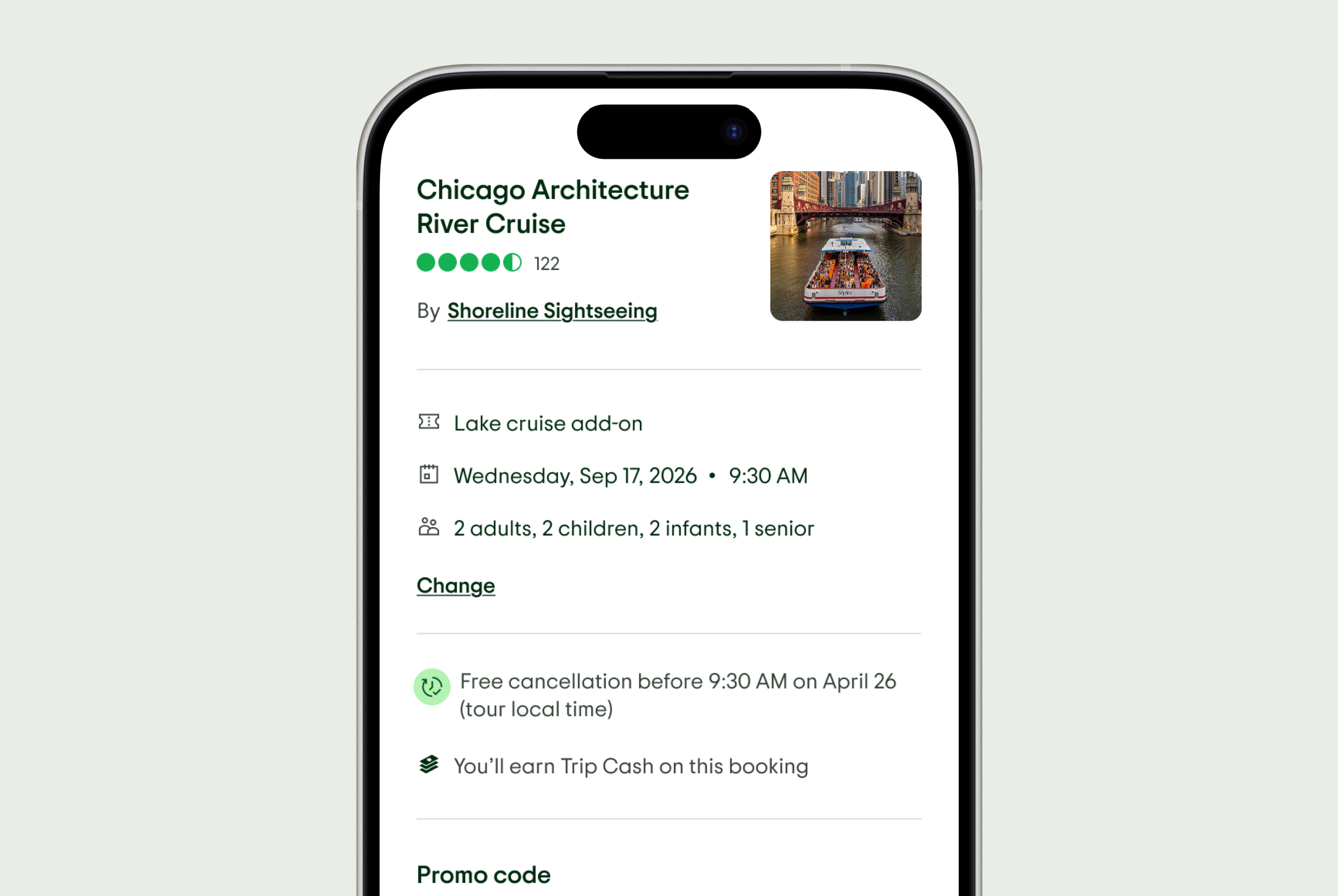
- A single, always-visible entry point in the order summary.
- A partial loading state on re-entry, signalling changes were being applied.
- The same familiar checkout flow on re-entry, so nothing felt disorienting.
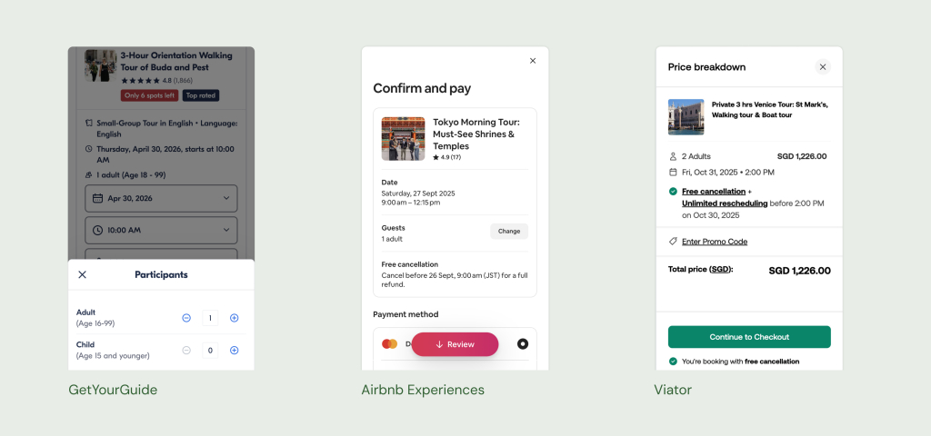
Early explorations
More than a button — placement, copy and visual hierarchy
Two early concepts shaped the direction — one felt disconnected, the other created information overload. Both were text-heavy, which became critical when stress-tested in German: labels expanded, CTAs wrapped, meaning got lost. The constraint was clear: no relying on text.
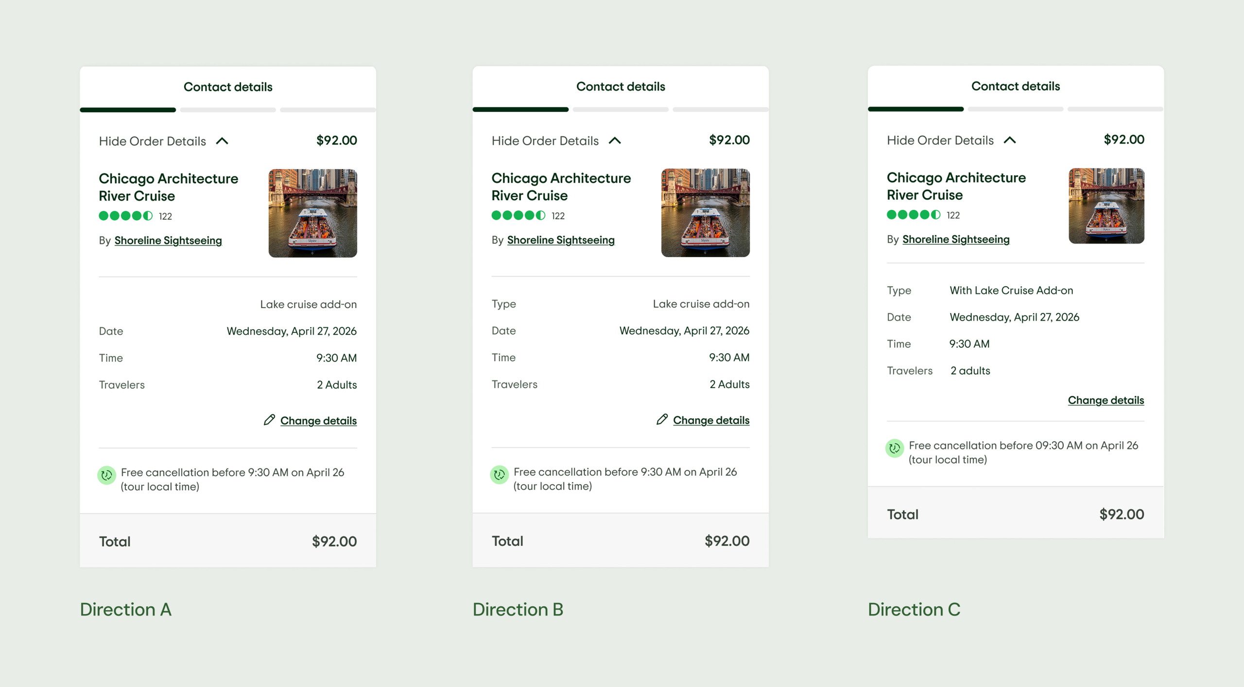
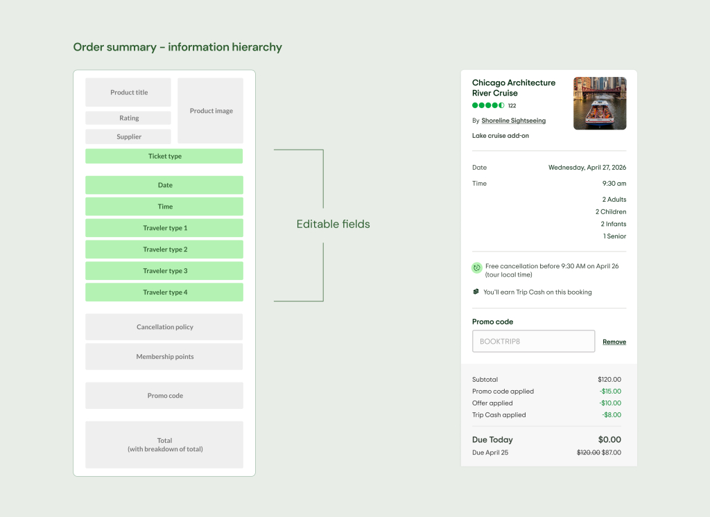
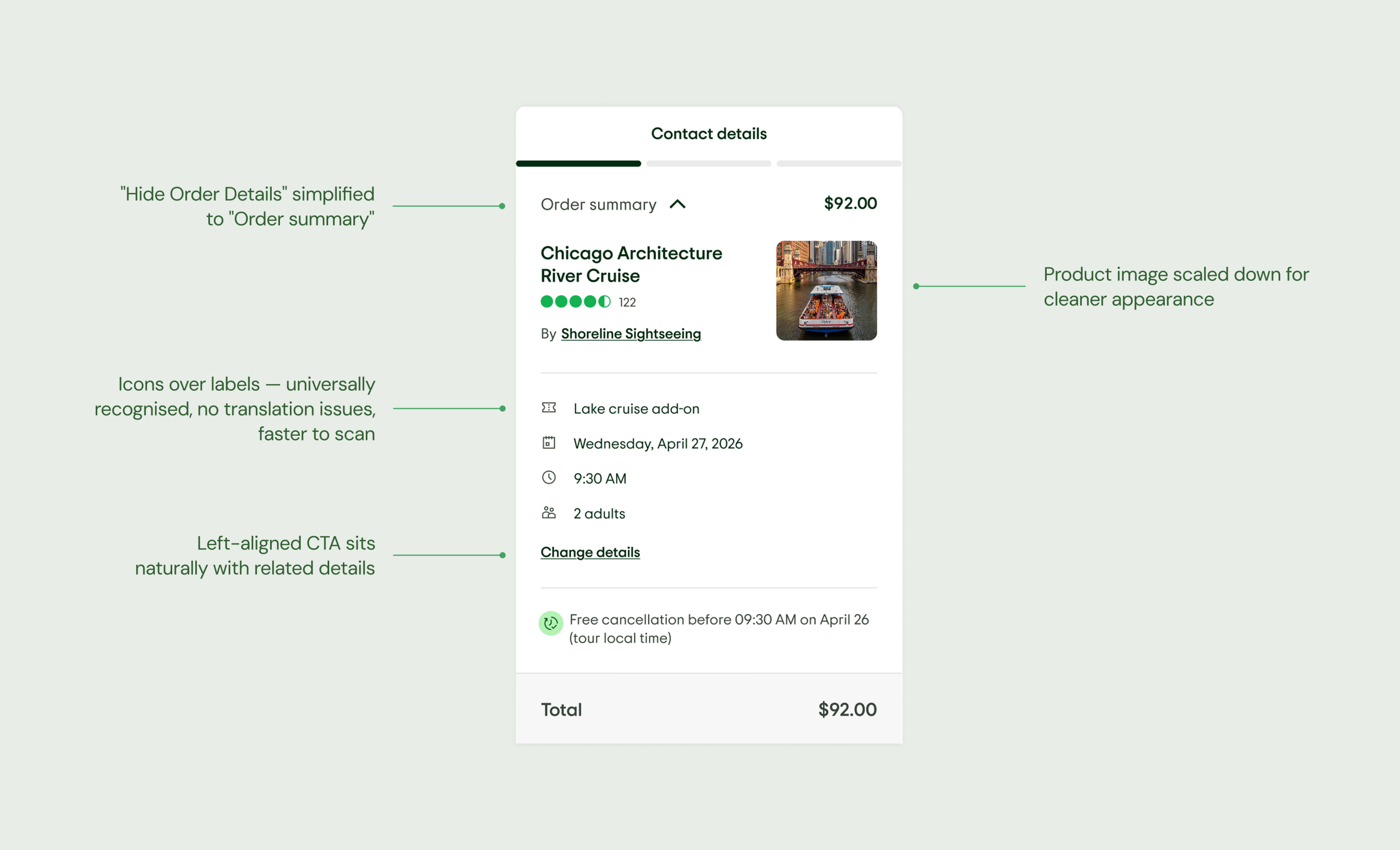
The chosen direction
Icons over labels, one entry point, left-aligned CTA
Direction D resolved both problems at once — replacing text labels with icons, and anchoring the “Change” CTA left-aligned with the details it references.
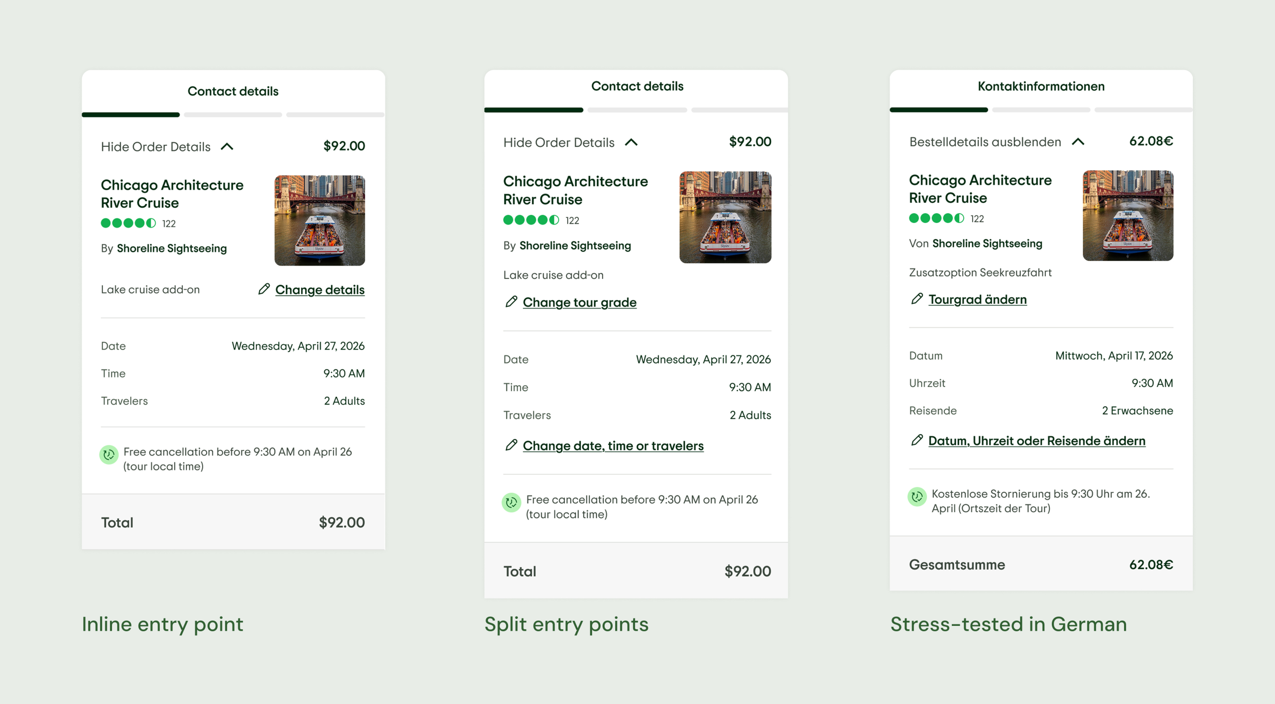
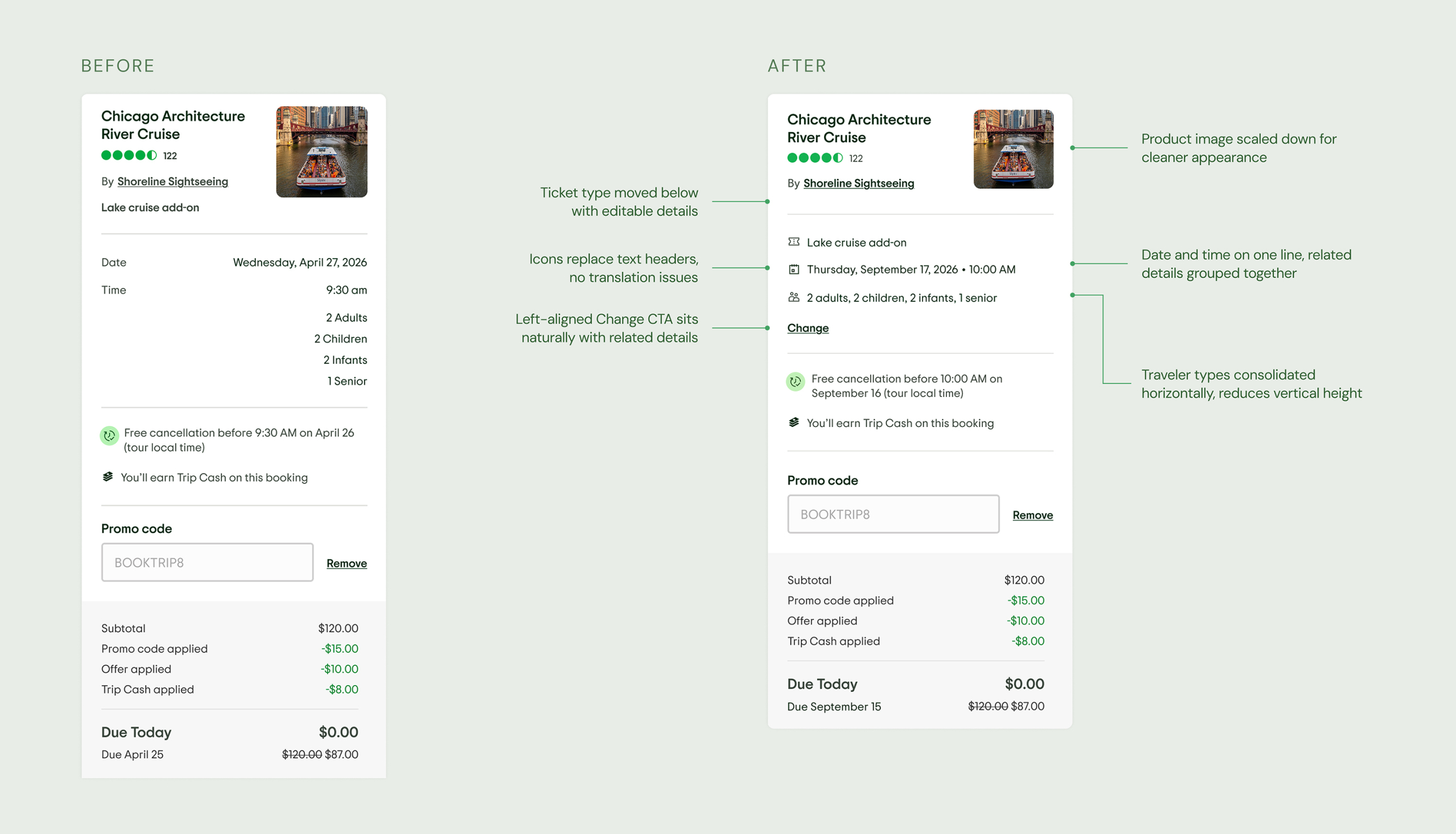
Before and after
Same complexity, sharper hierarchy
After landing on Direction D, I made further refinements. Here you can see the before and after in the most complex possible state — the heaviest version of the order summary, with multiple traveler types and a pay later option. Same information, significantly cleaner hierarchy. Designed to scale.
The mobile flow
One entry point. No dead ends.
Experiment design
Isolating the value of editing from the order summary redesign
Two test variants were designed to separate the impact of the edit functionality from the visual improvements to the order summary.
- Control — Existing checkout, no changes. Baseline for comparison.
- Test 1 — Edit entry point + order summary redesign. Tests the full proposition.
- Test 2 — Order summary redesign only, no edit entry point. Isolates the visual uplift from the functional one.
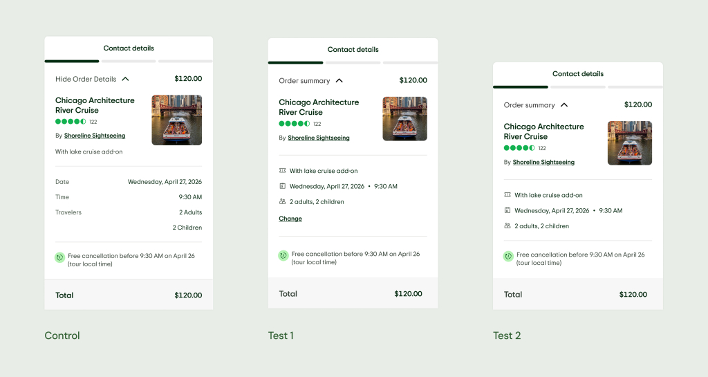
Primary metric: experiment items. Secondary: net revenue, booking uniques, successful checkout visitors. Guardrail: cancellation rate.
Reflections
What started as a contained feature request became an opportunity to improve one of the highest-intent moments in the experience. The order summary redesign that emerged made checkout feel more trustworthy — not just more functional. The shared edit pattern has potential beyond checkout, and inline editing remains the most efficient path for users. The experiment will determine what comes next.