Impact
The Things to Do page serves 70M+ monthly users and contributes approximately 25% of Tripadvisor’s revenue, making improvements to discovery both high-impact and highly scalable.
Content-thin geo pages (validation phase)
- +1.75% product review page visitors
- +3.39% product list page visitors
- +2.43% increase in product click uniques
- $27K in annualised revenue
All Things to Do pages (scaled rollout)
- $1.5M in annualised revenue
Overview
Tripadvisor’s Things to Do pages are a key entry point for travelers researching experiences, but they primarily surface activities within a single anchor destination. This narrow focus often limits discovery of nearby destinations, leading to dead ends during exploration.
This issue was particularly acute on content-thin geo pages (166,000+ pages across Tripadvisor), where limited activity options contributed to high bounce rates.
Additionally, repeated stacks of similar product shelves made long-scroll pages feel visually monotonous and uninspiring, increasing the risk of abandonment.
There was a clear opportunity to improve discovery while also introducing a more engaging, flexible guidance module that could scale within the Tripadvisor Design System.
My Role
I led the design end to end, partnering closely with the Product Manager and cross-functional teams in Machine Learning, Data Merchandising, and Engineering.
Approach
We ran A/B/C experiments to evaluate the impact of introducing the module and to compare two design variations. We moved forward with the option that enabled simpler implementation and faster rollout.
The module’s positive impact on content-thin geo pages supported its expansion across all Things to Do pages, with further testing underway in other parts of the Tripadvisor experience.
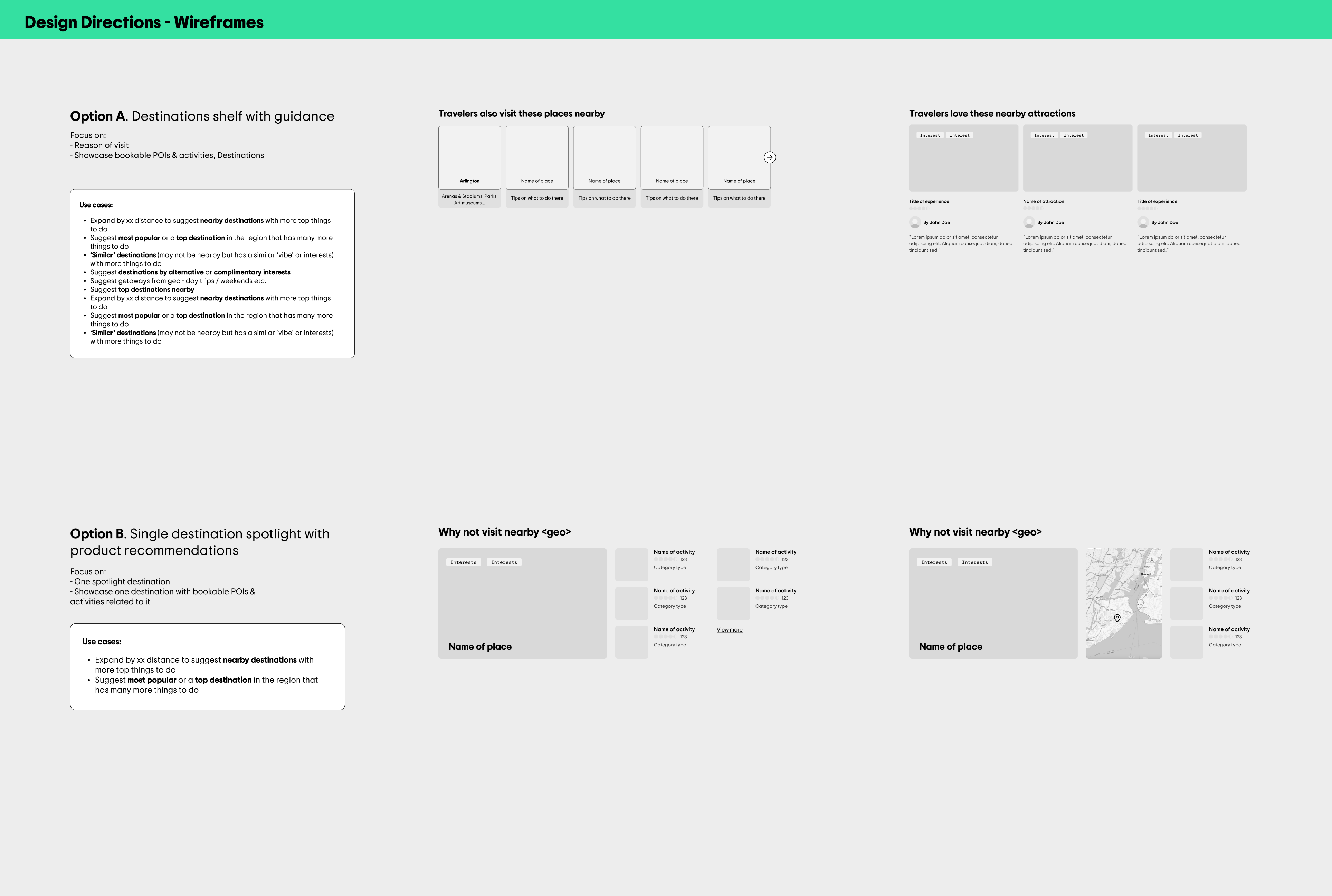
Design direction
Following landscape research and an assessment of technical constraints, I explored multiple design directions with the broader team.
Two primary approaches emerged:
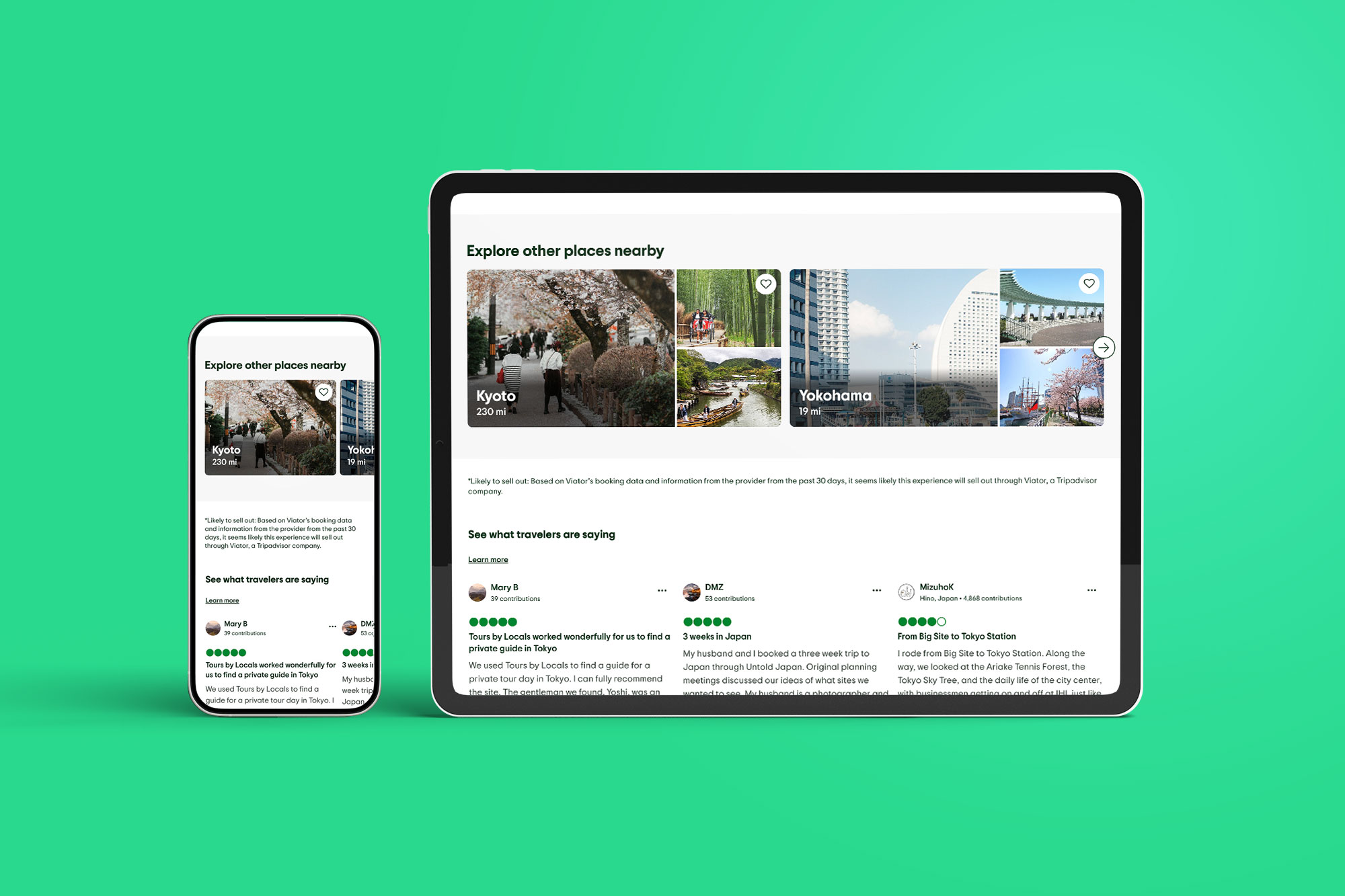
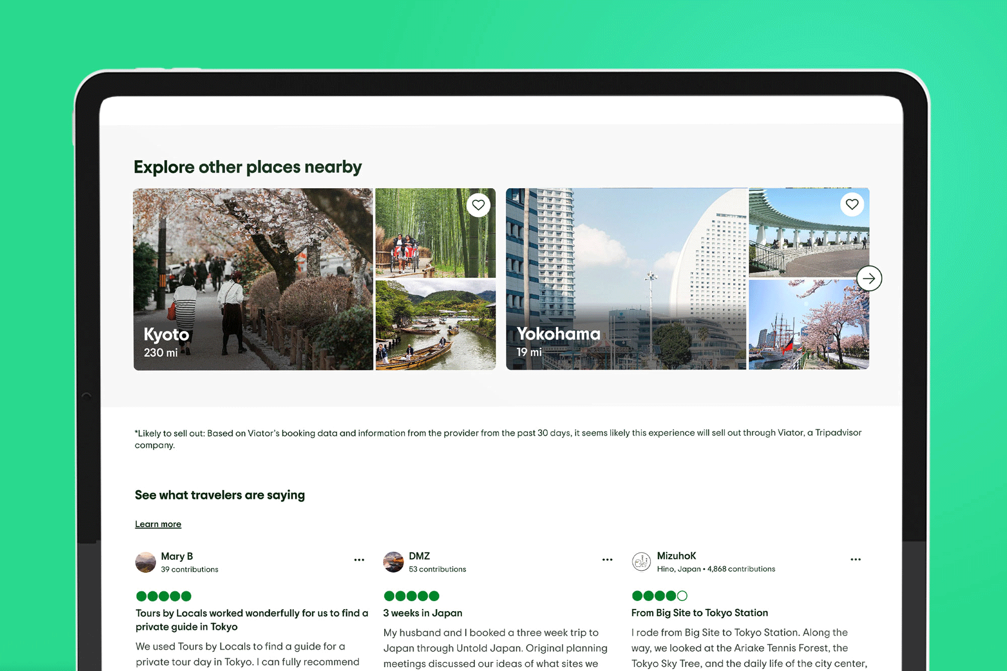
- Multi-destination guidance, surfacing several nearby destinations to encourage broader exploration
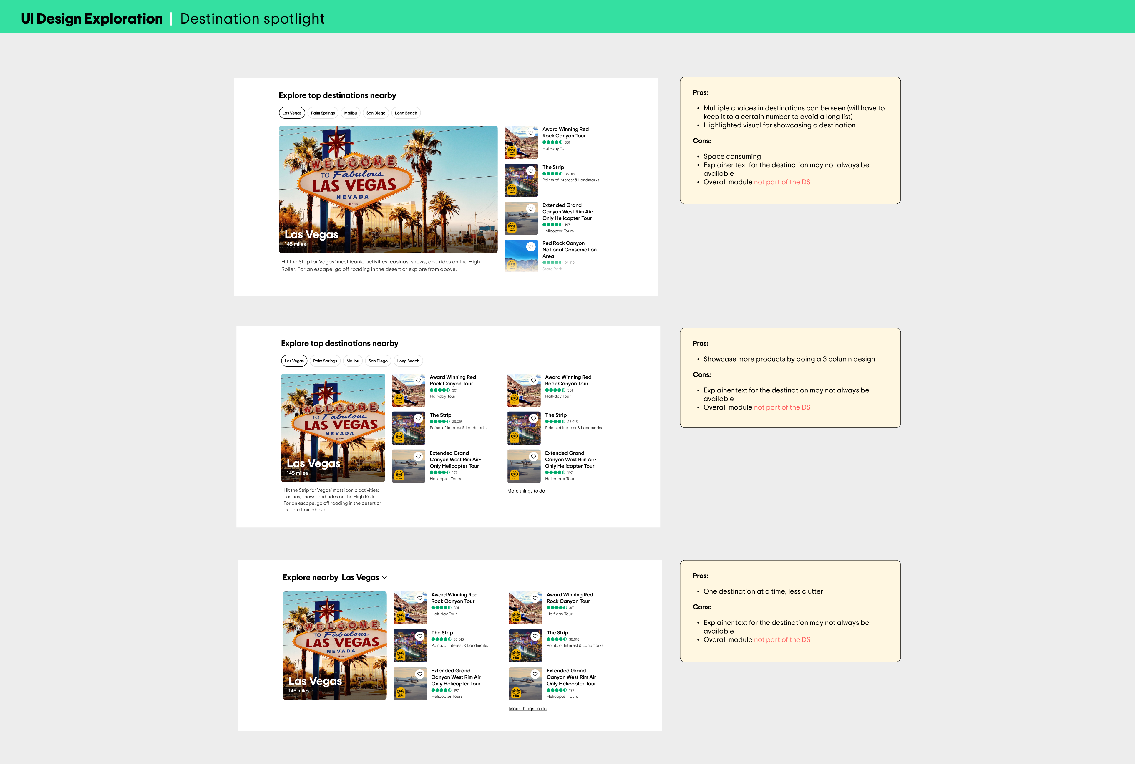
- Single-destination spotlight, highlighting one nearby destination with recommended activities
We moved forward with the multi-destination approach, as it offered greater choice and better supported discovery beyond the anchor geo.
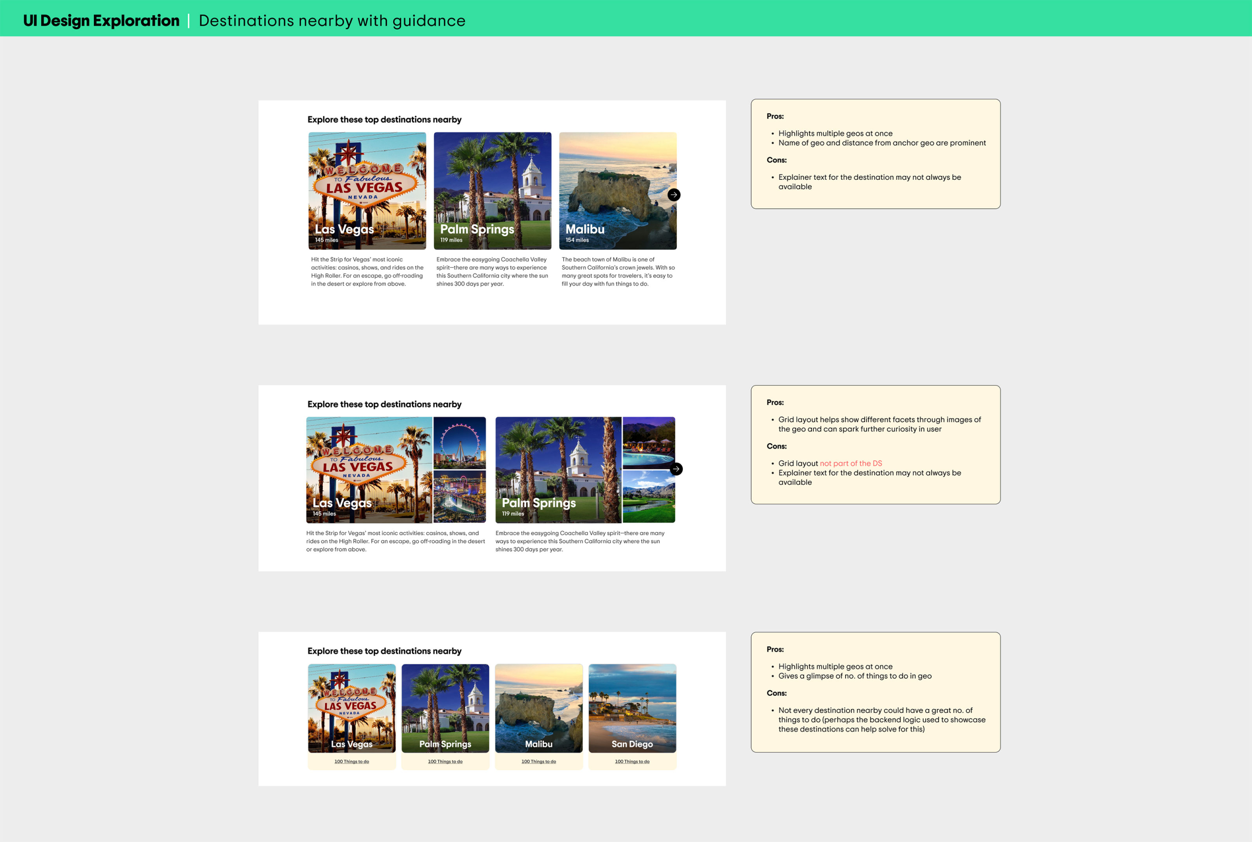
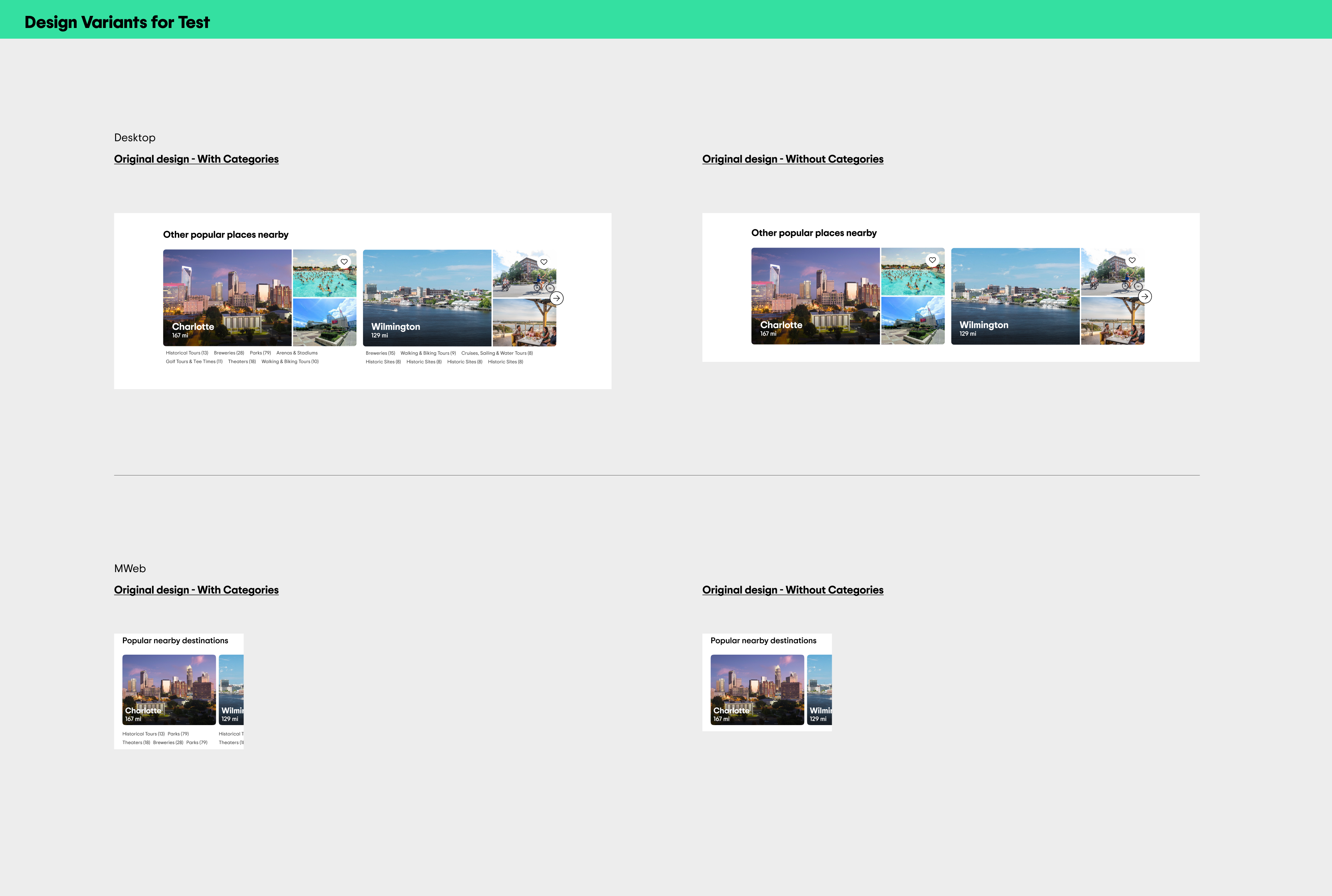
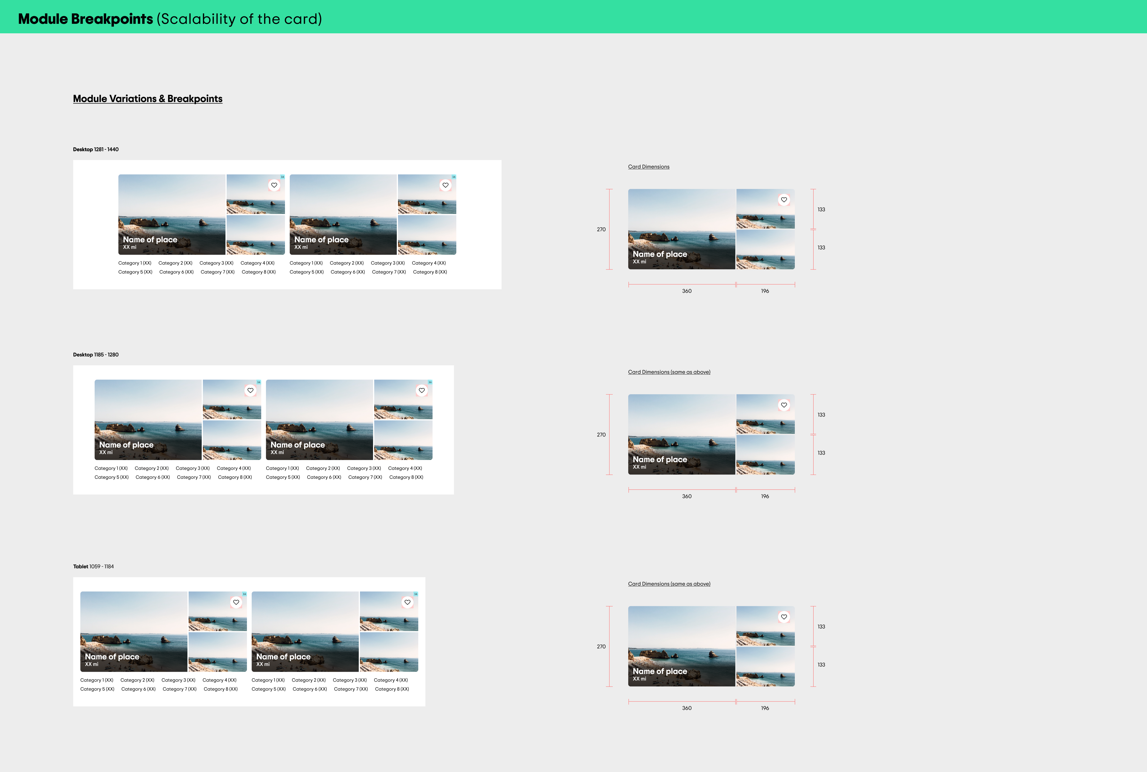
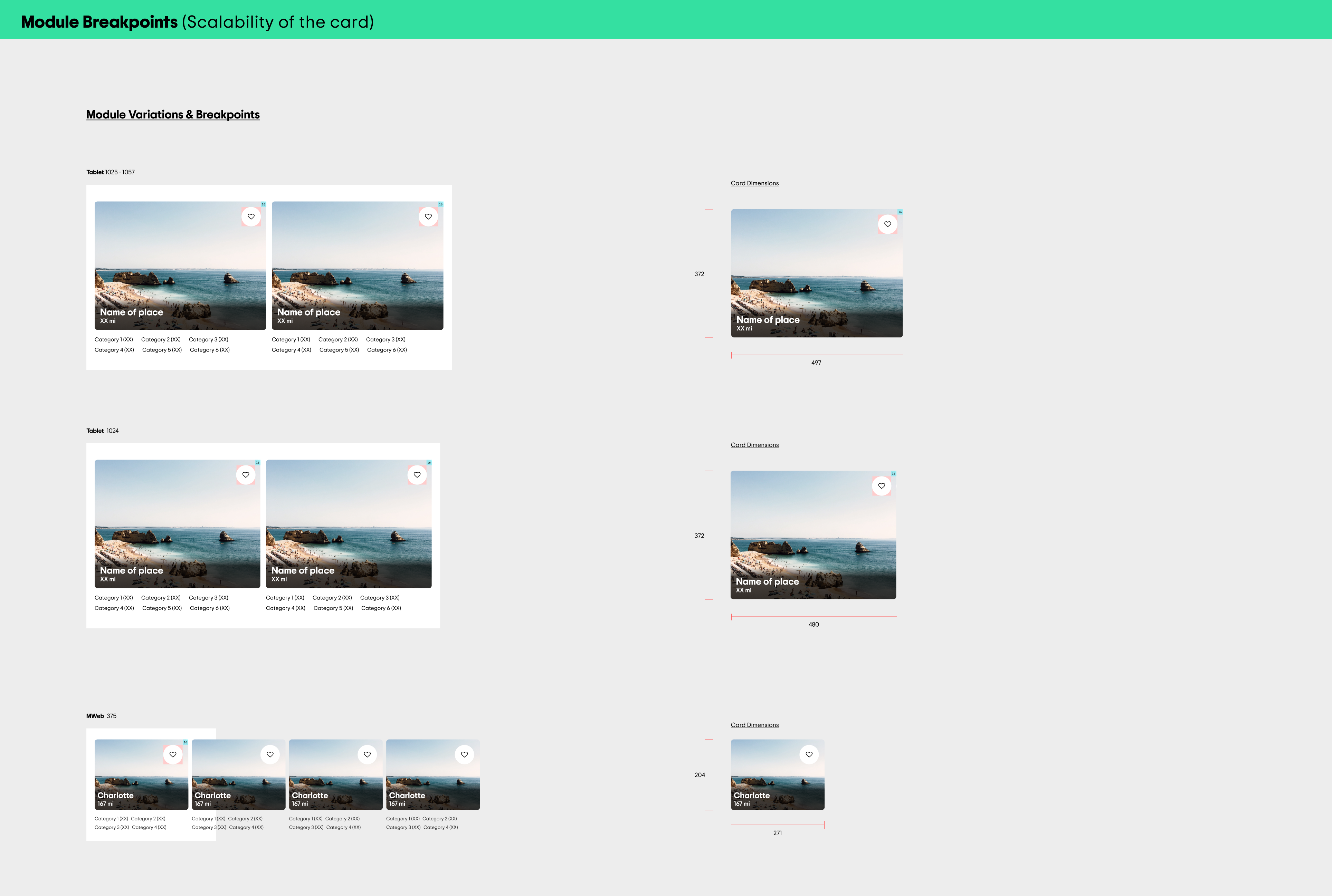
- The final design surfaces 4–6 nearby destinations, each paired with relevant activities powered by a machine learning model.
- To break the visual monotony of long-scroll pages, the module introduced a two-card collage layout, creating a more engaging interruption that encouraged continued exploration.
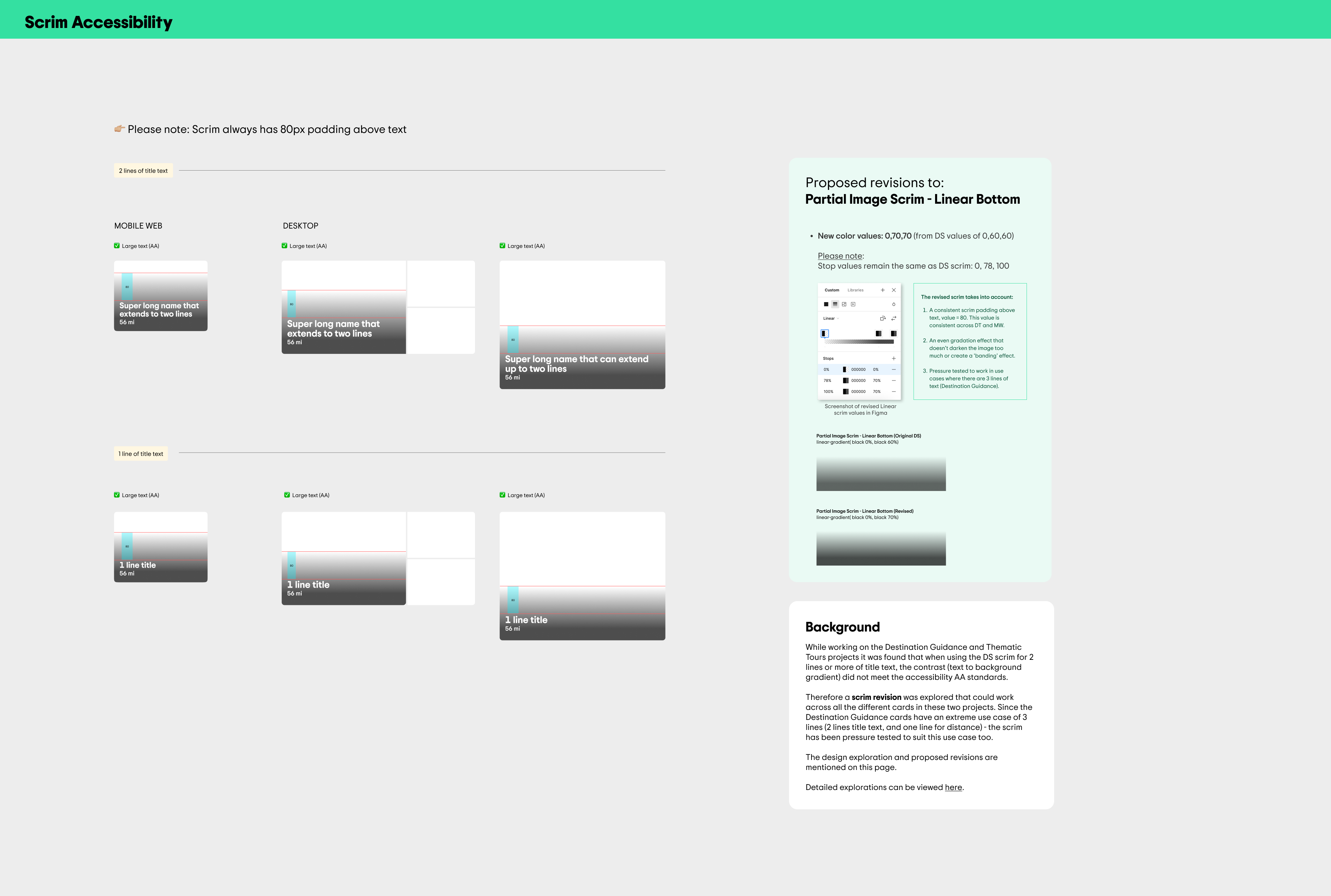
Built from scratch, the module required close collaboration with the Design System team — I proposed updated scrim values that met accessibility standards and were incorporated into the DS for use across multiple contexts.
Results
Following strong performance on content-thin geo pages, the module was expanded across all geo pages. At scale, it enabled continuous nearby discovery and delivered sustained engagement and revenue impact.