Impact
+12% checkout completion rate YoY
$9.1M incremental revenue from shipped work
~$3.1M projected annually from experiments in flight
A two-sided challenge
Checkout is a pivotal step in turning intent into purchase. Tripadvisor Experiences powers 300,000+ products for 900M+ users, making checkout performance critical to bookings and revenue.
The existing multi-step checkout, built on a legacy platform, introduced friction at both the user and system levels:
- High abandonment: Multi-step pages frustrated users
- Difficult corrections: Going back risked losing data
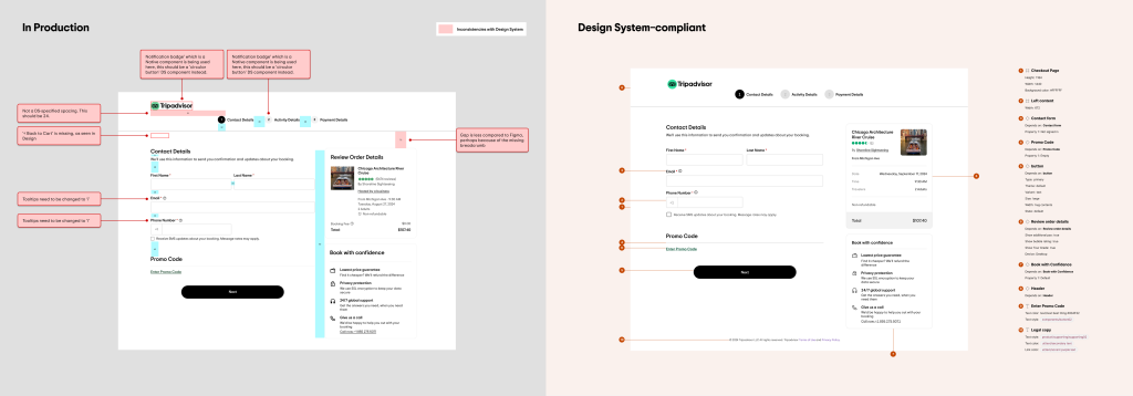
- Inconsistent UI: Legacy components created uneven experiences
- Slow iteration: Non–Design-System components made updates harder
My Role
I led the checkout redesign and optimisation efforts as an IC, partnering closely with Product and Engineering to shape the experience and support the Design-System replatform.
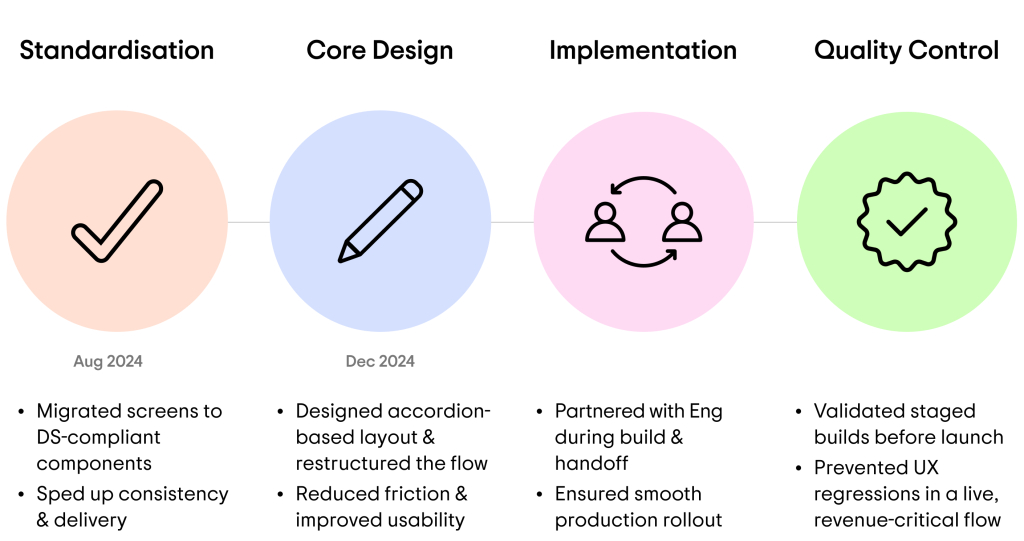
Reducing risk before reducing friction
The checkout transformation began with a replatform to Design-System–compliant components — reducing development turnaround time by ~50% and establishing a stable foundation for safer, faster experimentation across a revenue-critical flow.
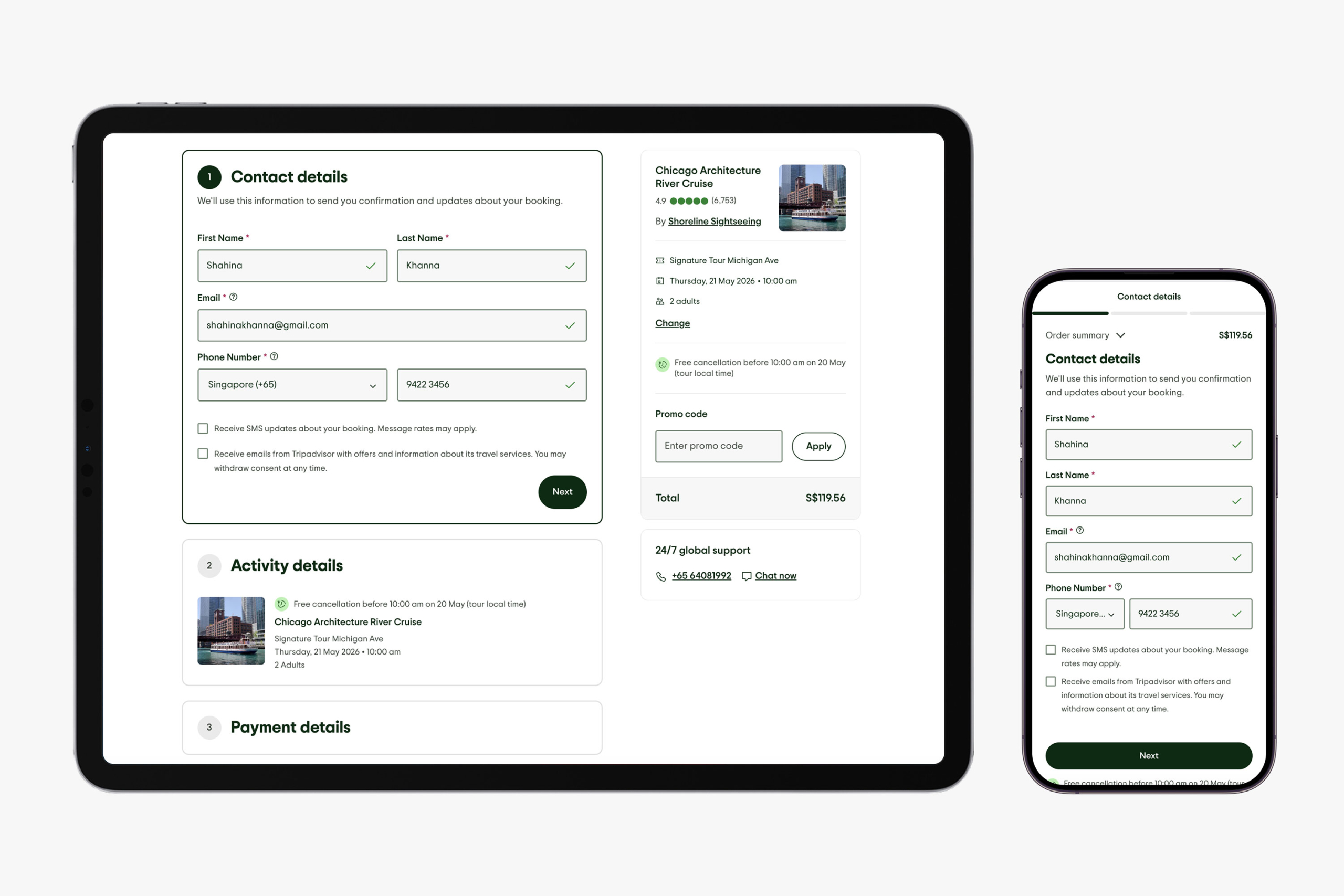
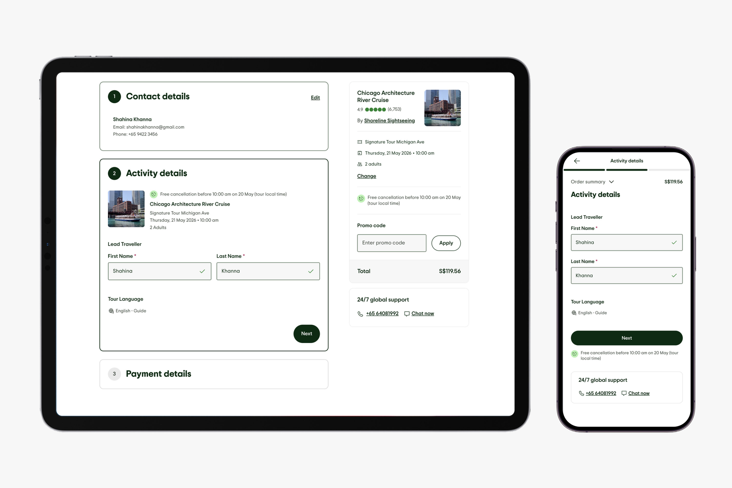
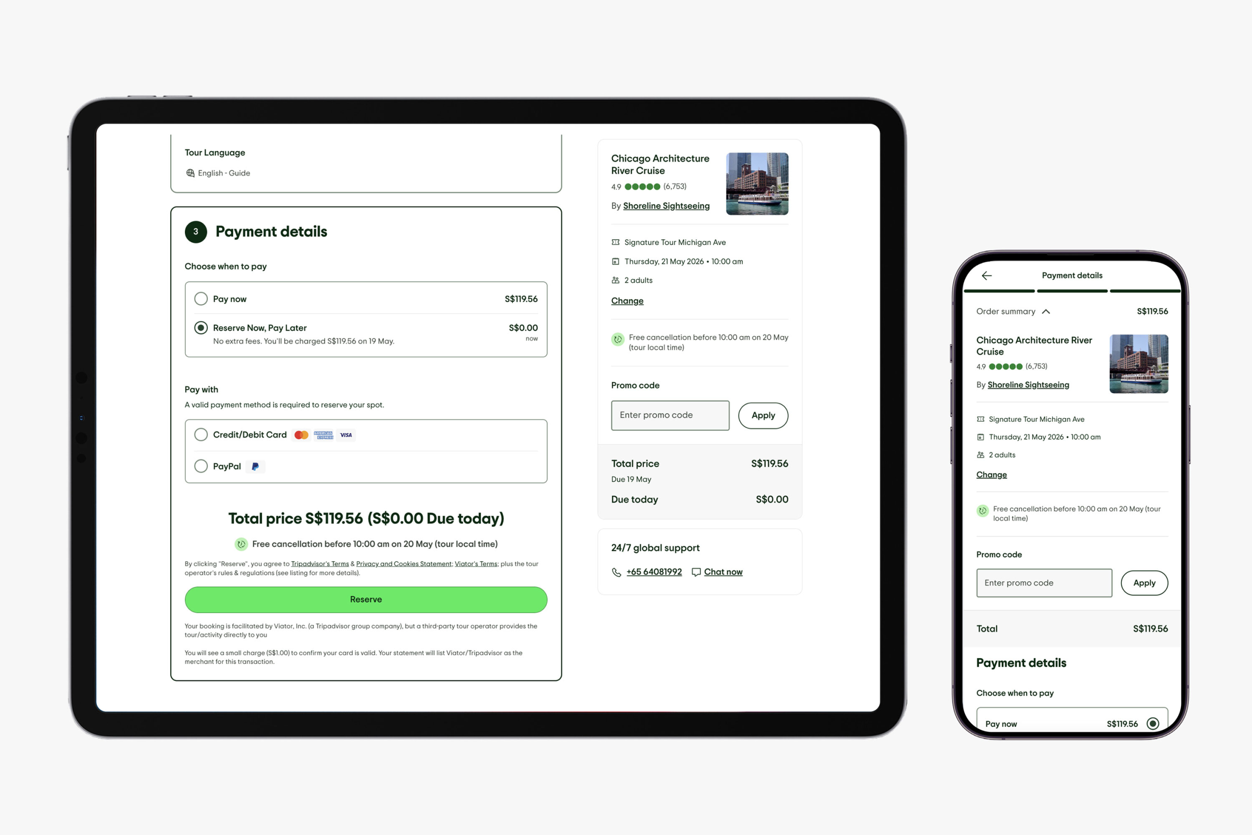
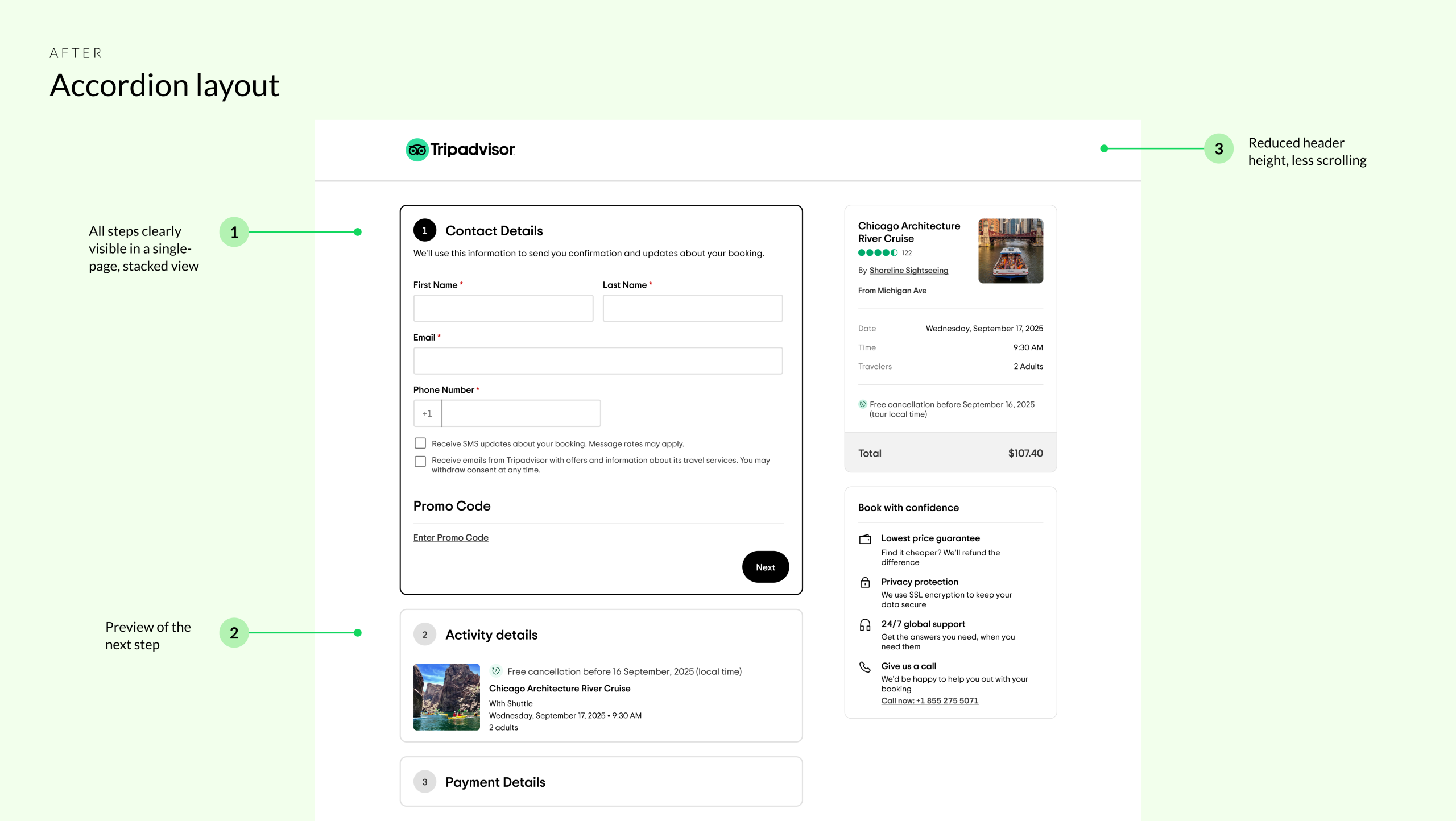
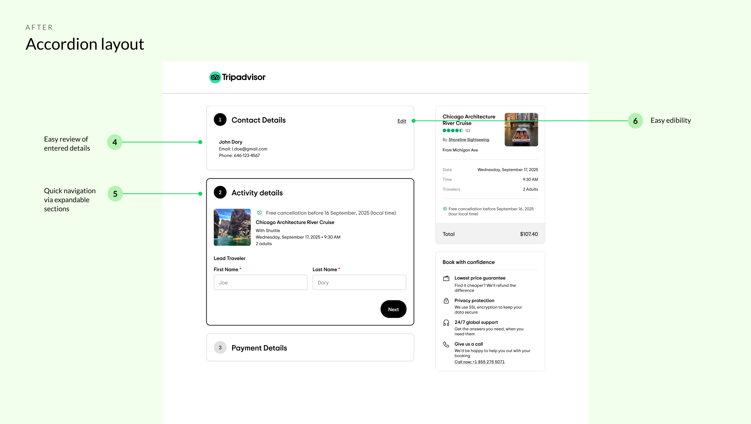
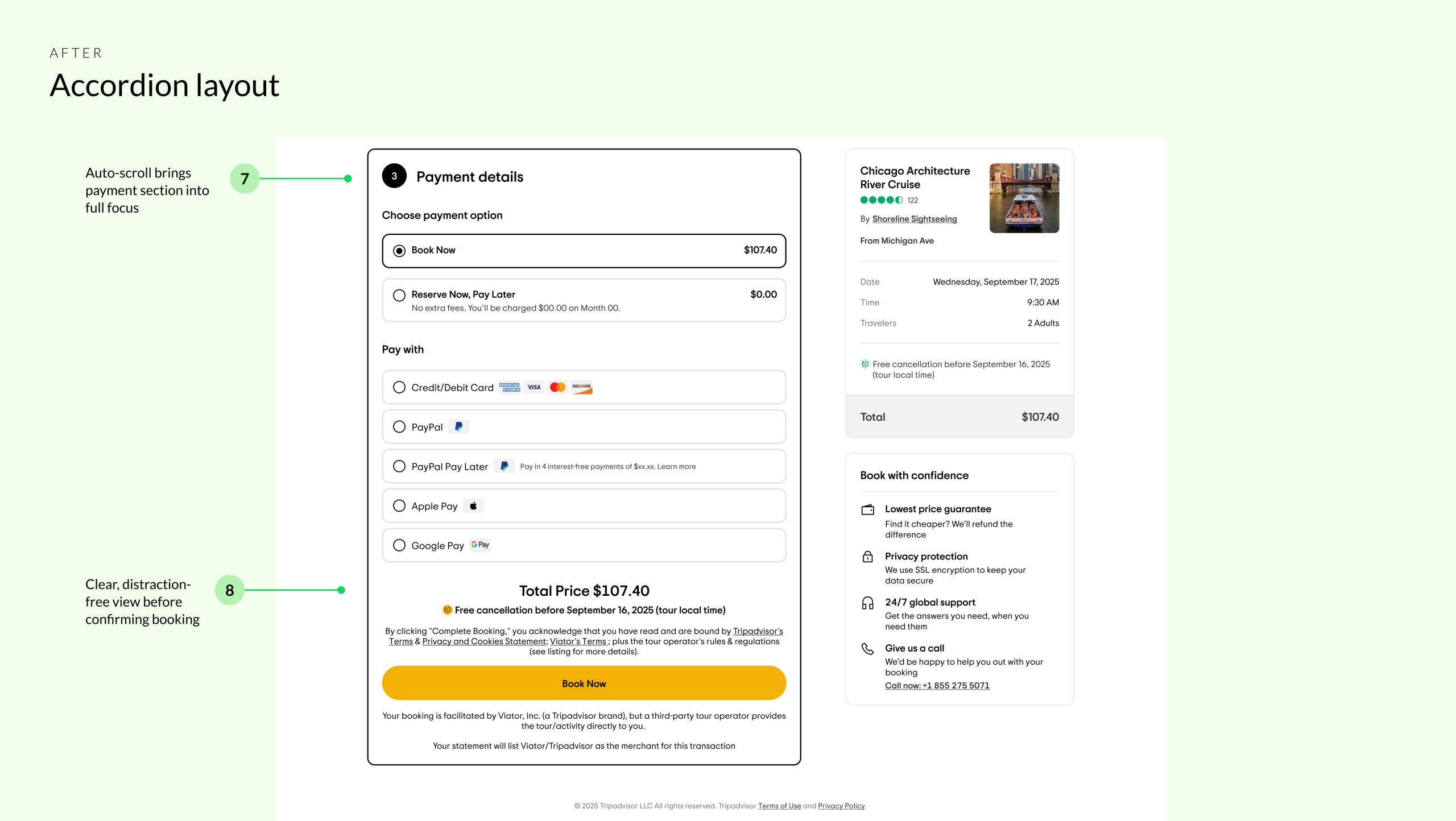
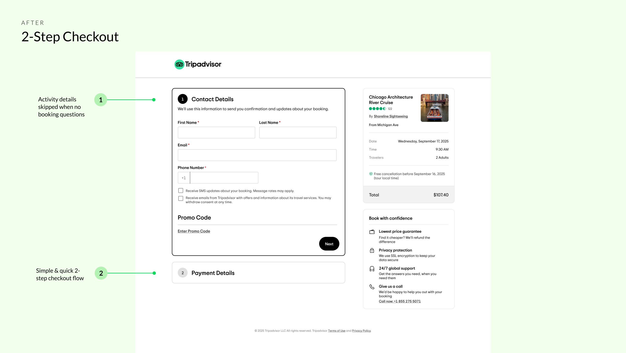
From multi-step to accordion
With this foundation in place, we revisited the existing three-step, multi-page checkout. While functional, the flow introduced unnecessary friction that made the experience feel more cumbersome than necessary.
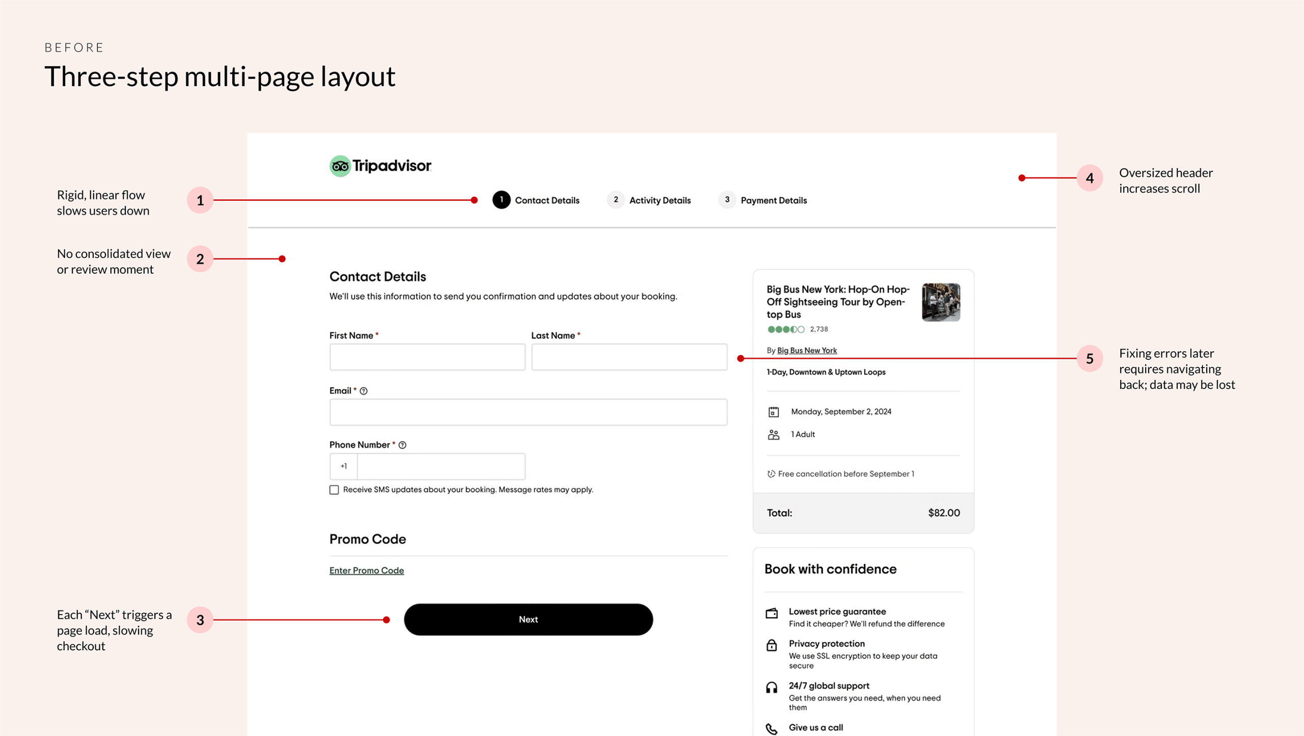
Collectively, these limitations reduced momentum and confidence at high-intent moments, leading us to explore a simpler, single-page accordion layout.
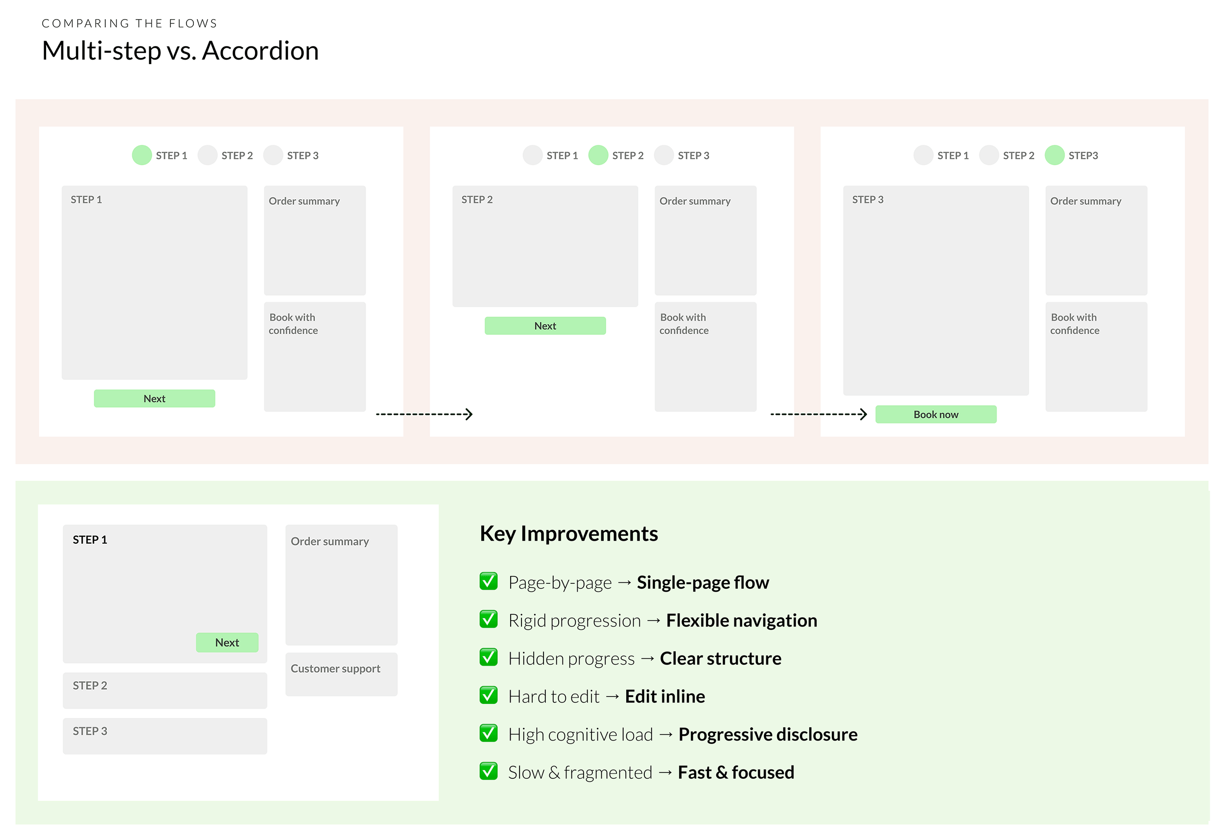
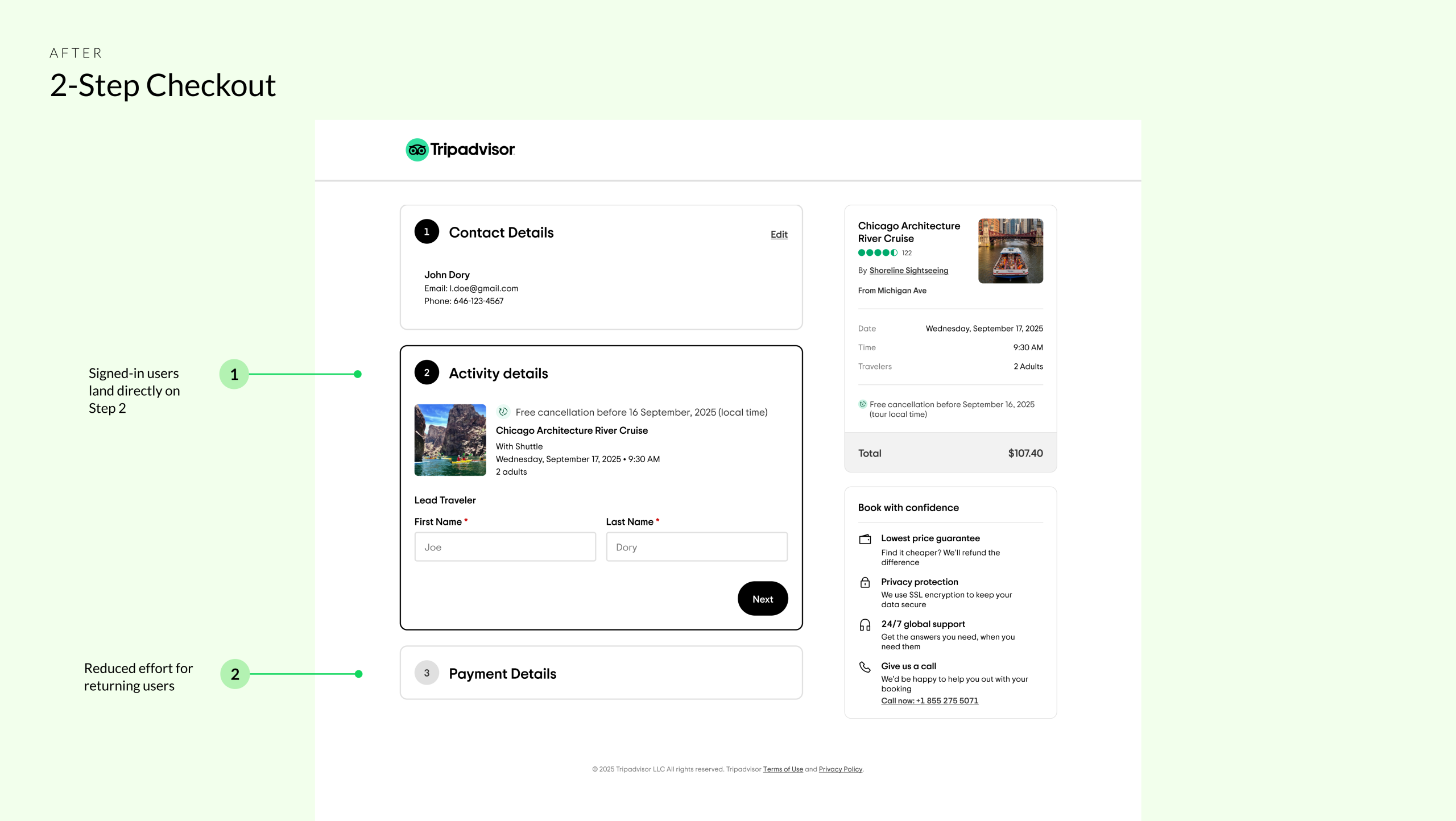
We focused on Desktop first, where a higher share of users are signed in. This allowed us to skip the contact details step for authenticated users, directly reducing time to complete checkout and validating the new layout in a more controlled, data-rich environment.
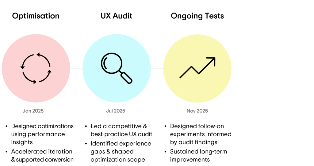
What we tested next
We ran targeted optimisations to further streamline checkout and improve conversion, including the examples below.
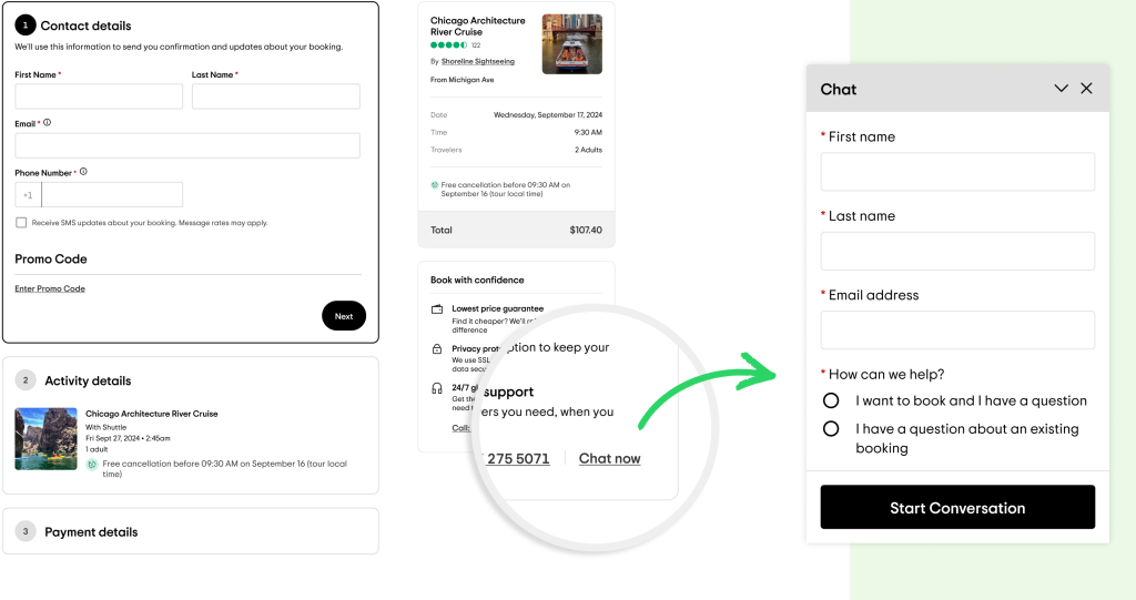
1. In-Checkout Live Support
Users left checkout to seek clarification at high-intent moments. We added Salesforce-powered live chat to product detail and checkout pages — real-time support without disrupting the flow. +0.87% conversion lift · ~$3.1M annualised incremental revenue
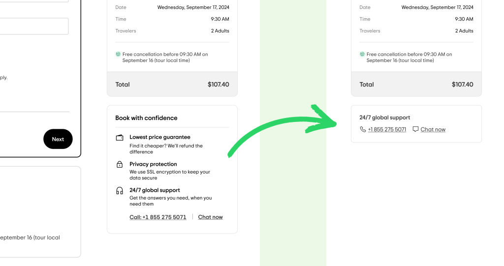
2. Simplify “Book with Confidence” Module
The module added visual clutter by calling out trust signals users increasingly expect by default. We streamlined it to a single high-value reassurance — 24/7 global support — giving greater prominence to live chat. Improved visual clarity without negatively impacting conversion or revenue.
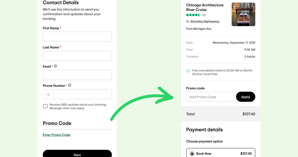
3. Promo code placement
Early placement introduced distraction ahead of a critical commitment point. After testing multiple positions, we moved it to the order summary — visible without interrupting checkout on desktop and mobile. +1.71% conversion · +2.41% net revenue · +1.94% progression to payment
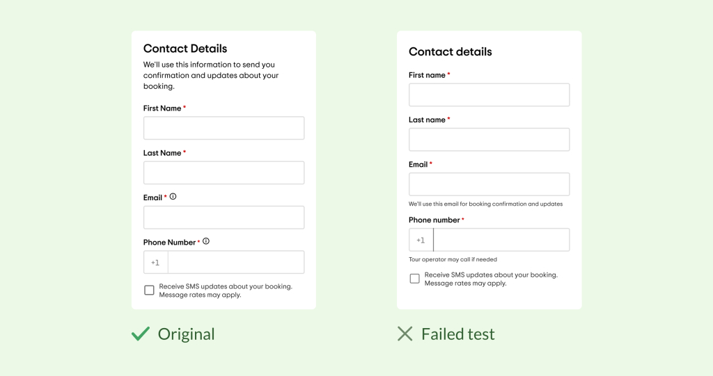
4. When hypotheses don’t lift
We surfaced trust messaging directly under the contact fields — visible and upfront rather than hidden behind tooltips. Hypothesis: explicit reassurance would reduce anxiety and improve completion. Flat across all metrics. Not shipped. At the first step, momentum matters more than explanation, flow clarity builds trust better than assistive text.
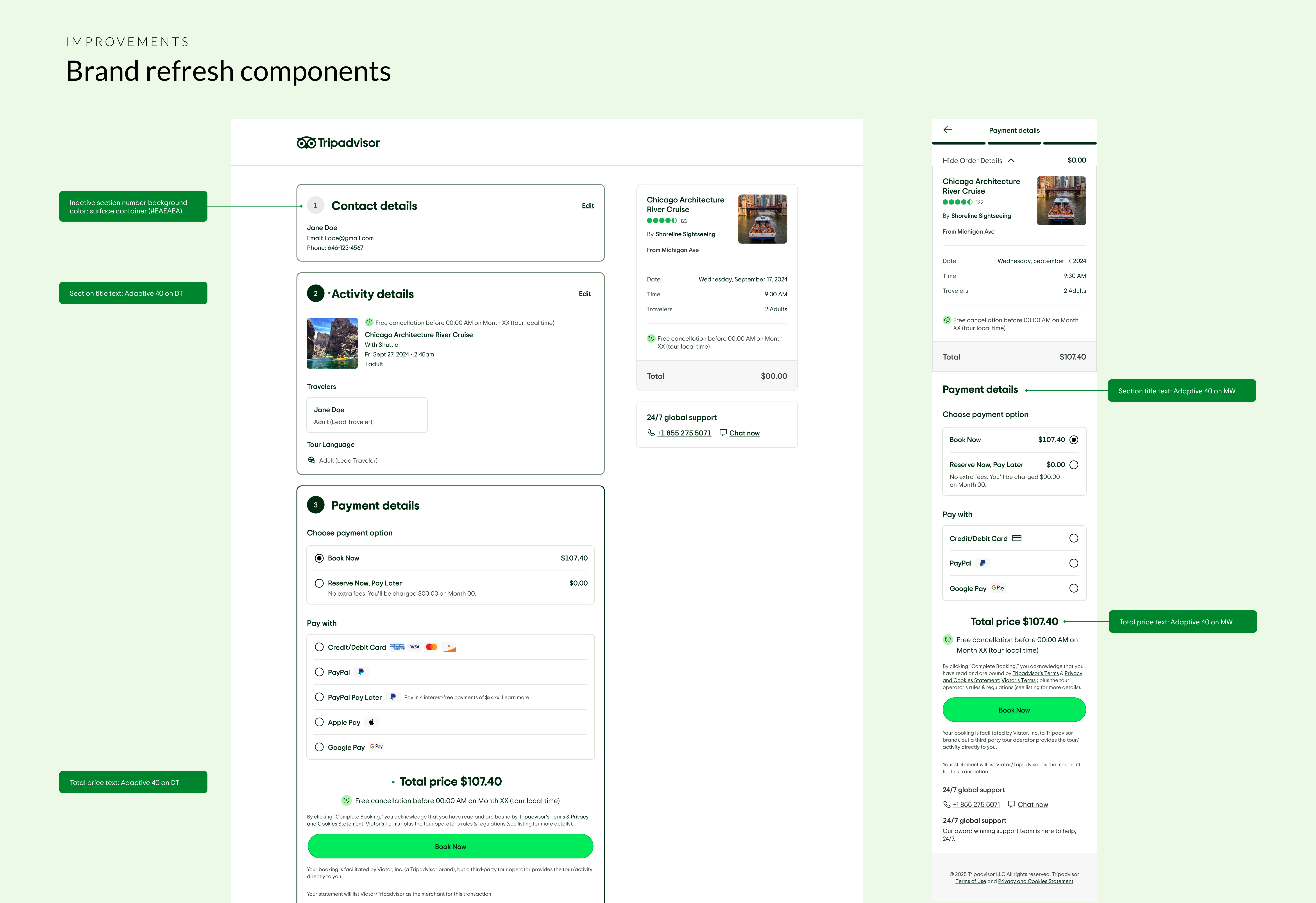
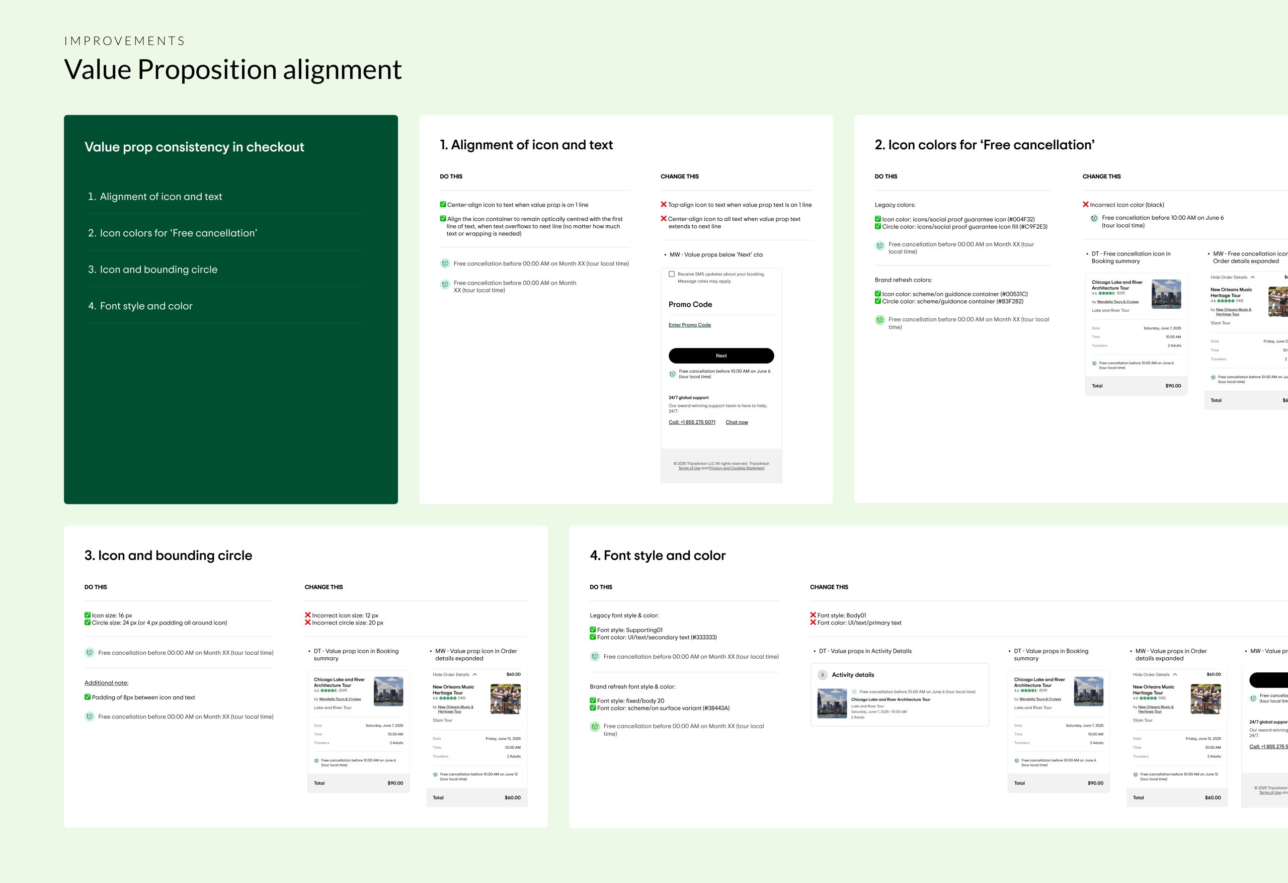
Driving consistency at scale
A subsequent brand refresh required transitioning legacy checkout components to the refreshed Design System. I led efforts to standardise inconsistencies in value proposition presentation — reinforcing visual consistency and trust across checkout.
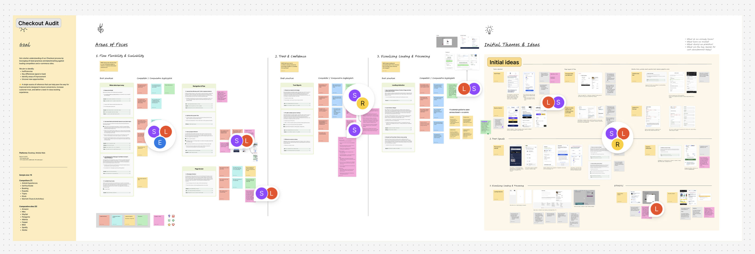
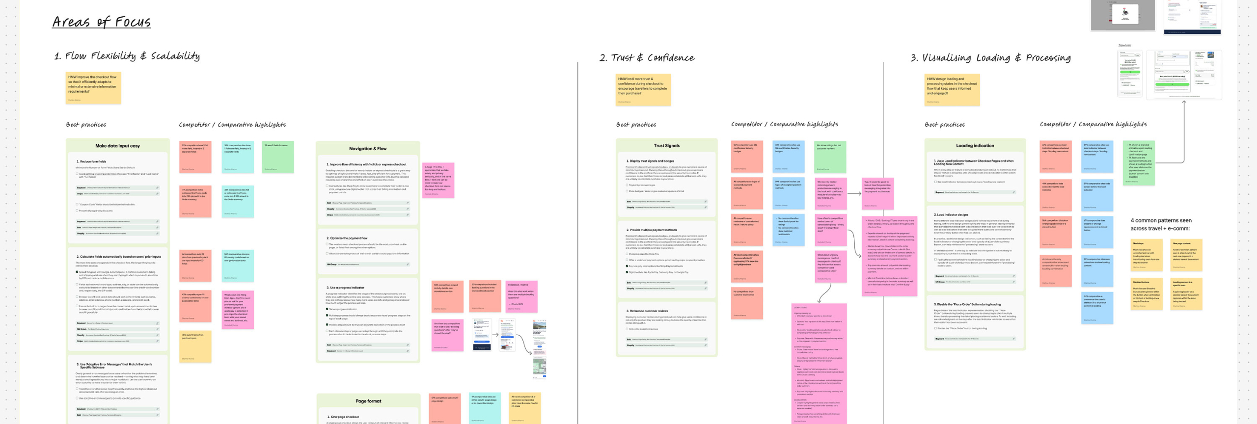
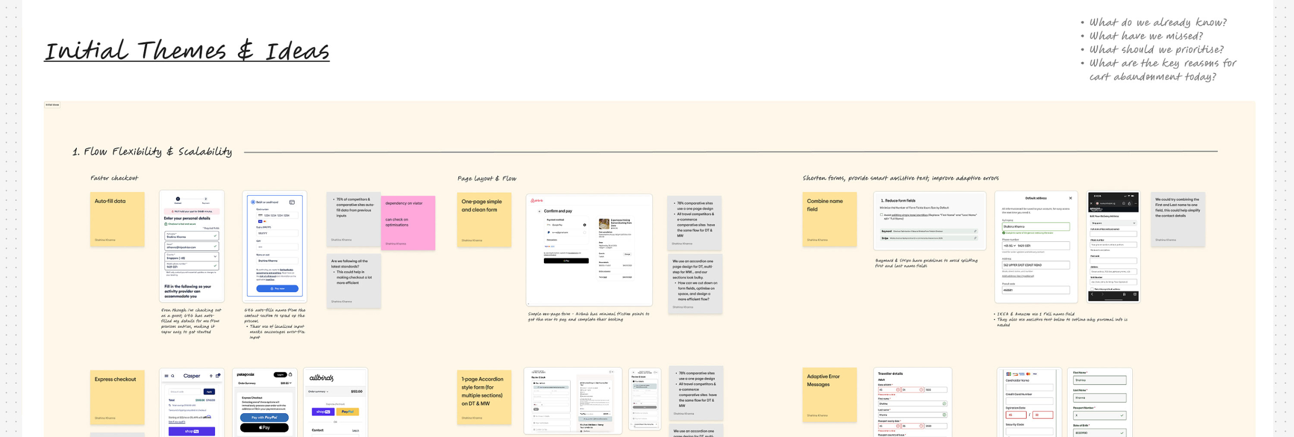
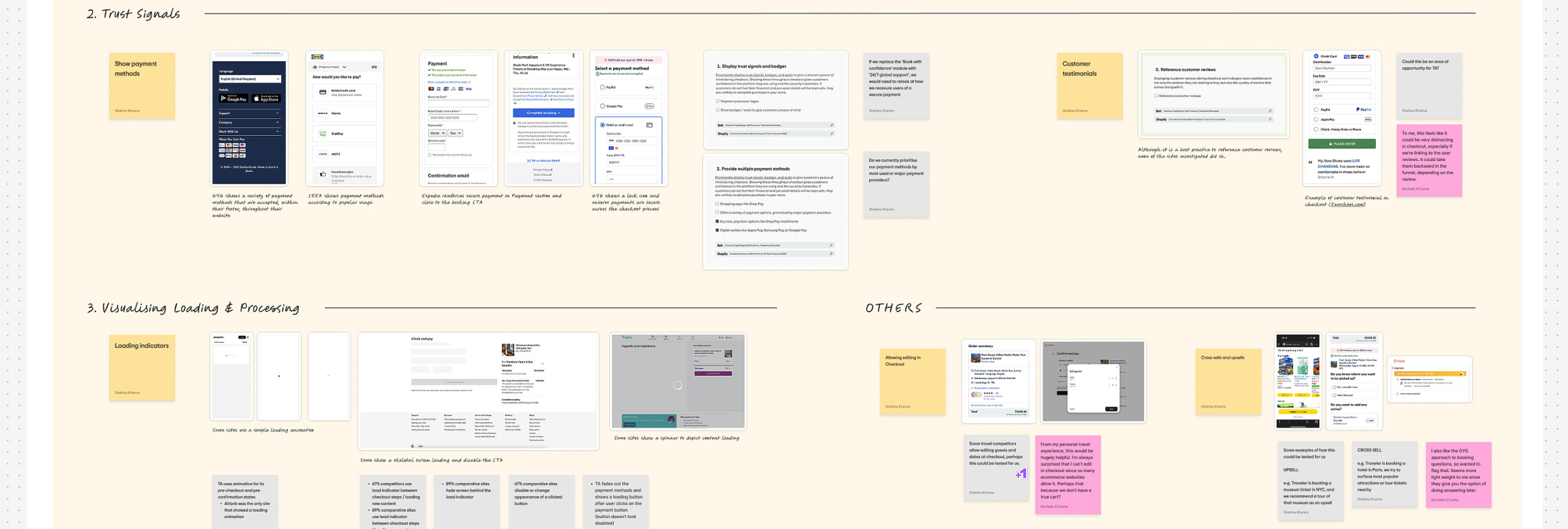
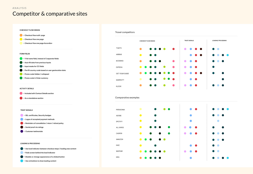
Stepping back: an end-to-end audit
As the accordion checkout and early optimisations shipped, I led a UX audit across 16 competitor and best-in-class experiences to identify systemic opportunities to improve usability, trust, and scalability.
The audit surfaced four high-impact opportunities that directly shaped what we prioritised next.
Opportunities discovered:
- Phone number UX simplification
- Partial loading to improve perceived speed
- Editable booking details
- Estimated rewards messaging.
This shift from isolated fixes to a more cohesive, system-level approach informed prioritisation and roadmap planning with leadership.