Overview
Tripadvisor’s Vacation Rentals business transitioned to operate as a full meta provider, making Holiday Lettings the default booking experience for Tripadvisor’s owned inventory. This shift heightened the importance of trust and clarity at the point of booking — the existing flow had a 29% exit rate, a 50% increase in dropped sessions, and ~20% of customers unable to complete bookings due to errors or incorrect details. Improving it was critical, while staying true to its existing brand and design language.
My Role
I led design and research in close partnership with the Product Manager, collaborating with a User Researcher, Copywriter, and Design Manager.
How we tested
Using data insights, competitor analysis, and design critiques, we formed hypotheses and validated them through 8 remote moderated sessions across desktop and mobile with US and UK participants.
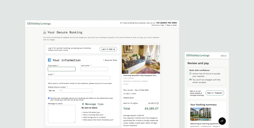
The existing flow — cluttered, lengthy, and losing users
The original booking page was visually inconsistent within the Holiday Lettings experience. Limited clarity around pricing and payment increased the risk of user error, frustration, and drop-off.
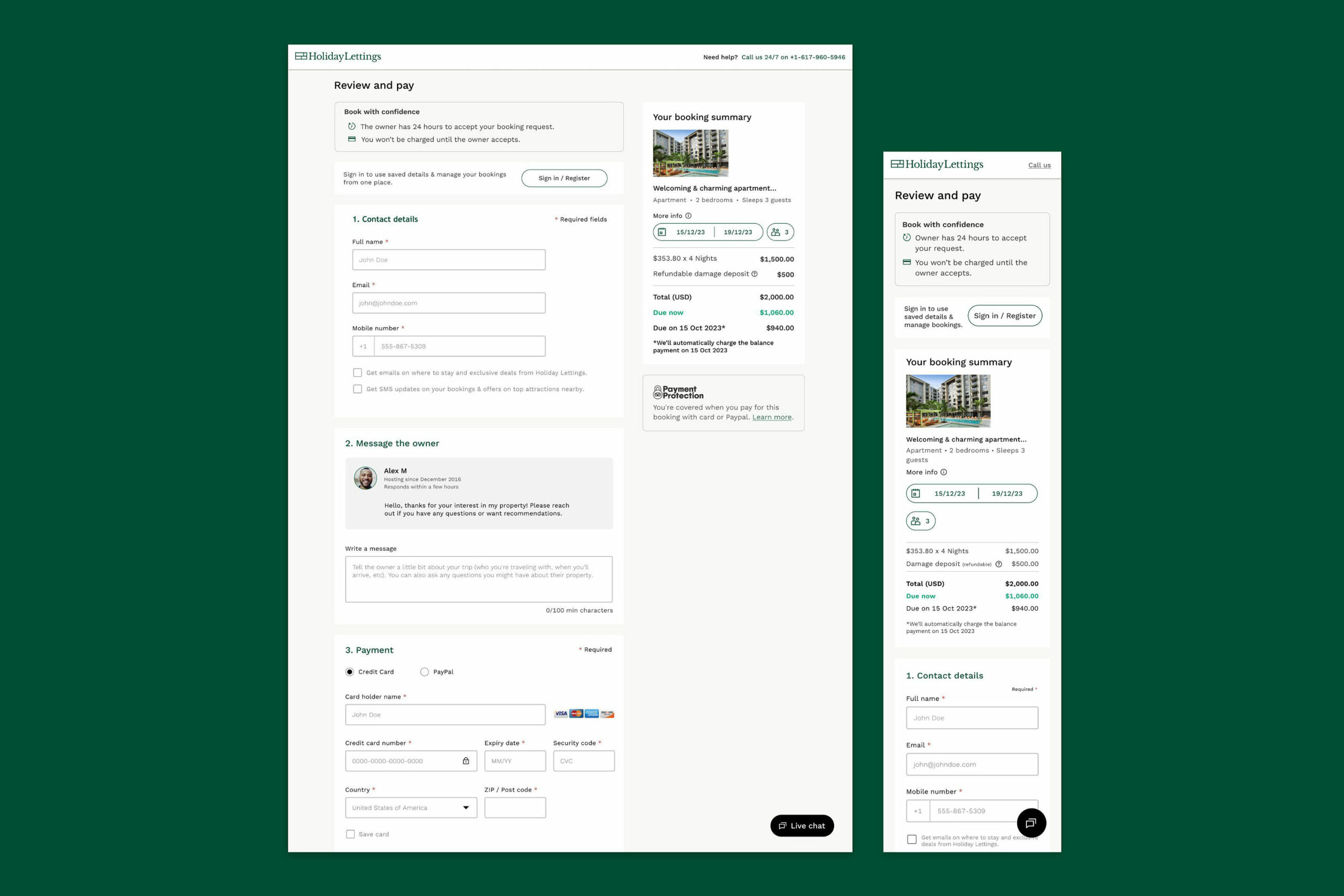
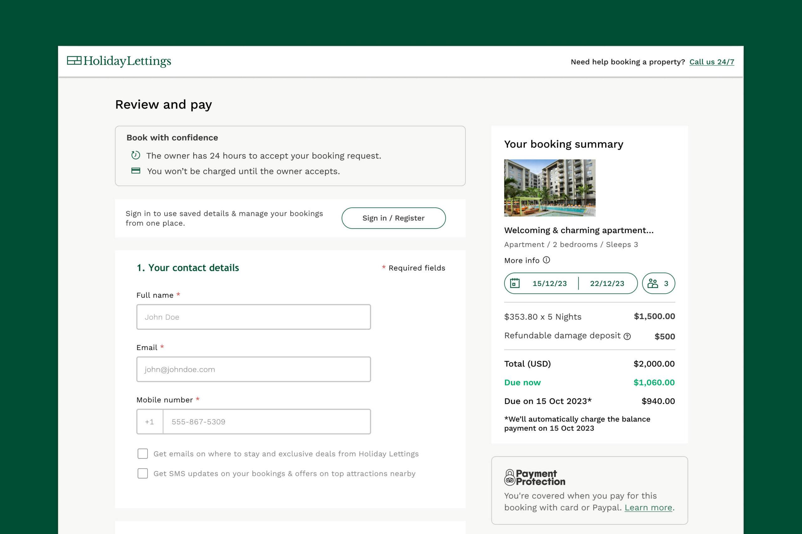
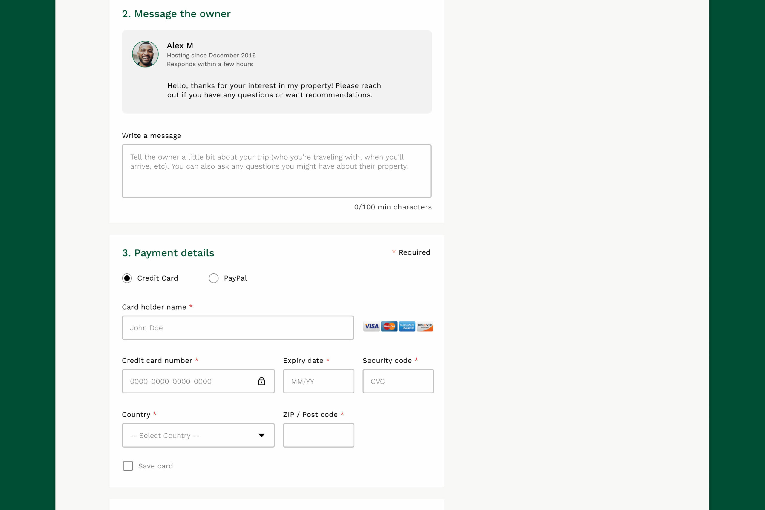
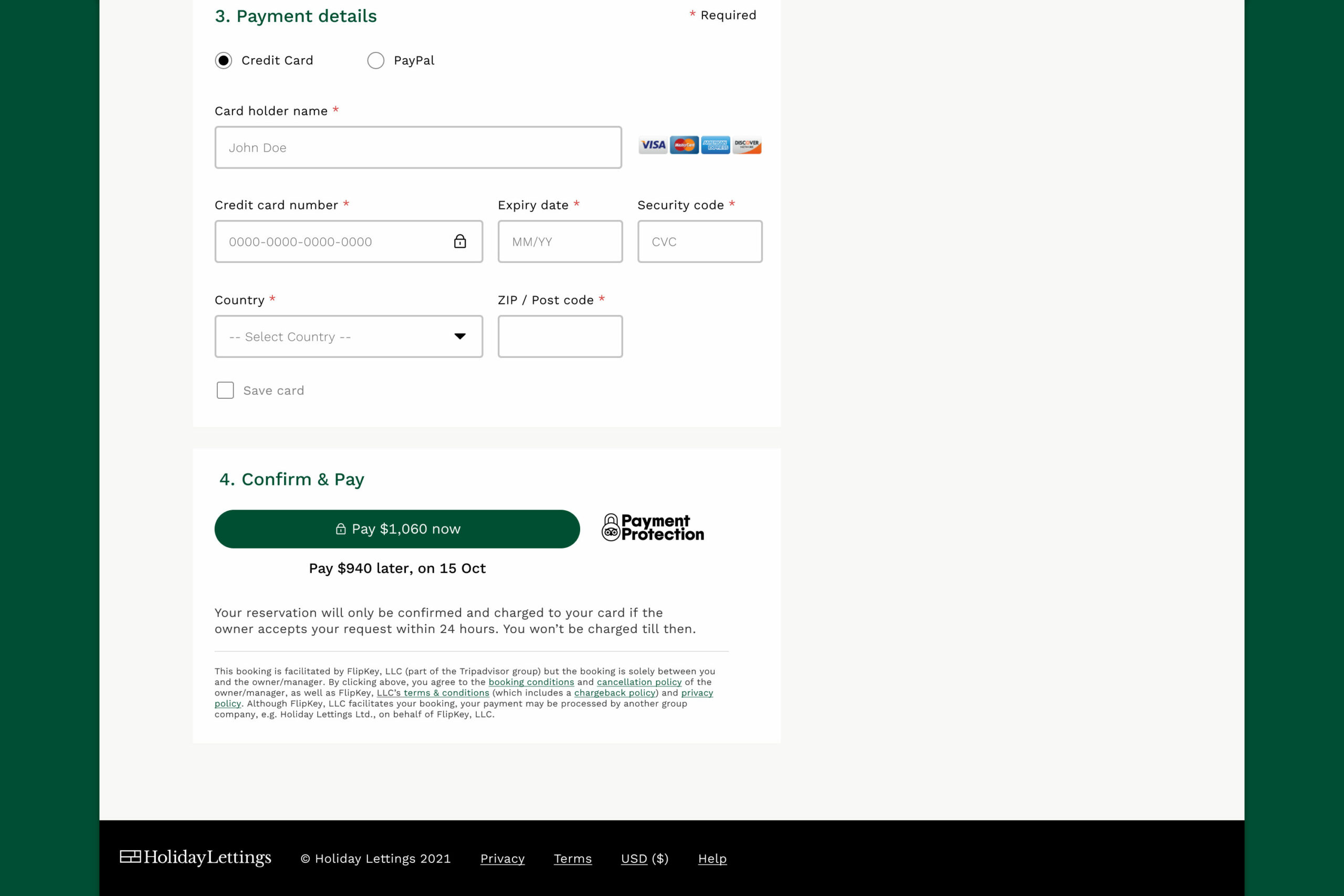
Direction 1: Everything visible, upfront
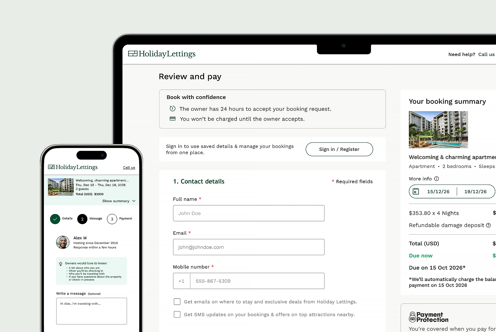
A clean, concise single-page form focused on transparency and upfront visibility of key booking details.
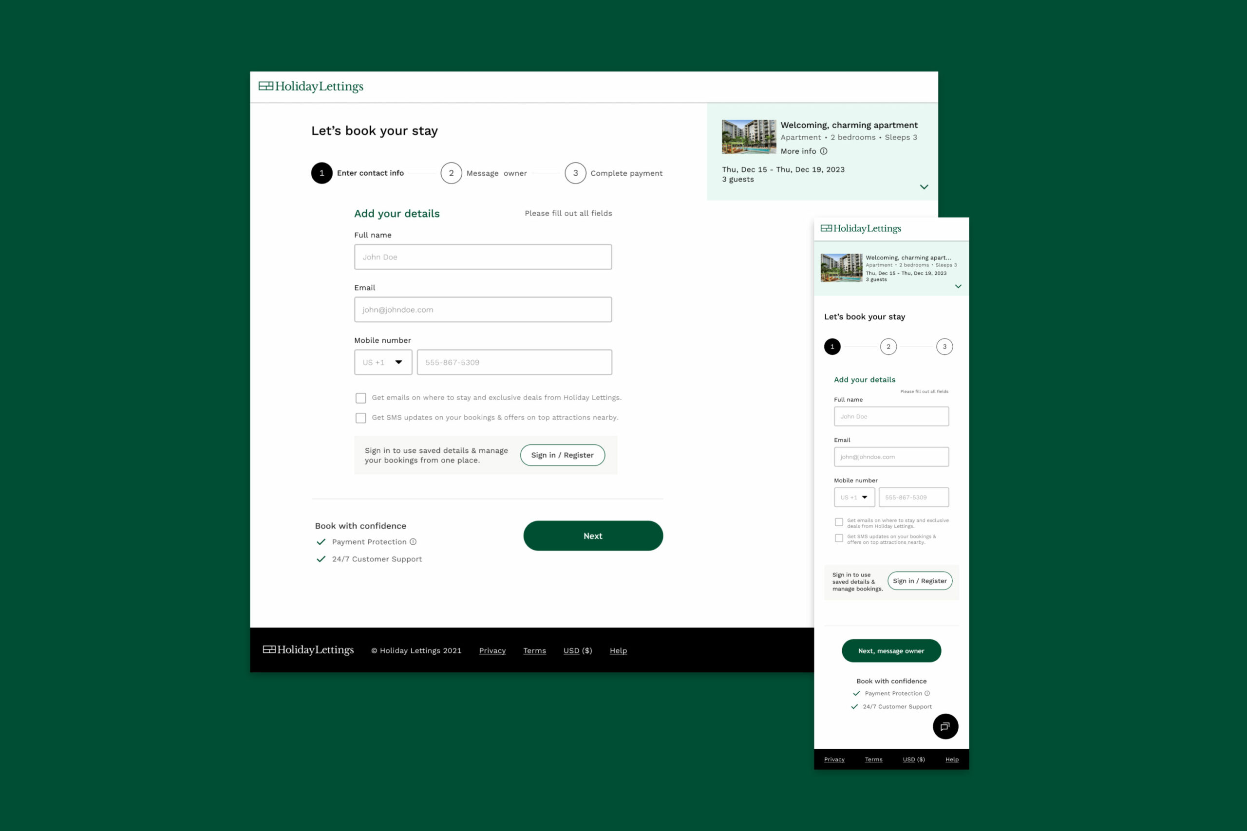
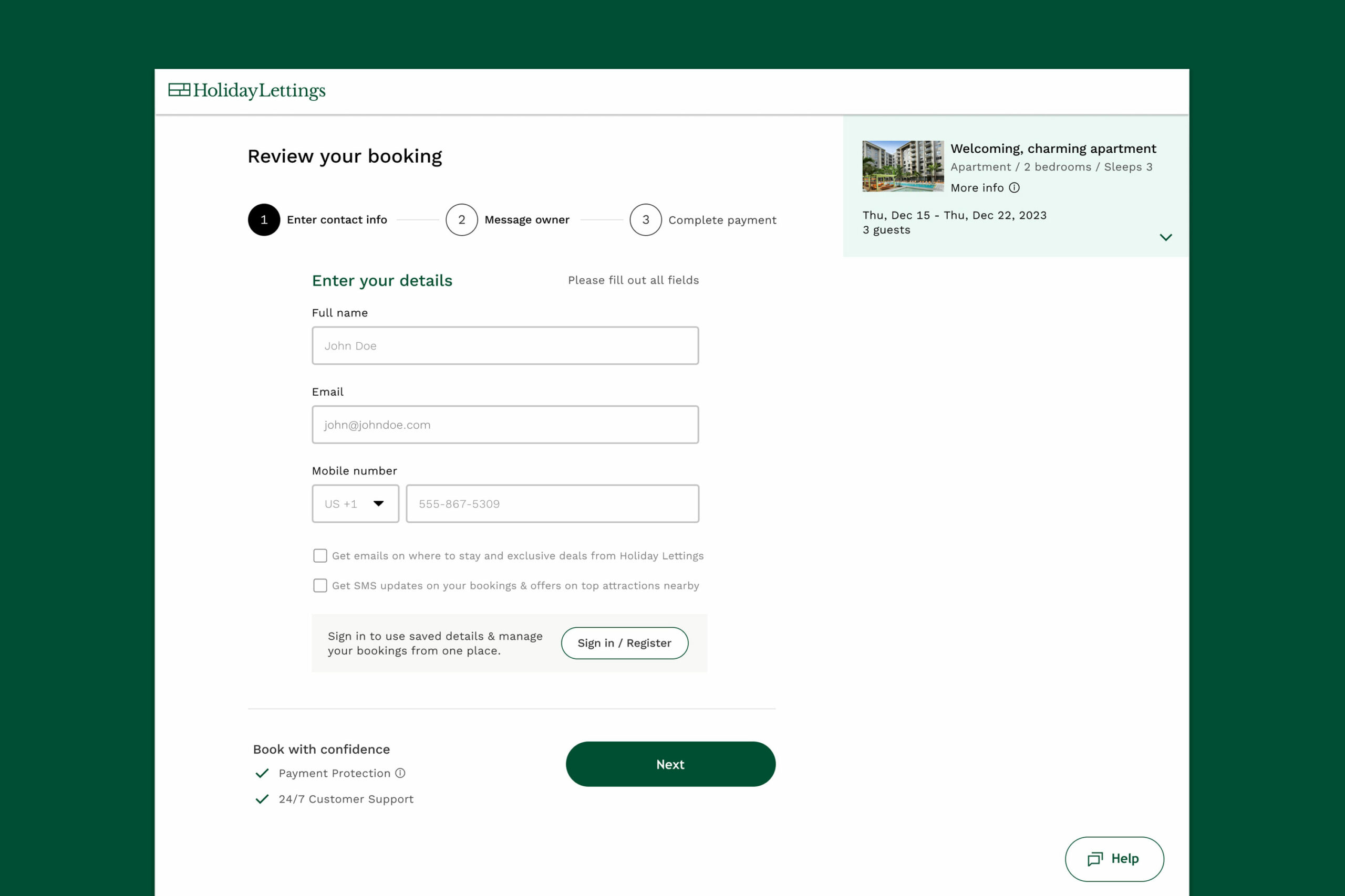
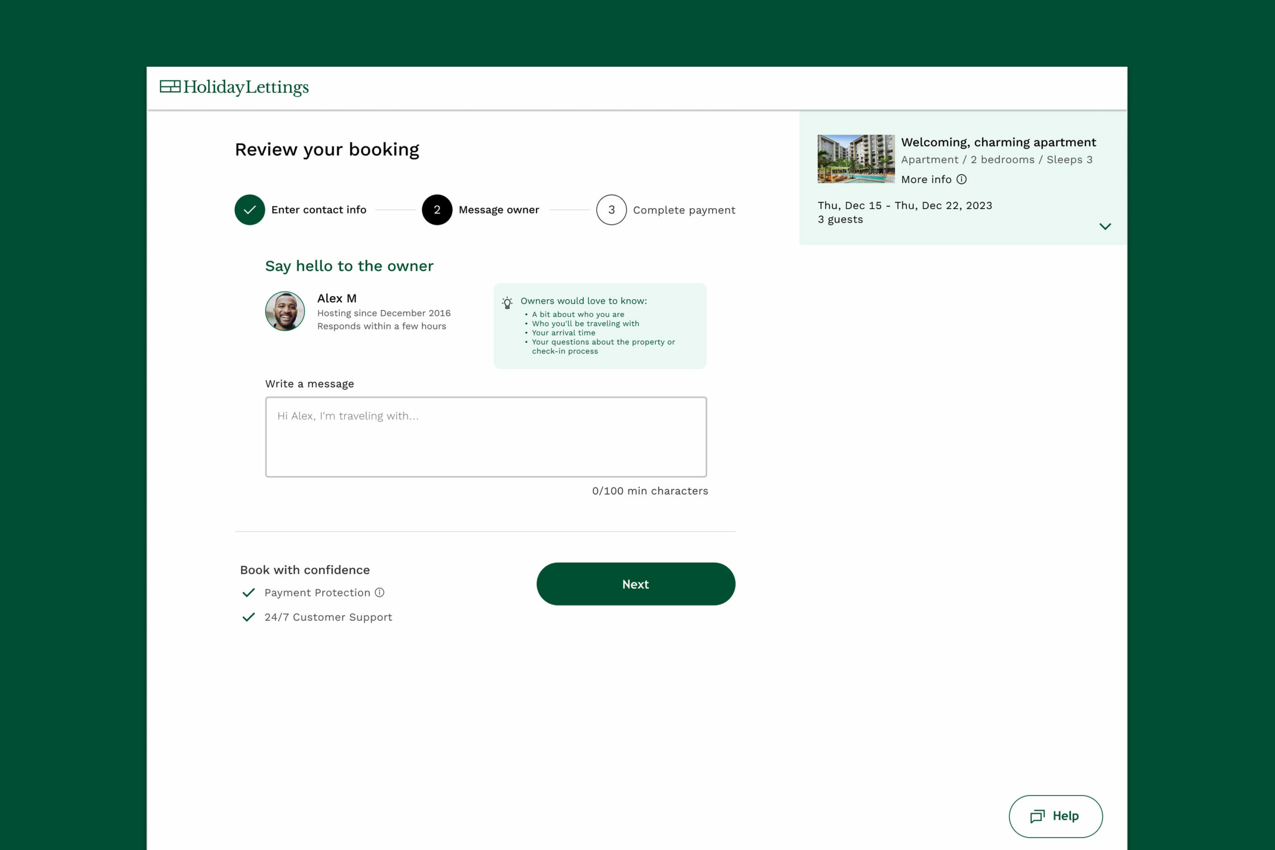
Direction 2: One step at a time
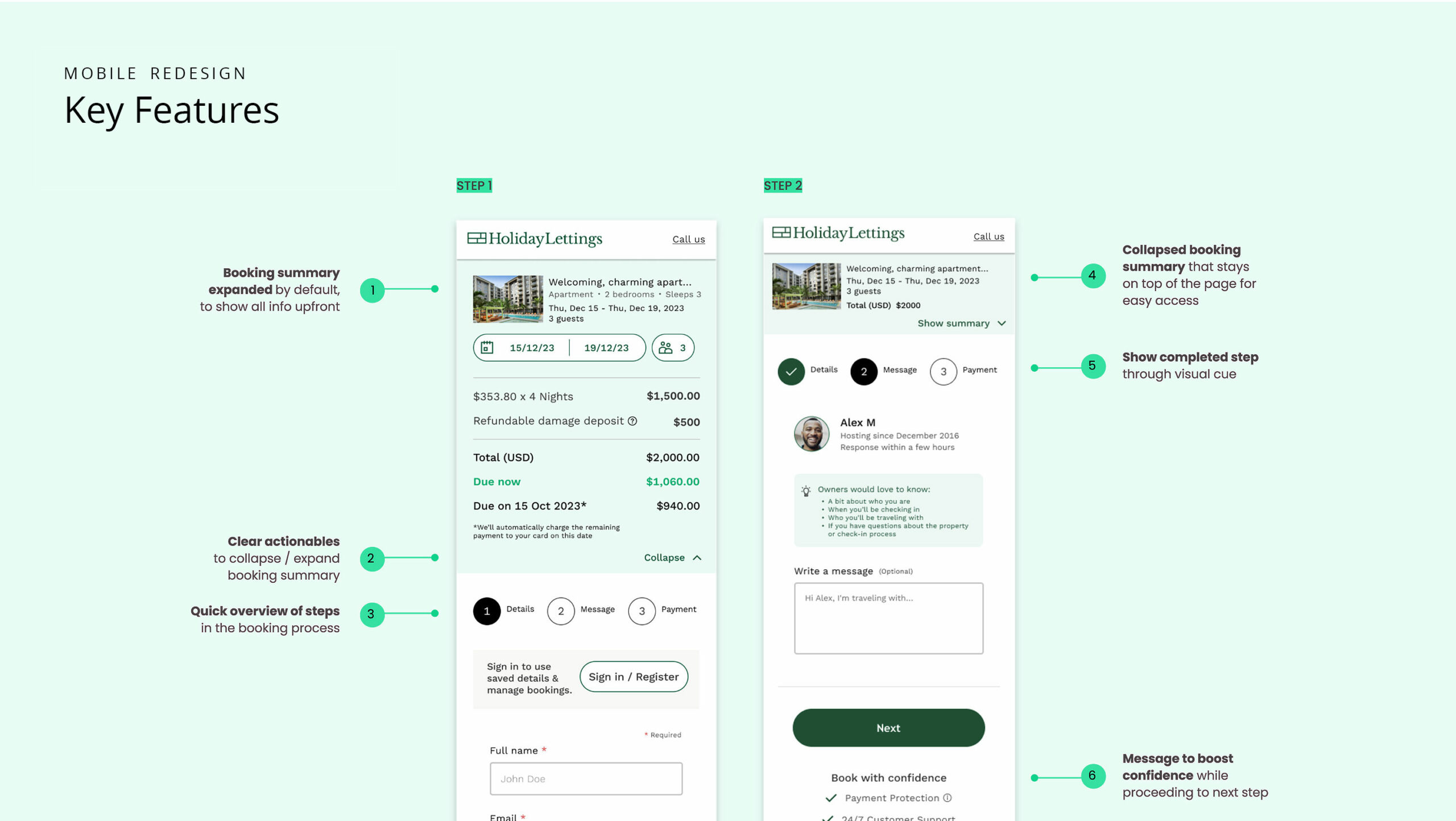
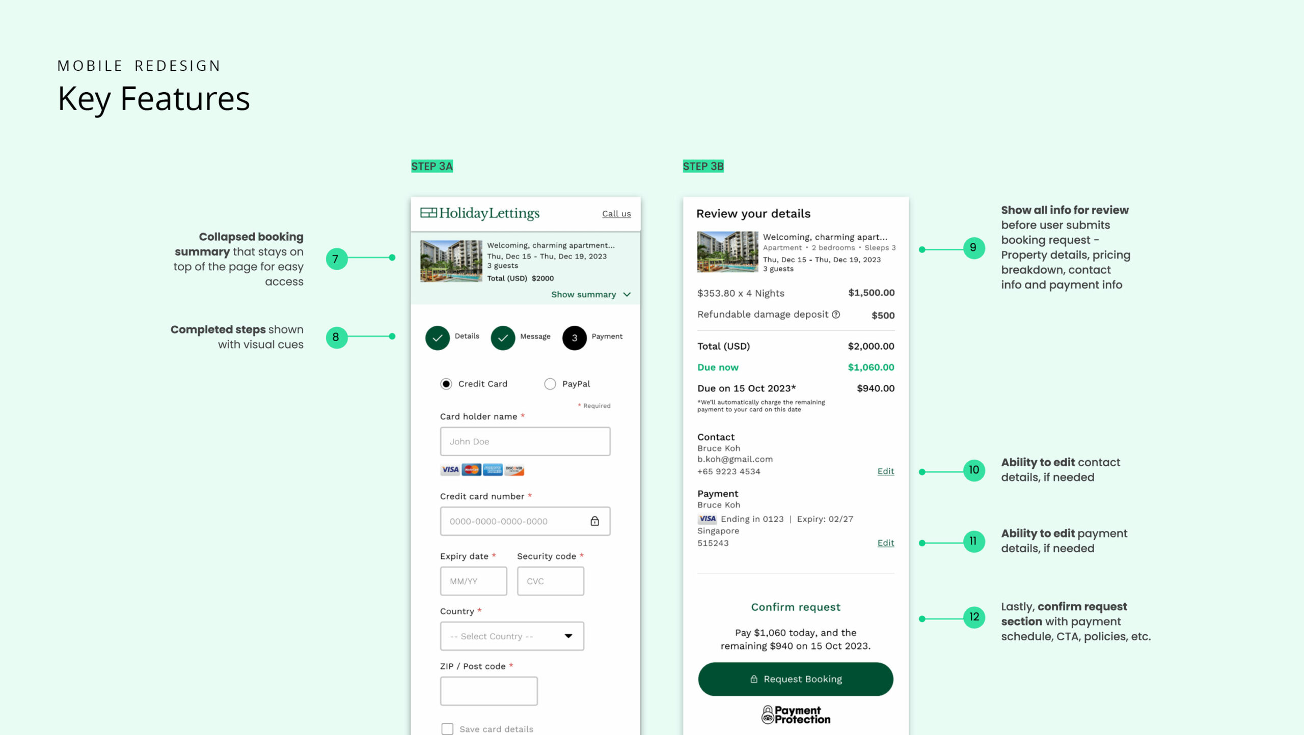
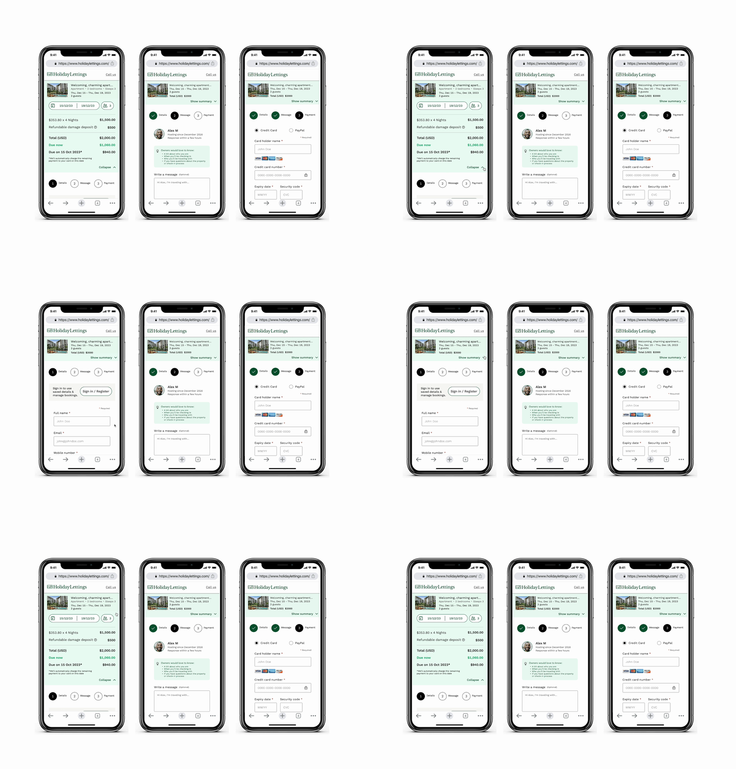
A three-step flow designed to guide users through the process with a more conversational tone and clearer progression.
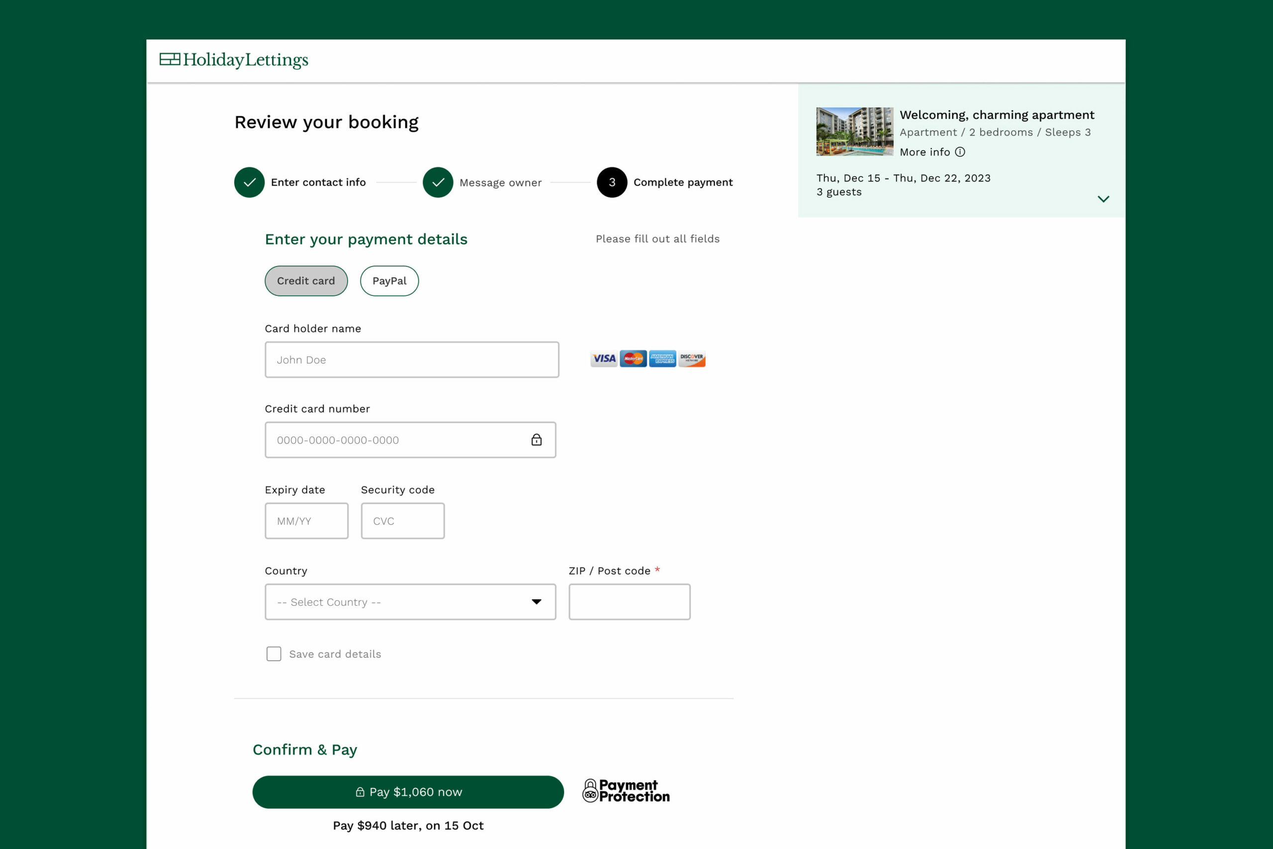
Additional Concepts
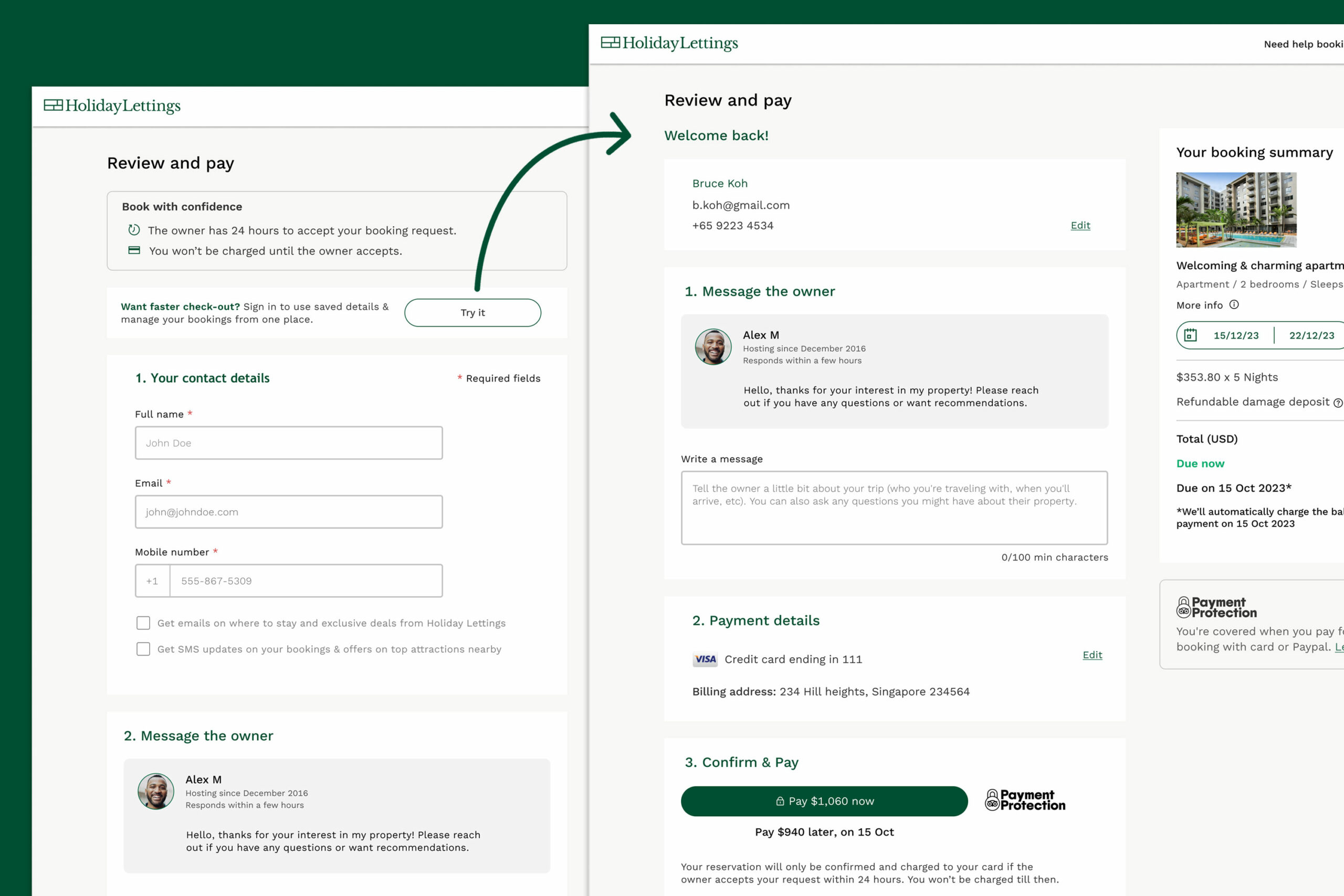
Express Checkout
Explored a faster booking path by allowing signed-in users to move through checkout more quickly.
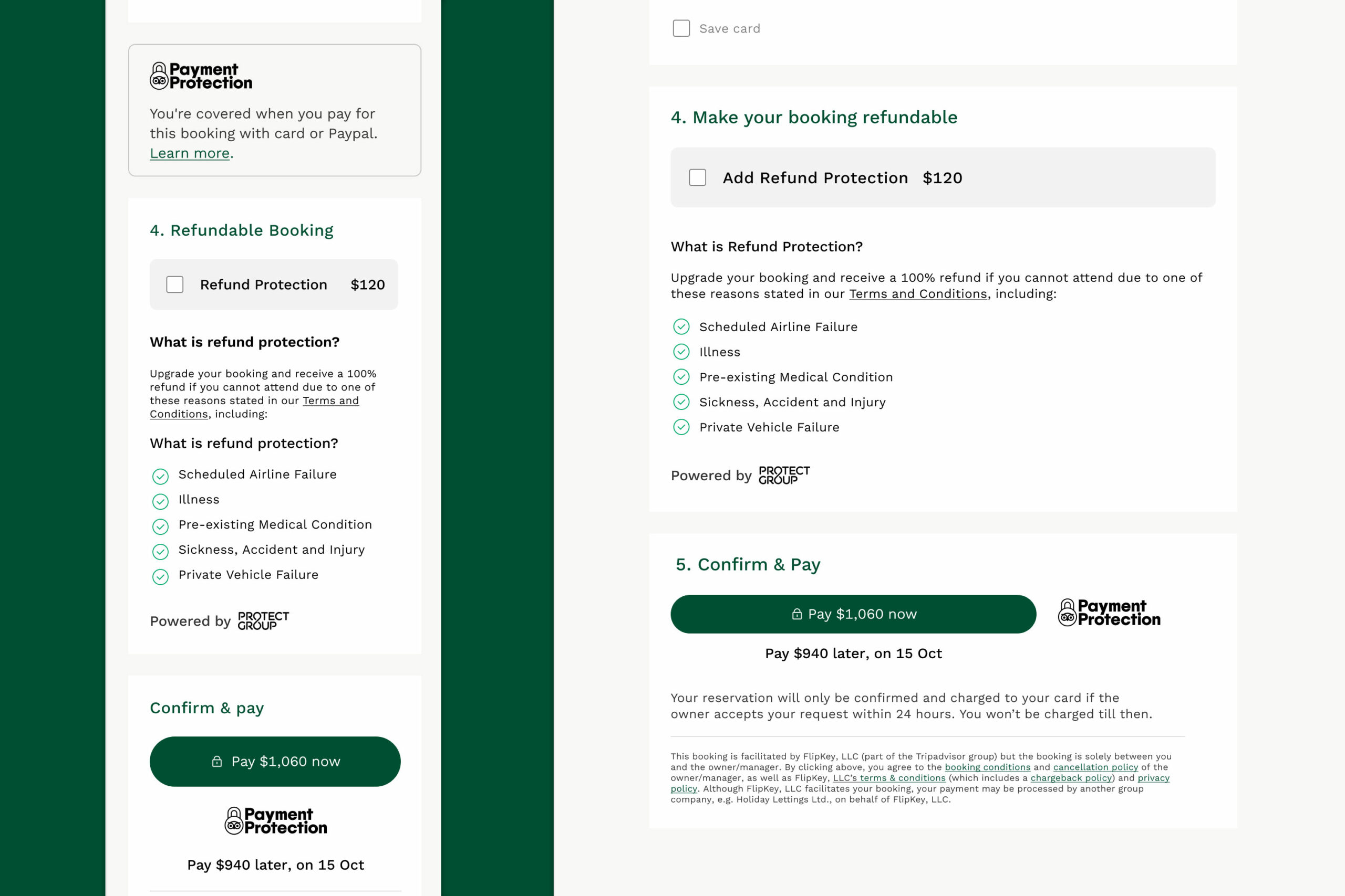
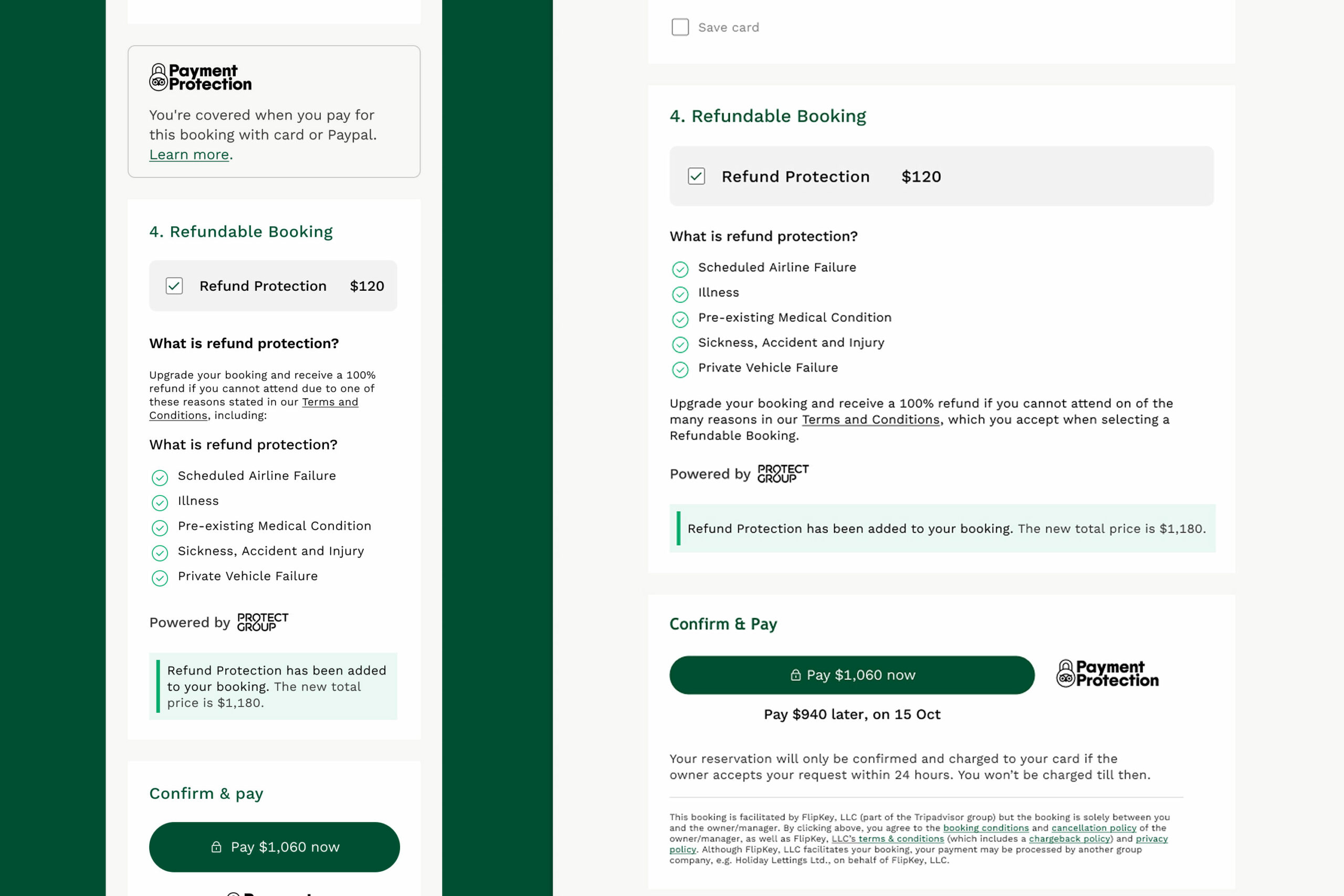
Refund Protection Add-On
Tested traveler understanding, perceived value, and price sensitivity around a refund protection product.
The critical insight — platform changes everything
User testing consistently showed a preference for the revised designs — but the most valuable insight was about platform, not layout.
Desktop users preferred a clean, one-page format that surfaced all relevant information upfront.
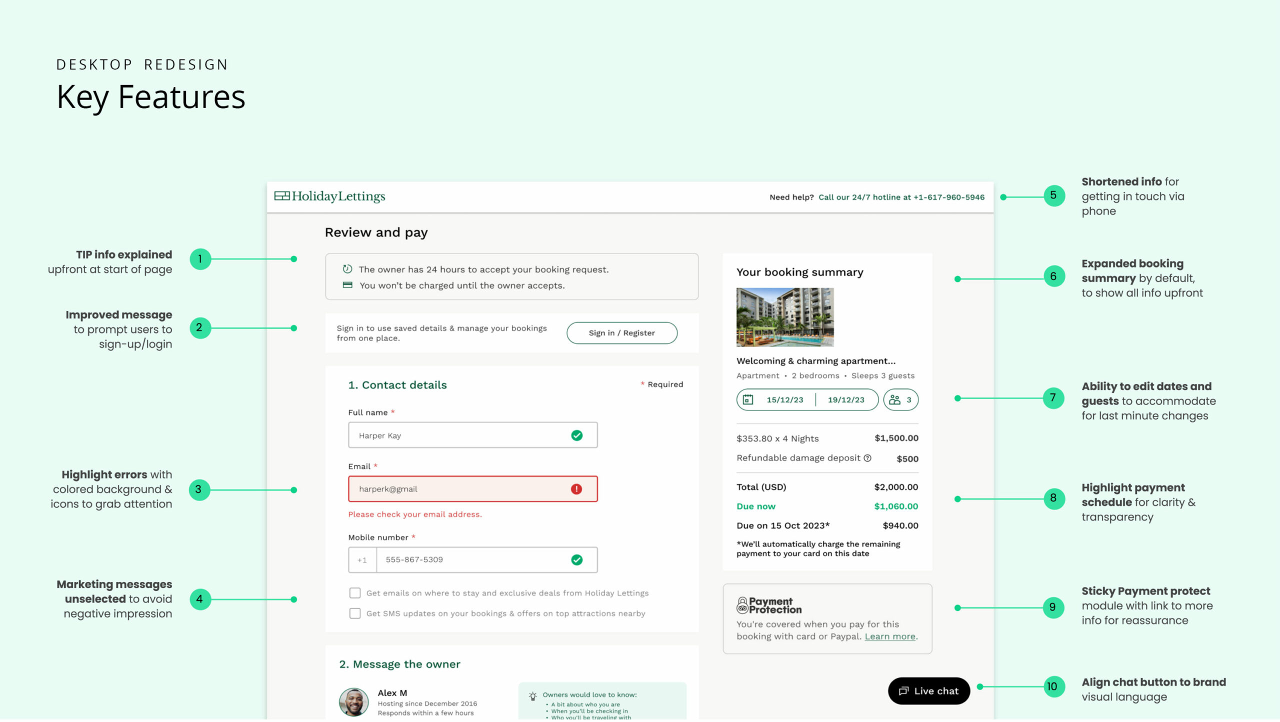
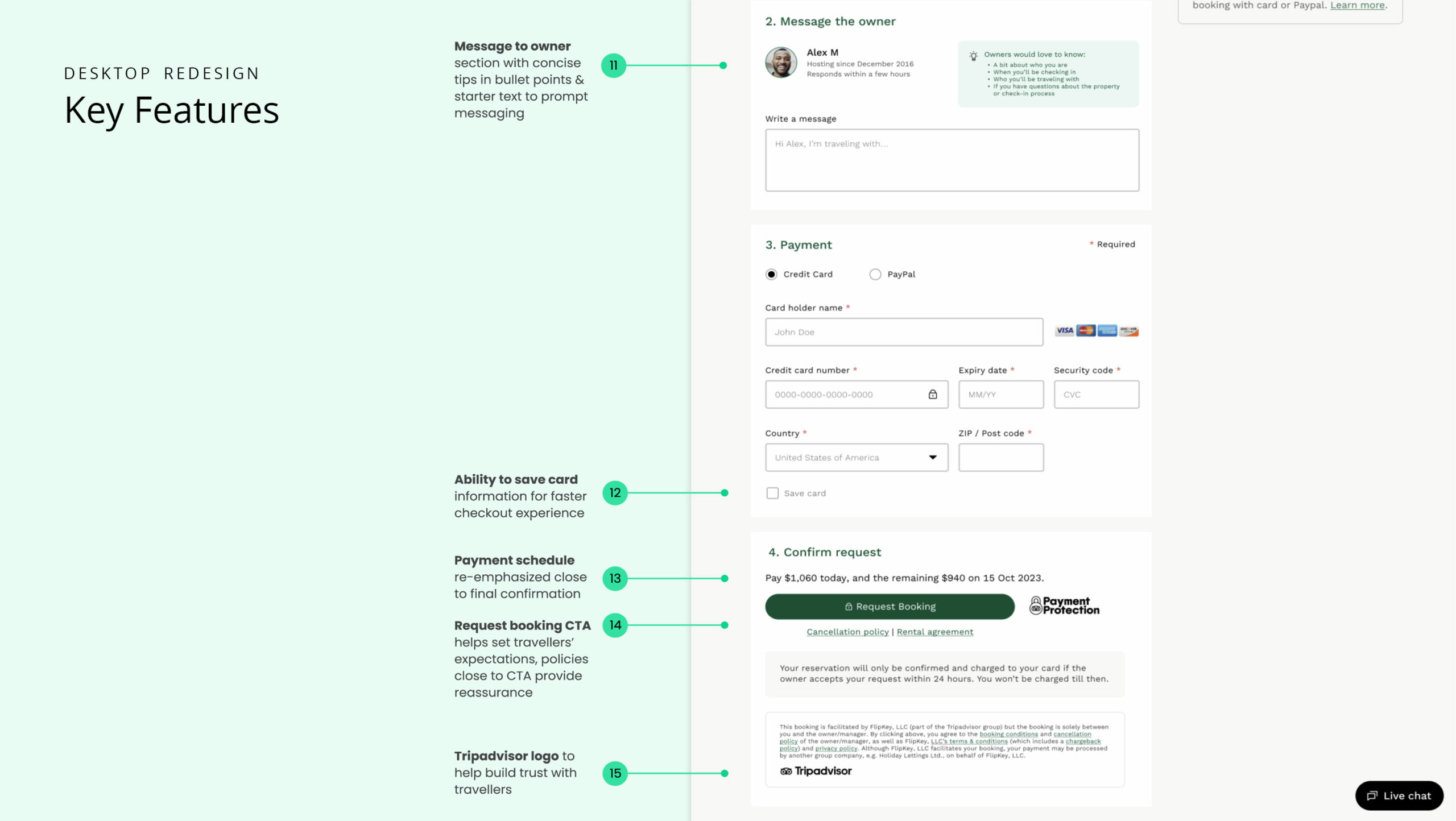
Mobile users preferred a staged, step-by-step format that allowed them to focus on one action at a time without feeling overwhelmed.
The platform insight from this research was one of several factors that later informed my confidence in launching the accordion checkout on desktop first for Tripadvisor Experiences, while retaining the multi-step flow on mobile.