Overview
To support the launch of a new-generation cross-line laser device in the European market, the client sought a companion app aimed at “soft DIYers” — users with basic home improvement skills seeking guidance and inspiration.
Rather than positioning the app purely as a feature showcase, we identified an opportunity to build engagement through project-led inspiration and community participation.
My Role
As Design Team Lead, I drove the concept development, facilitated cross-functional alignment, and led the UX and UI design from early research through detailed interface design.
Gathering Insights & Defining the User
Given a tight timeline, we synthesized insights from existing market research and desktop analysis to better understand the mindset, motivations, and barriers of soft DIYers.
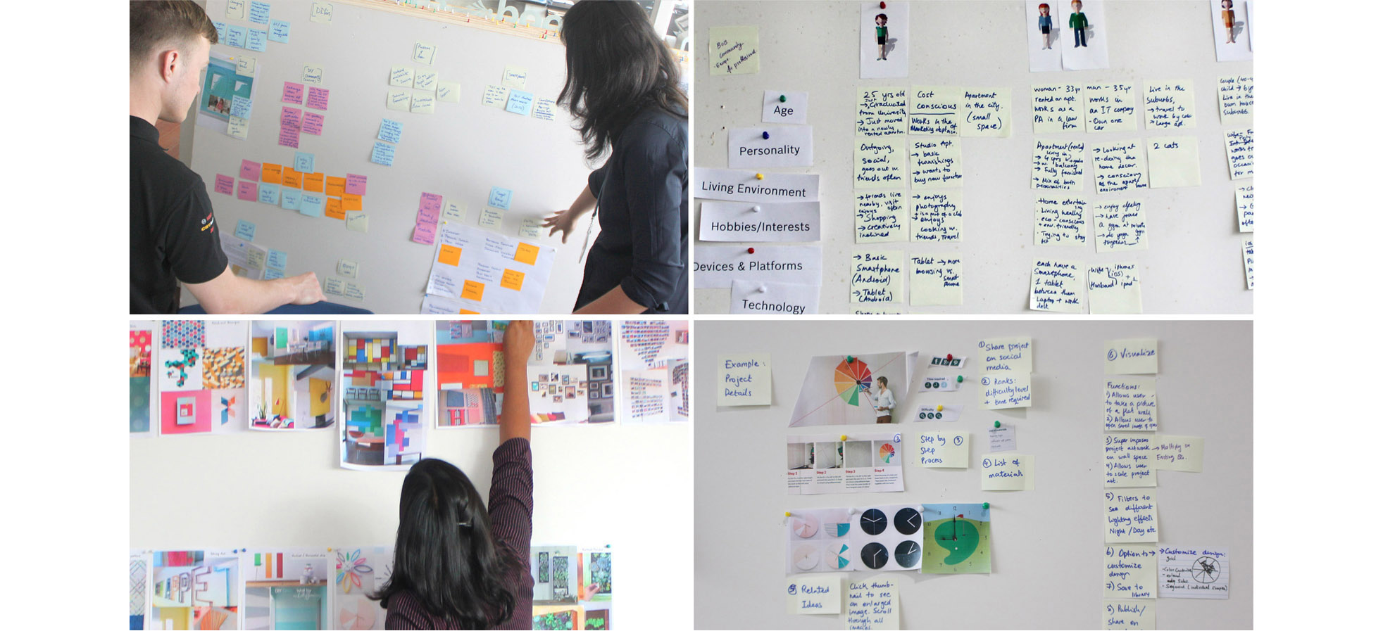
Through stakeholder co-creation sessions, we:
- Defined core user personas
- Mapped key needs and motivational triggers
- Generated and prioritized ideas based on user value, business goals, and technical feasibility
This ensured early alignment on both commercial and user outcomes.
Concept Development & Prototyping
We defined the core value proposition: shift from promoting a tool to enabling creativity and confidence in making.
Early concepts were tested internally using paper prototypes to validate assumptions quickly and iterate efficiently before investing in high-fidelity design.
User Flow & Wireframing
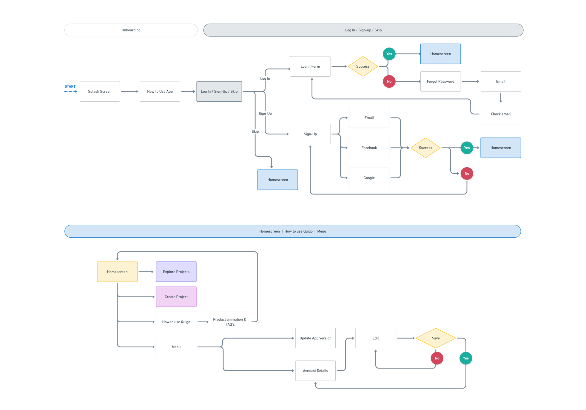
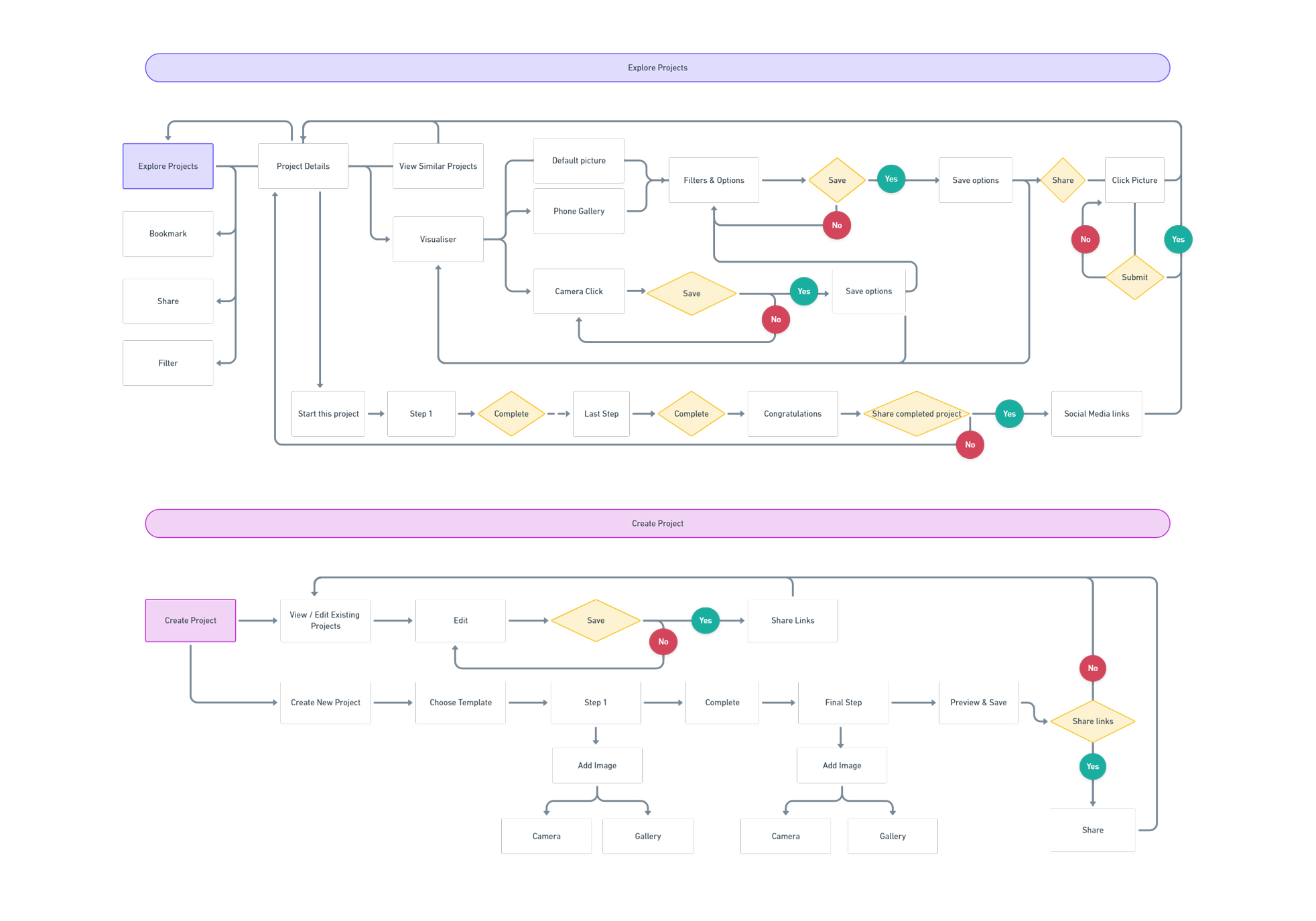
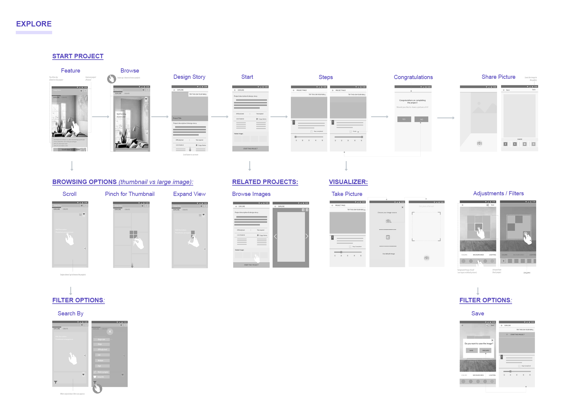
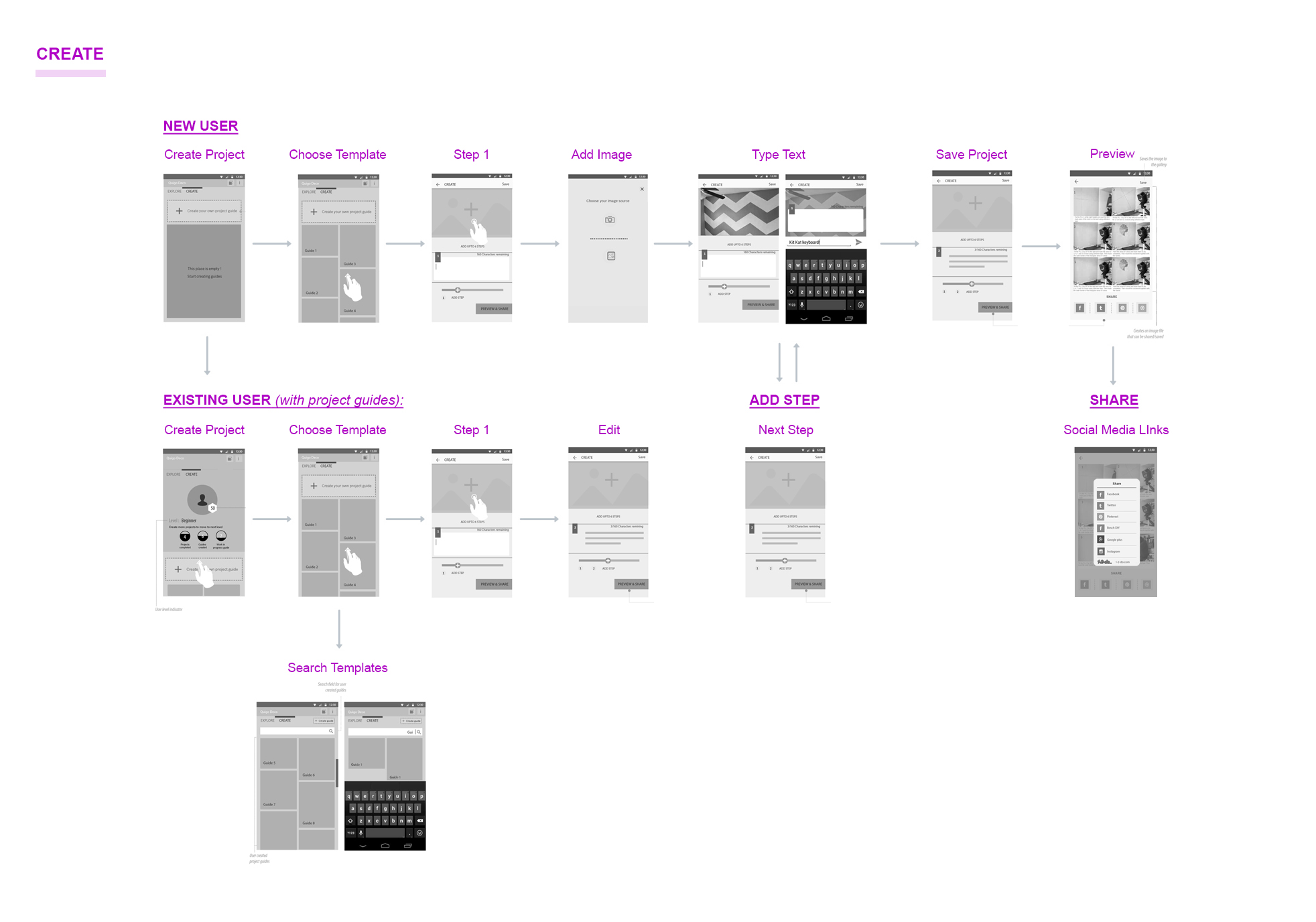
I developed the end-to-end user flow and information architecture to ensure intuitive progression from inspiration to execution.
Detailed wireframes clarified interaction patterns, feature hierarchy, and stakeholder alignment before moving into visual design.
Design Concept
The final concept positioned the app as a maker community platform rather than a product companion.
Users could:
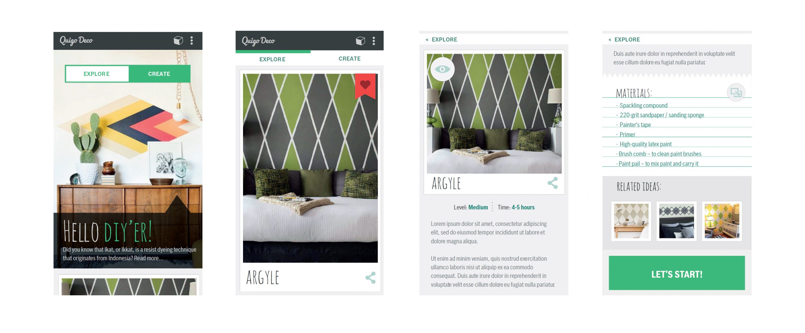
- Discover curated interior projects
- Access step-by-step execution guides
- Pre-visualize designs within their own space
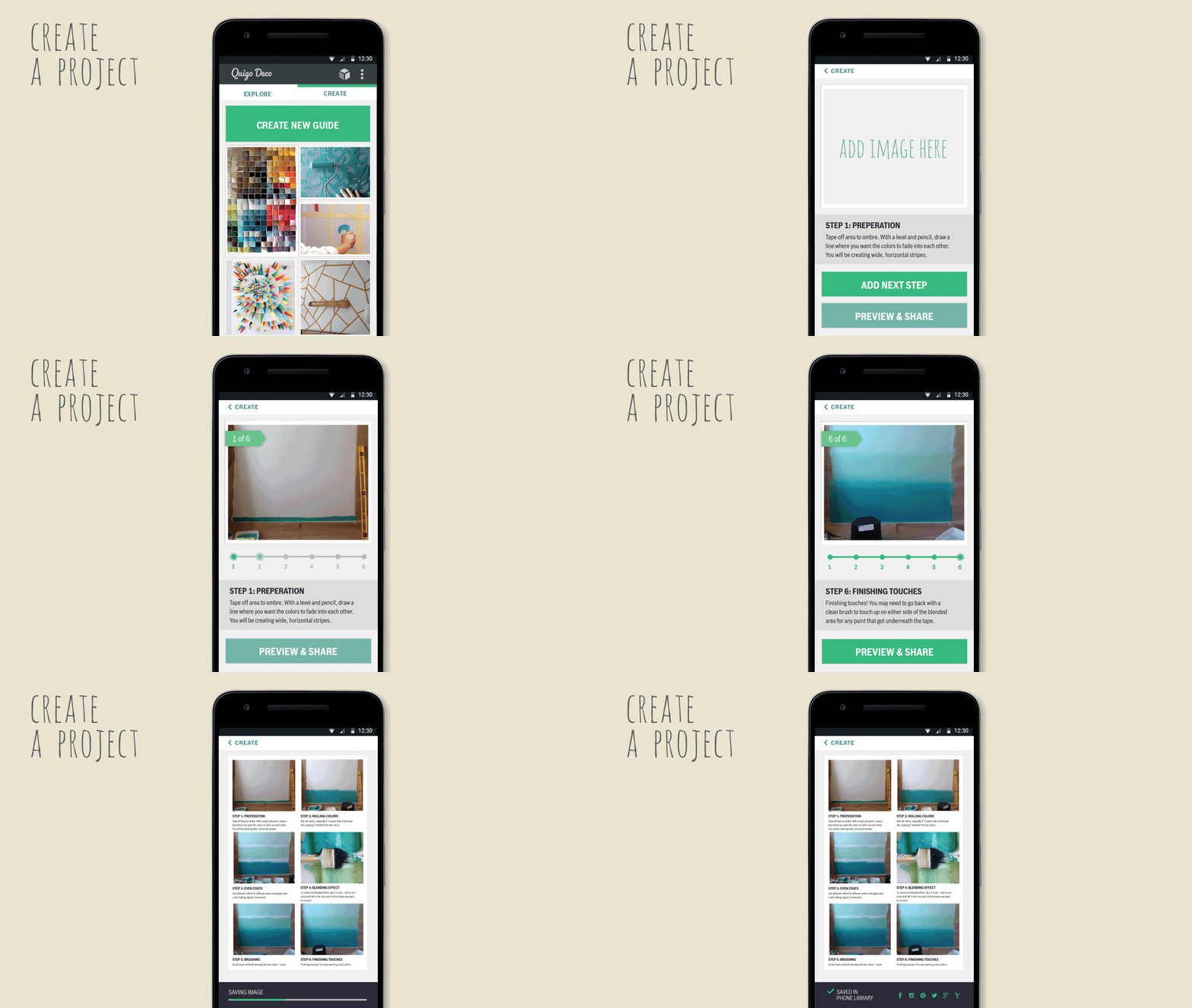
- Create and share their own project guides
By embedding pre-visualization and guided templates, the app reduced uncertainty and increased user confidence in starting and completing projects.
Design Language
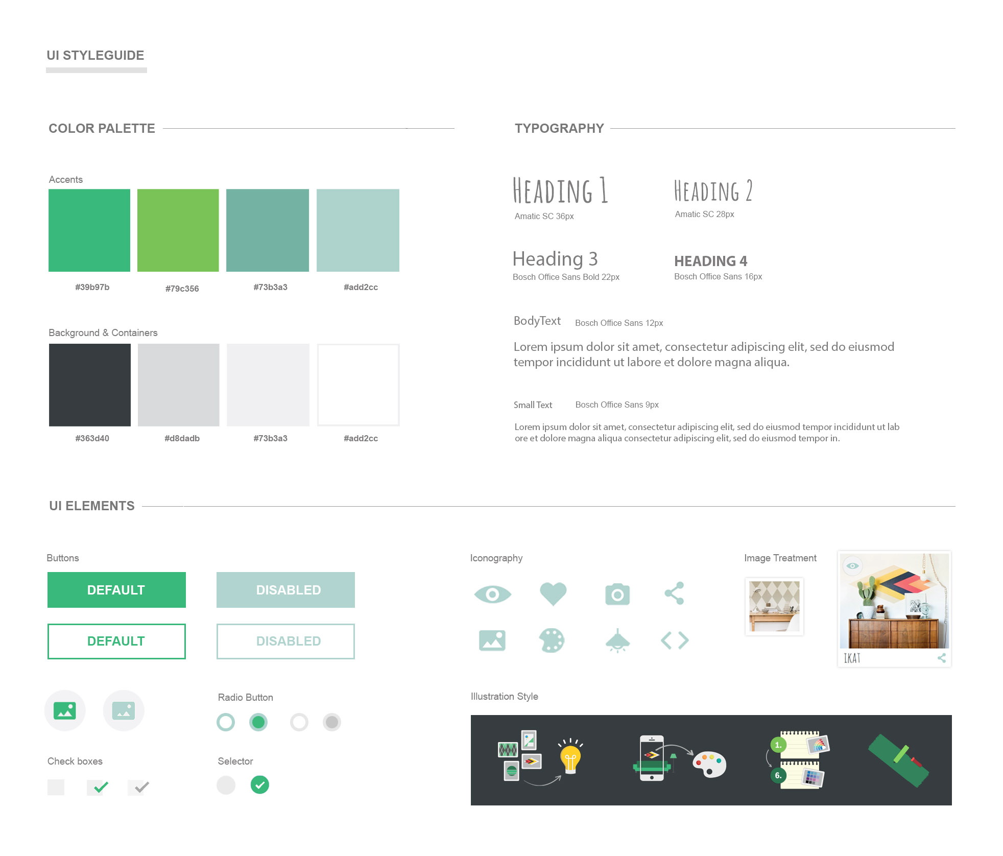
The visual language drew inspiration from both physical DIY environments and digital maker culture.
I created a clean, energetic interface designed to feel approachable and confidence-building, balancing inspiration with clarity.
Core Functions
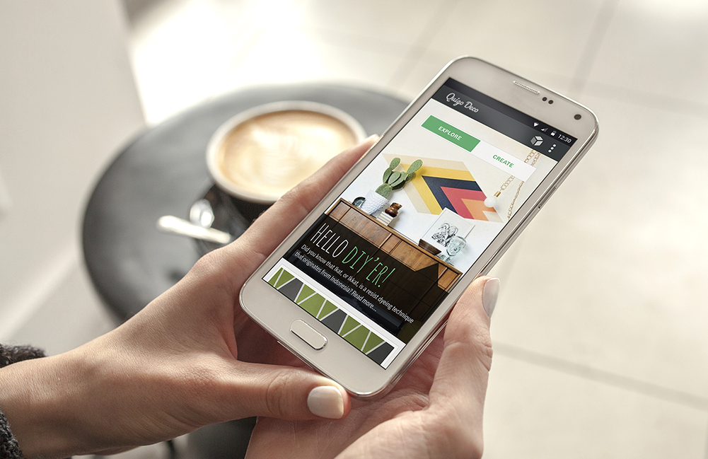
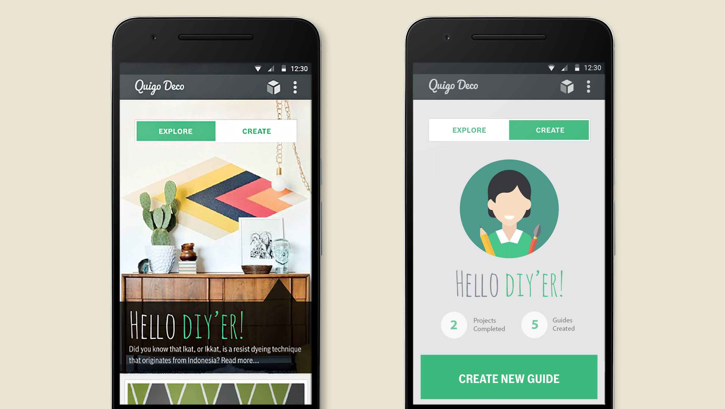
The two primary functions of the app are to Explore and Create.
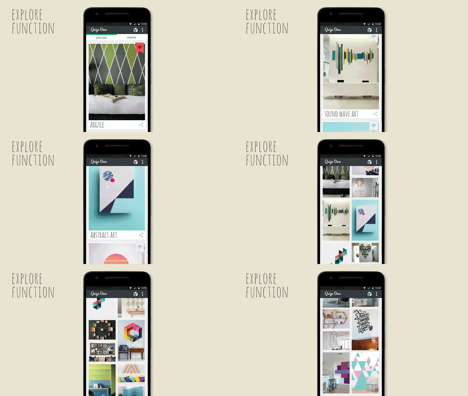
The Explore function prompts users to browse multiple projects (via thumbnail or large view) that are updated regularly, filter ideas to get closer to one they want, bookmark ideas they like, and share with others.
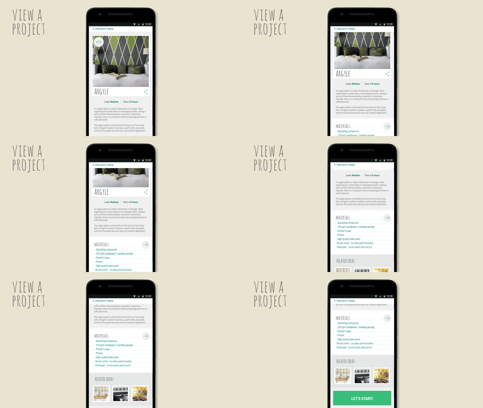
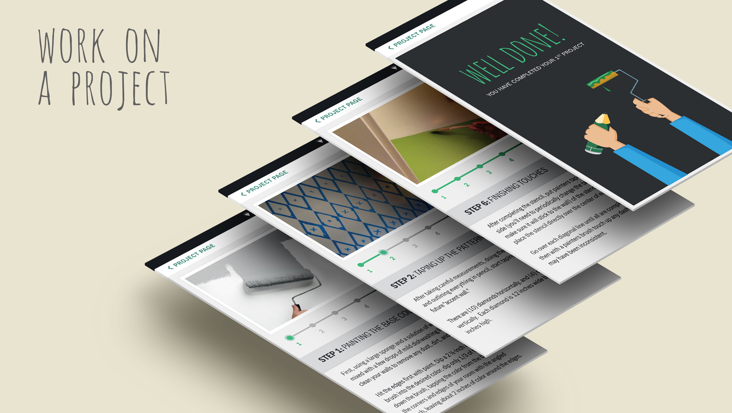
Users can read a design story related to the project, materials needed, and then get started with the guidance of step-by-step instructions.
A pre-visualization feature enables users to quickly view the design on their own wall to see if it would suit their space. There are also filters that can be played with for different lighting effects etc.
The Create function encourages users to create project guides to help share with the larger DIY community.
The user has access to easy-to-use and ready-made templates to help quicken the process. After a user saves a guide they have created they can view and edit it at any time.
New project ideas along with the features that support the process of easily making encourage users to start, continue, and complete projects successfully and share with the creative community.
Promotional video created for the app:
Outcome
The concept reframed the product from a standalone tool to part of a broader creative ecosystem, aligning stakeholders around a more engagement-driven strategy. While the app was not pursued due to budget prioritisation, the work clarified user positioning and informed future digital activation discussions.

