OVERVIEW
Pep Coaching integrates co-active coaching methods with the latest research on wellbeing, happiness and personal development.
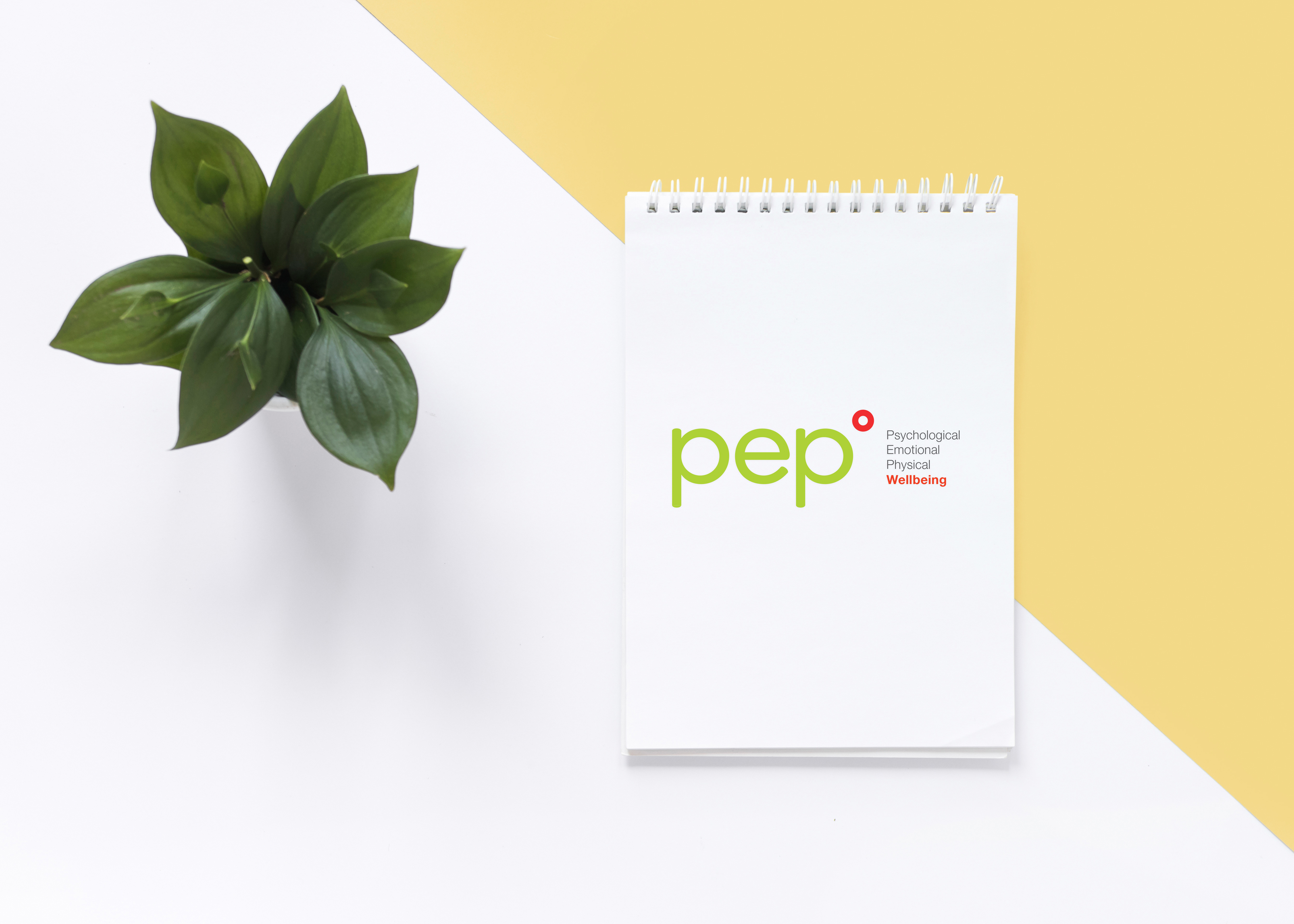
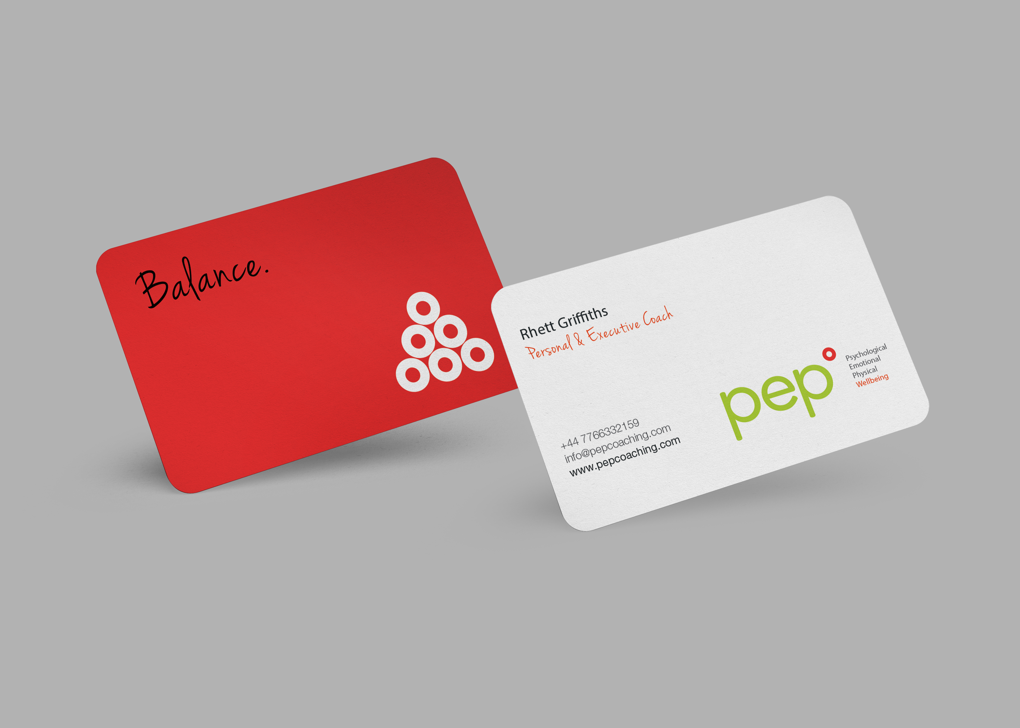
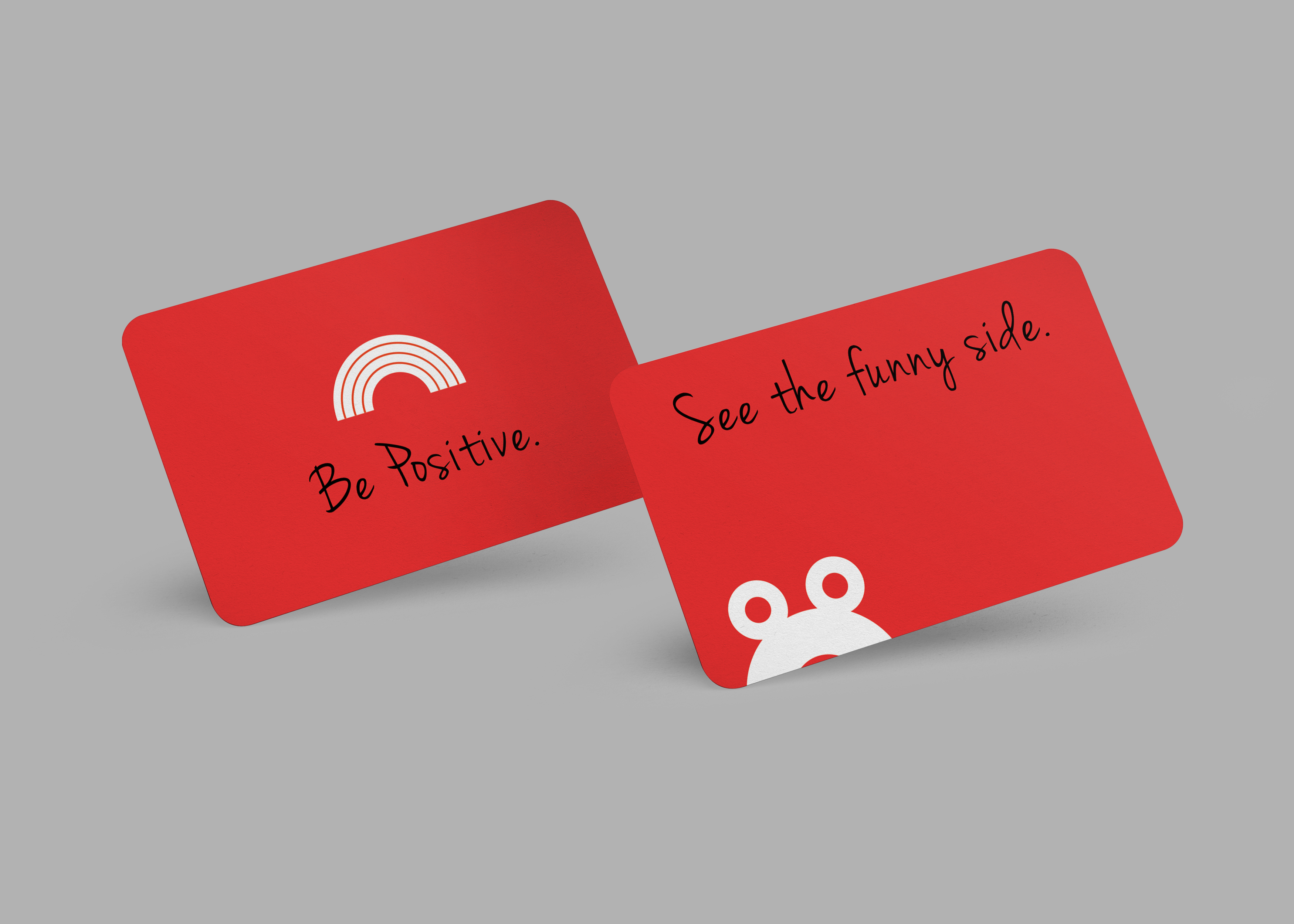
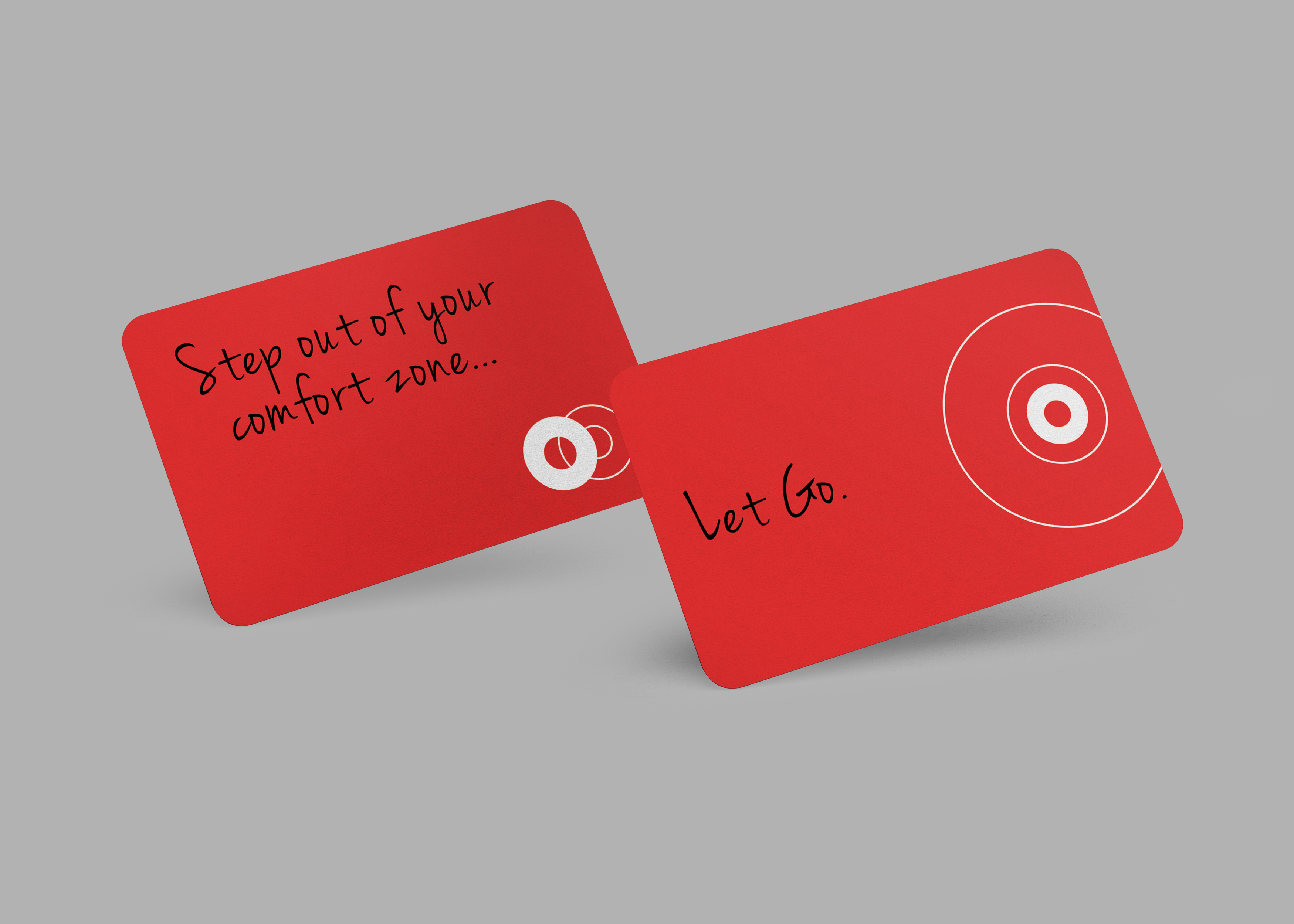
A re-look at the branding was done in order to bring some “pep” to the identity. A new logo, a set of business cards, and a website was created.
The fresh green color of the type along with the lower case and rounded forms were used to create a sense of approachability and fun to the identity. The pep circle floating on the top right reflects a sense of upliftment and happiness.
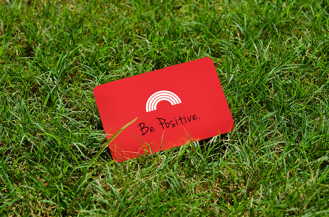
The business cards are designed to be ice breakers, and help prompt conversations. The pep circle is used in a playful manner to create visuals that depict the written messages.
A website was built to introduce coaching and its benefits, explain the services offered, and provide links and references on wellbeing.
