Overview
Mental health and wellbeing are often under-addressed in Indian society, creating a need for culturally relevant and accessible solutions. Eka was conceived as a mobile app for urban Indian users, bringing together meditation and yoga practices rooted in Indian tradition within a modern, approachable digital experience.
My Role
As an independent design consultant, I led the project end to end—defining the product name, brand identity, and visual and UI design for the app.
Why ‘Eka’?
The name Eka—meaning “one” in Sanskrit—reflects the core idea of pause and presence: one breath, one moment, one connection to the self.
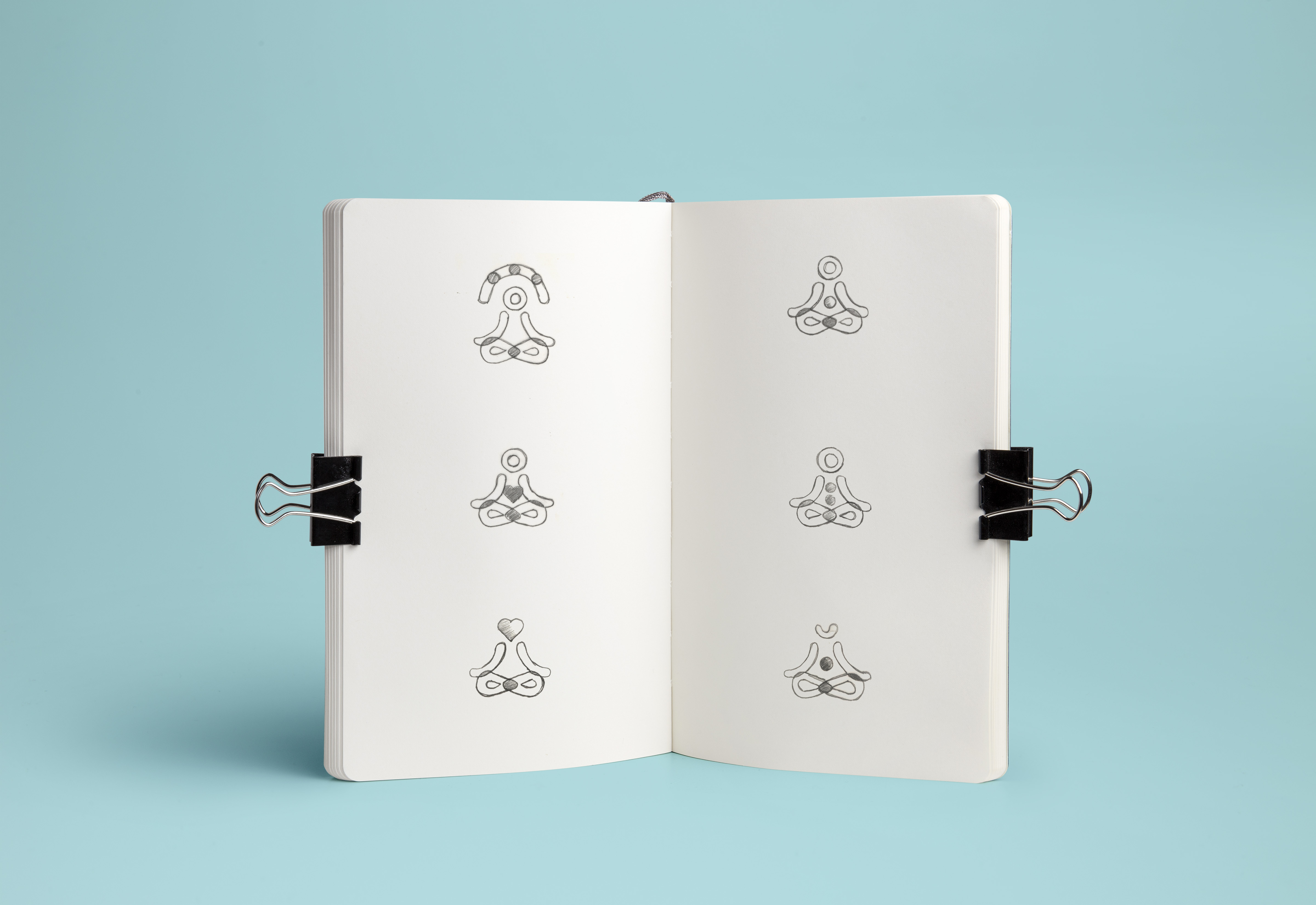
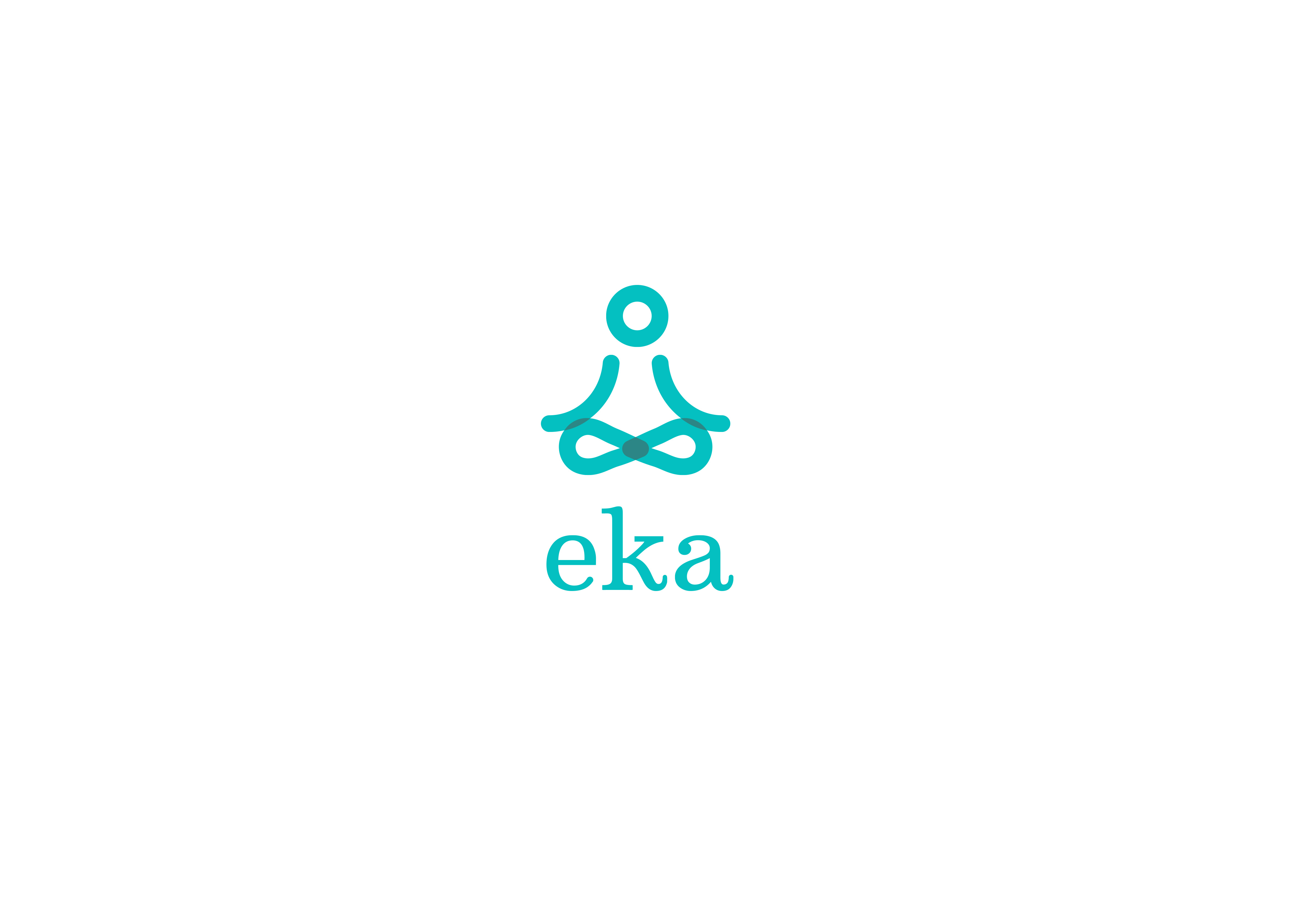
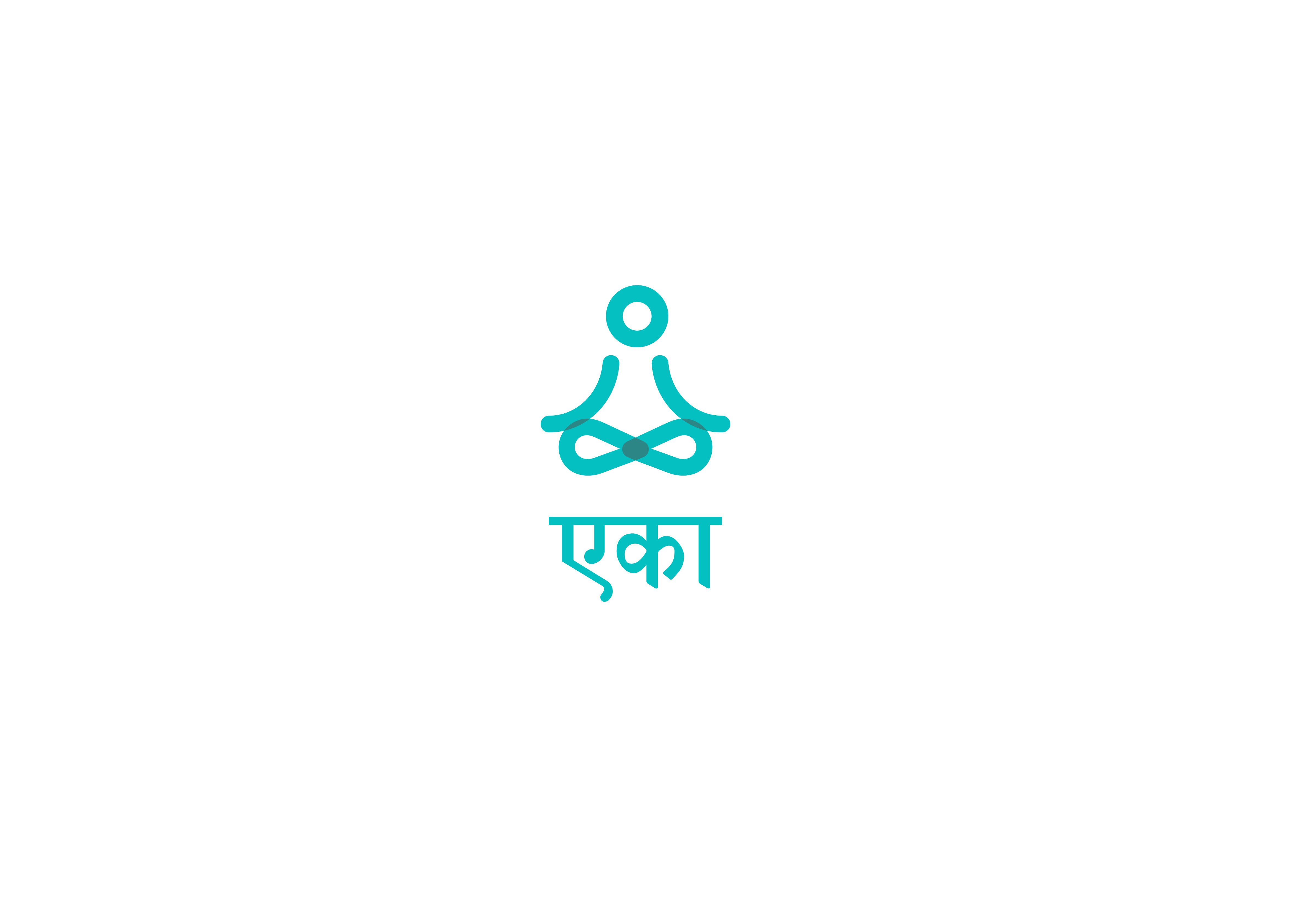
The brand combines an Indian name with a contemporary visual language to resonate with an urban audience. The symbol depicts a meditative figure in a minimalist lotus pose. Integrated strokes form the body, while a subtly detached head draws focus to the mind.
The symbol depicts a meditative figure in a minimalist lotus pose. Integrated strokes form the body, while a subtly detached head draws focus to the mind.
The custom typography balances ethnic character with modern simplicity, positioned to create a sense of levitation. A teal palette was chosen to feel both calming and confident.
App Design Language
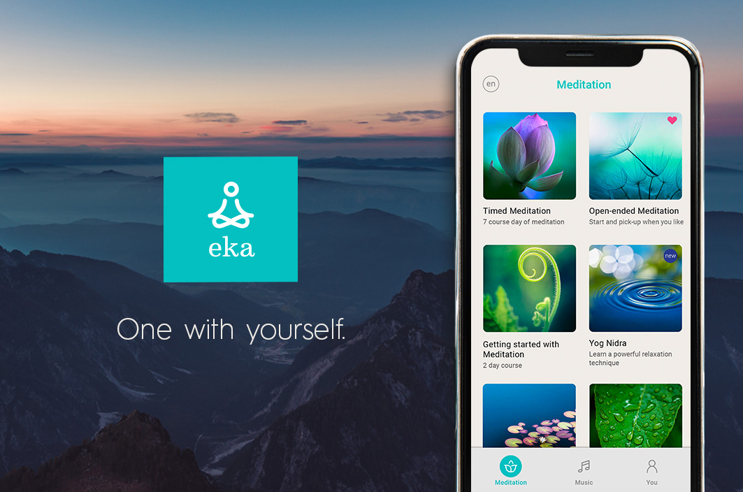
The app uses a clean, minimal visual system to create an open, distraction-free experience. Nature-inspired imagery introduces moments of reflection without overwhelming the interface.
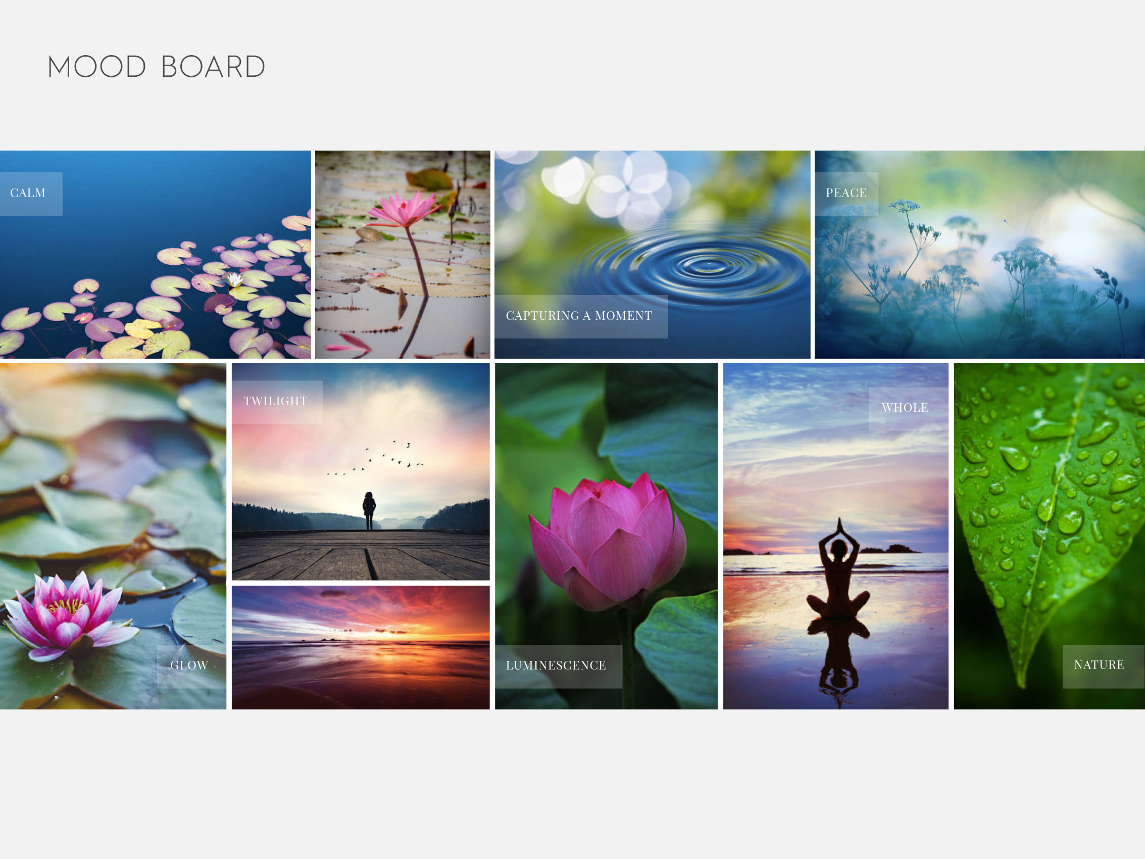
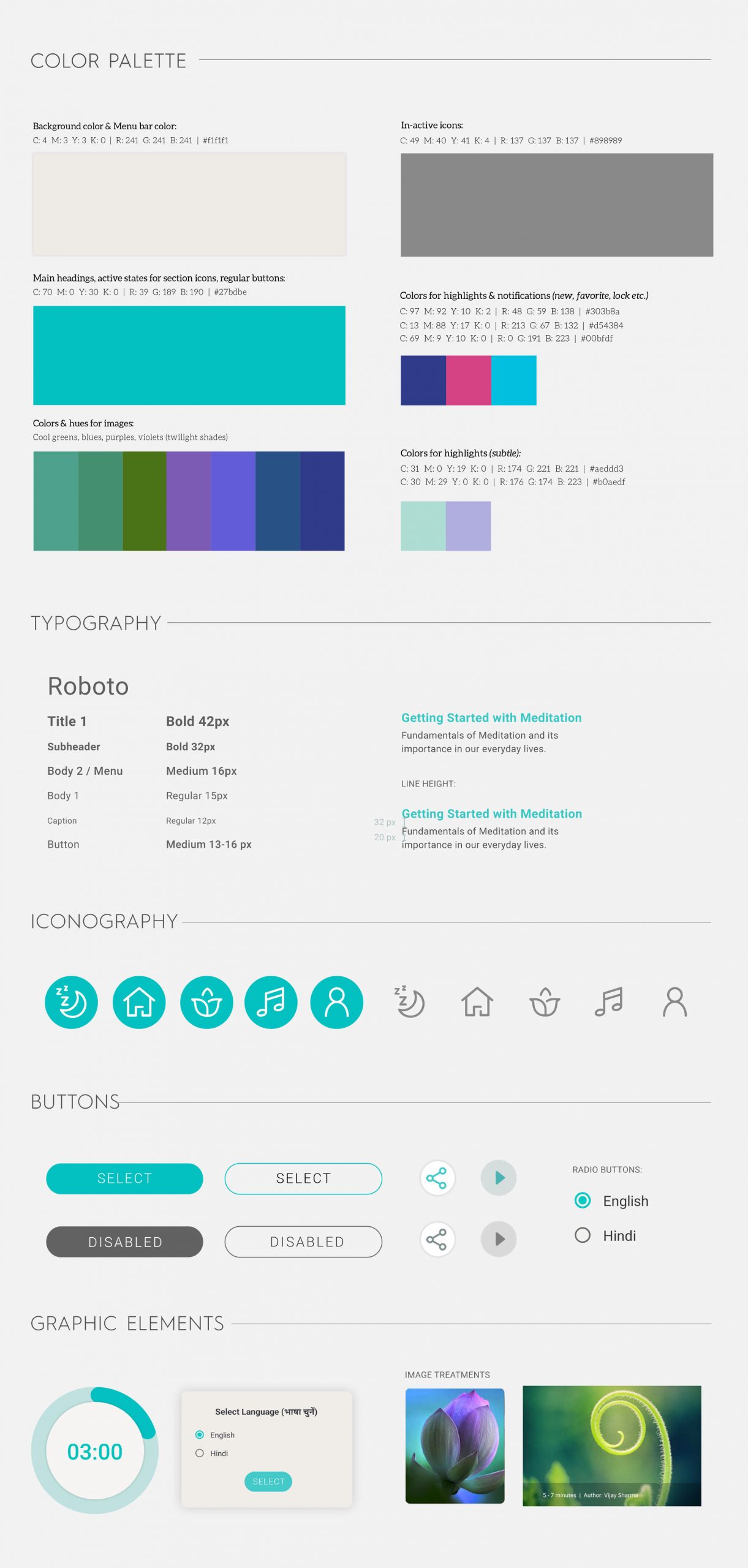
A twilight-inspired colour treatment complements the brand palette and light UI, adding depth, warmth, and subtle visual contrast while maintaining a calm tone.
Core Features
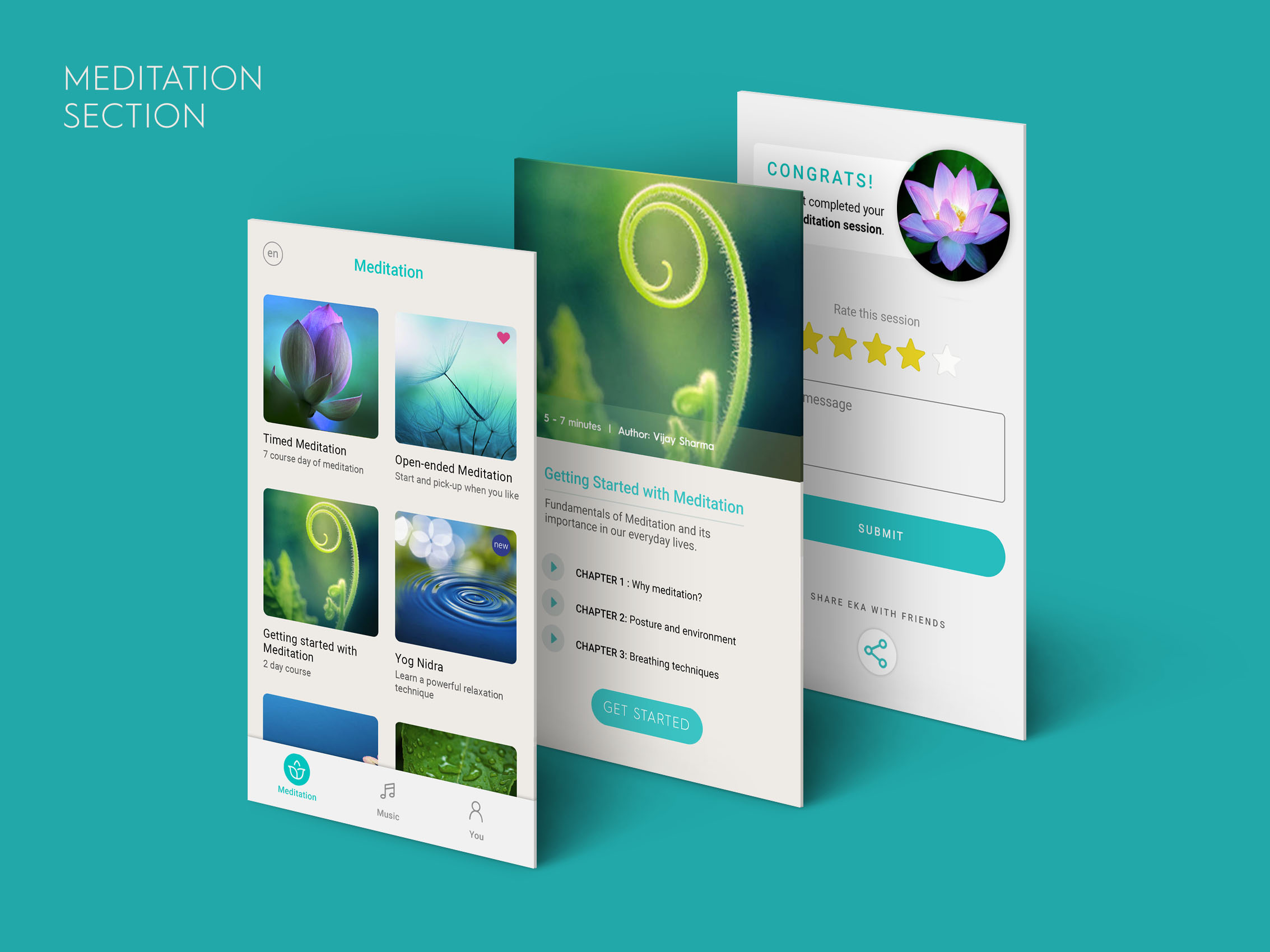
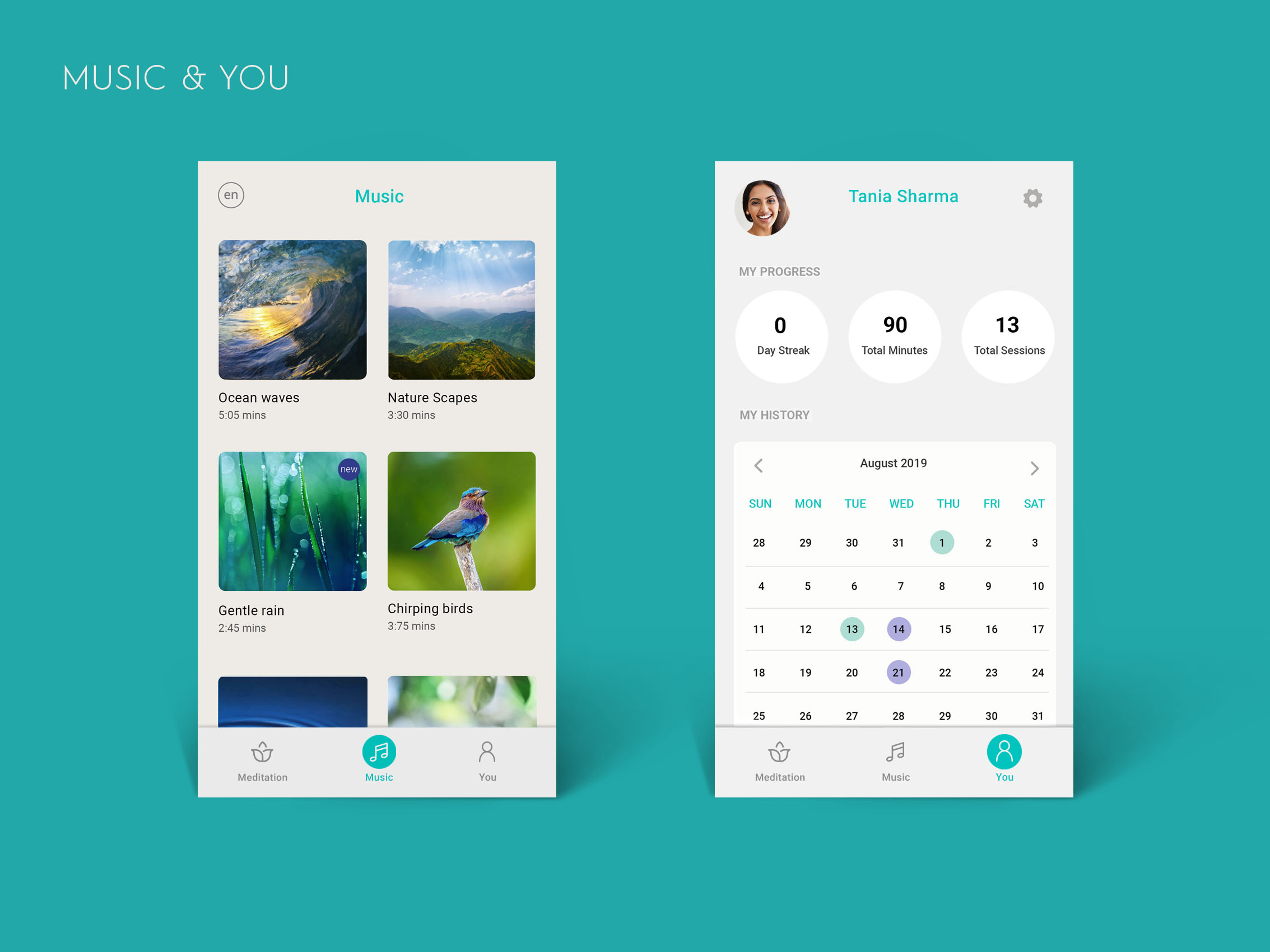
The app was structured around three primary sections, accessible via a bottom navigation: Meditation, Music, and You.
The Meditation section offers guided techniques and courses, organised into chapters. Completion is acknowledged through rewards, with options for feedback and ratings.
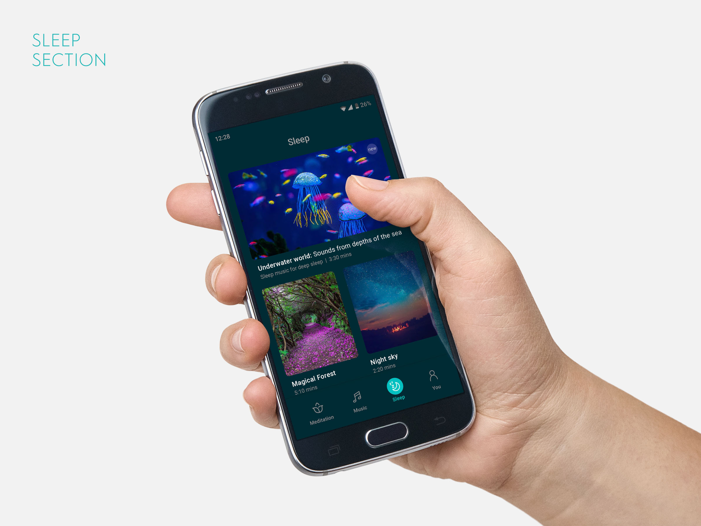
A Sleep section was also conceptualised for future release, designed in a dark theme for comfortable nighttime use, with recent content surfaced prominently to encourage discovery.

